

Jason Yuan is a young designer from Rhode Island whose project swept across the web last year. His story titled I Got Rejected by Apple Music...So I Redesigned It was featured on TheNextWeb, FastCoDesign, and Mic. Jason demonstrated that even design giants can make confusing and frustrating choices and how easily those can be avoided and fixed.
Of course, Apple doesn’t suffer significant losses related to their poor design decisions. Regular users often don’t even notice that there’s room for improvement. We don’t live in a perfect world. So, we're used to less-than-perfect and difficult-to-use interfaces. Here and there, each of us stumbles across a complicated flight booking process or a local business website that obviously fails to deliver its message to anyone who visits their home page. In most cases, it’s okay, not a big deal. We click the “back” button and search for a better alternative. As luck would have it, we users have a deep pool of services to choose from. So, sticking with a clunky, inconvenient interface is not required. However, if you’re the business that customers bounce from, it's not okay and it is a big deal.
There are three main reasons brands might consider a website redesign:
- You’re not getting the desired results
Your site does attract traffic, but not enough. Maybe, the wrong pages bring more traffic than the main page. You generate leads, but not as fast as you’d like to. Certainly something needs to be changed.
- Your goals for your solution have changed
When you change your marketing strategy, your website should reflect that. If your blog used to be a completely non profit project but now you’re planning to use it for selling e-books and courses, your website should be updated to reflect that as well.
- You want to highlight your content
Content-driven design is on everyone’s mind of late. We talked about it both in 2017 and this year in our UX design trends and will repeat it now. People come to your site for the information they were looking for in the first place. Can they find your blog posts easily? Is your content optimized for search engines? How readable is it? A lot of design decisions come into play when you make content your driver.
Do you recognize your situation? If so, let’s first define what redesign actually is.
Redesign is:
⊕ Creating a new user journey based on qualitative and quantitative data
⊕ Creating new content and shaping design around it
⊕ Introducing changes to improve customer experience and convenience
Redesign isn’t:
Θ Rebranding
Θ Giving your website a new look without upgrading UX or content
Θ Changing placement of the elements while ignoring usability
Now, that we’ve decided what redesign entails and how to be sure that you need it, let’s plan it.
Phase 1: Analyze Your Current Website and Set New Goals
If you’re considering redesigning your website, you may already know what issues need solving. Still, your website may not work for multiple reasons, not just one. There are four angles you should observe your current website from:
Conversion
When visitors first visit your homepage, what do they see? Is it clear what industry your business is in? Is the information they came for easily found on the site? If you can’t answer these questions, you probably don’t have user personas and are unsure which target audience your website is trying to hit. Each of your target actions should be tied to the desired outcome, which is usually unified under the conversion term.
Examples of the tasks that will support your conversion:
- Increase conversion through a website by 20 percent a year
- Redefine calls to action (CTAs)
- Generate 50 backlinks each month
- Gain 1000 newsletter subscribers
Detect bottlenecks that indicate the lack of strategy alignment:
- What would happen if you didn’t have this website? What functions does it currently perform?
- What sets you apart from competitors? What special niche does your business occupy?
- Do you have a tagline that concisely describes your unique service?
- Who is your customer? Is it a single person or a company? What’s their background and how do they find you?
- Do you have any referrals and how do you plan to attract them?
- Which calls to action do you want to include and in what order do you want visitors to see them?
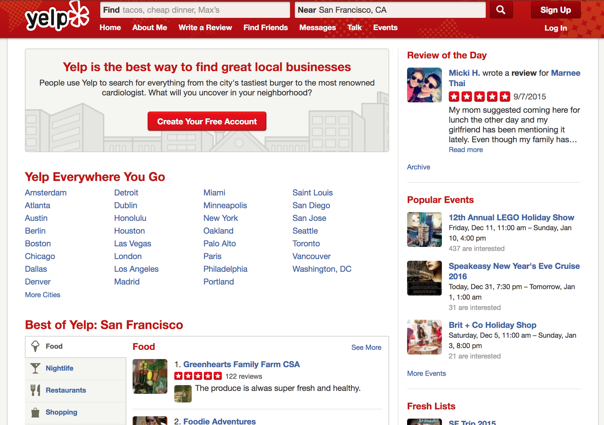
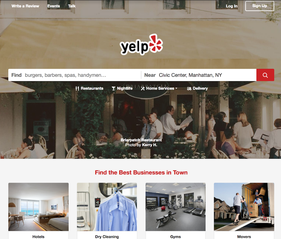
Yelp changed its conversion strategy and started providing experience-based information rather than location-based
Usability
Have you managed to convey your core message to your audience and helped them easily see, use, and navigate through that message without leaving your website. Your website speed, a convenient menu, security, responsiveness - all these factors shape user experience.
Examples of the tasks aimed to improve your usability:
- Increase the time spent on a website to two minutes
- Optimize website speed for Black Friday
- Boost the accessibility compliance rate to 90 percent
- Create responsive versions of the website for three different screen sizes
Detect your usability bottlenecks:
- Does your page have a clear visual hierarchy?
- Do all your website pages display correctly across different browsers? Use Browsershots to check how your pages are displayed on different versions of browsers
- Is your navigation easy to use? How structured is your navigation? Do you use breadcrumbs to let users find their way around your site?
- Are your graphics optimized and do they load fast on the page?
- Is your website accessible for all users? Is your text-to-background contrast ratio suitable for visually impaired? Do you provide captions to your audio and video content? Use automatic online tools like Web Accessibility and consult with our broad guide on accessible and inclusive design here.
Content
If your audience doesn’t get the information it comes to your website for, you need to create a content strategy. Content should be concise, comfortable to read and relevant to user request. Beyond the typos and grammatical errors, answer these questions for your content.
Examples of tasks that will improve your content:
- Create at least four blog posts a month
- Hire experienced writers
- Develop a platform for user-generated content
- Raise your Flesch-Kincaid readability score to 60 points
Detect your content bottlenecks:
- Is your content relevant? Should the stated information be updated?
- Is your content written in a language understandable to your users? If your customers are skilled photographers, you probably shouldn’t explain to them what ISO or aperture mean
- Does your content have a distinct voice? Is this voice consistent throughout the whole website?
- Is your content easy to scan and read? Is it divided into paragraphs, including bullet points, headlines, and blank spaces?
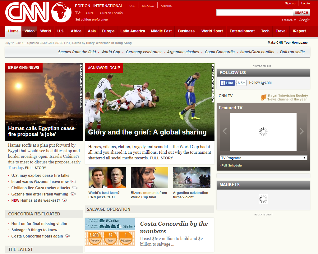
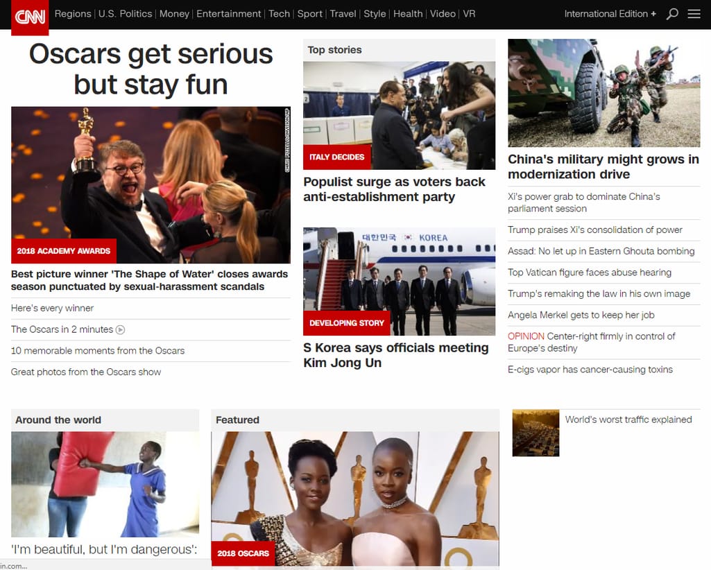
Starting from 2015, CNN illustrates news in bigger pictures and minimizes text overload
Search engine optimization
SEO determines how quickly and easily your customer will be able to find your website. If your website is full of graphics without alternative text, efficiently used HTML tags, and relevant keywords, it’s a huge roadblock for Google crawlers trying to find your page. Evaluate your SEO using online tools like Website Grader, SEOptimer, or one of the many others to detect some obvious mistakes in your optimization.
Examples of the tasks that help to elevate your SEO game:
- Generate 50 backlinks per month
- Convert your site to HTTPS
- Develop a mobile version of the website
- Invite an SEO specialist to the team
Detect your SEO bottlenecks:
- Do you know the most popular and relevant keywords for your business? Do you use them across the pages?
- Are your titles and meta descriptions of suitable size?
- Is your website protected by HTTPS? Google ranks secure communication higher in its search results.
- Are your URLs easily discoverable by Google’s spiders? Use RankSider or similar tools to check.
At the end of the evaluation stage, you compose a design brief - a document storing the details of your design project. It will guide your team of developers, designers, and strategic leaders from ideation to final product. In a design brief, you describe all goals and expectations that you’ve set during the evaluation stage, along with the company’s profile, description of its target audience, the project’s budget and time frames.
Phase 2: Redesign a Content-First Information Architecture
Content-first approach is one of the most popular philosophies in today’s web design world. It implies that your design should be only the framework for your actual treasure - ideas and messages that you share with your audience. Instead of developing a super stylish but generic design template to cram your content into, start with the information you’re planning to include. This saves time spent on multiple iterations, allows you to stay true to your mission and goals, and ensures correct hierarchy and consistency.
Let’s have a look at the typical website information architecture development process considering the content-first ideology.
Building information architecture (IA) implies organizing your website in the most user-friendly and intuitive way. A great IA is developed strictly on data and here’s where all your user research from Phase 1 will come in handy. Heatmaps, Google Analytics data, scroll depth tracking - all these will smooth the progress of composing an IA that balances customer satisfaction and business needs.
User flows and customer journeys
A customer journey is the most realistic illustration of all touchpoints a user comes in contact with when visiting your website. To build a customer journey you need a persona and a use case - a problem to solve or a task to complete. If a visitor comes to your website to learn more about your product, what would they first click on? Finishing a task often requires completing smaller tasks and it’s the relationship between these tasks that creates the flow or journey.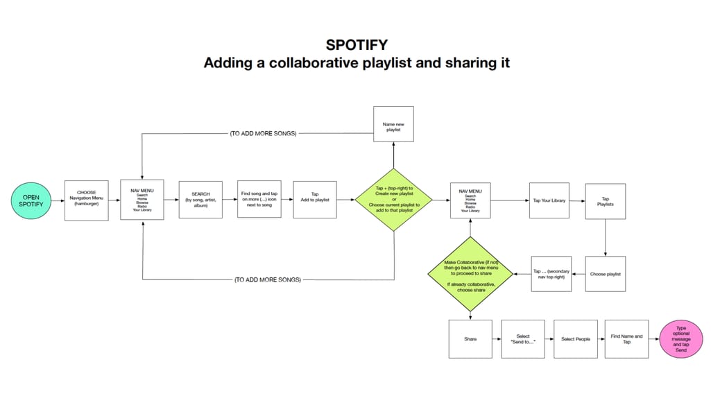
A user flow for Spotify’s collaborative feature Source: lisapassanante.com
This stage serves as a test of how your content supports your new goals. Use your findings about customer journeys to review your current content. What should be edited, completely rewritten, or omitted in a redesigned site? Is there any content conflict that would obstruct users from crossing the finish line? Review competitors’ user flows and how they use content to guide customers to the goal. For exploring users, find ways to lead them to completion with inviting copy and CTAs.
Sitemap
A sitemap is a navigation of your new website, a list of its pages, their relationships to each other. Not only does a sitemap organizes your site, it also helps search engine crawlers find pages not accessible through links on other web pages. Developing an intuitive sitemap is one of the main hitches of UX design.
A sitemap of the 4site trip management platform constructed by AltexSoft
Sitemap elements are basically content categories you’ve decided on while organizing customer journeys. Since all sitemap items should be organized in a hierarchical way, only linking them to the right content can provide enough information about their relationships.
Phase 3: Create Revised Wireframes and Test with Them
After creating a sitemap, designers start building wireframes. Wireframes are simple blueprints of how content will be organized on each page. They are a step further from a sitemap and finally allow us to incorporate usability principles to ensure that content is arranged to help company a achieve its goals.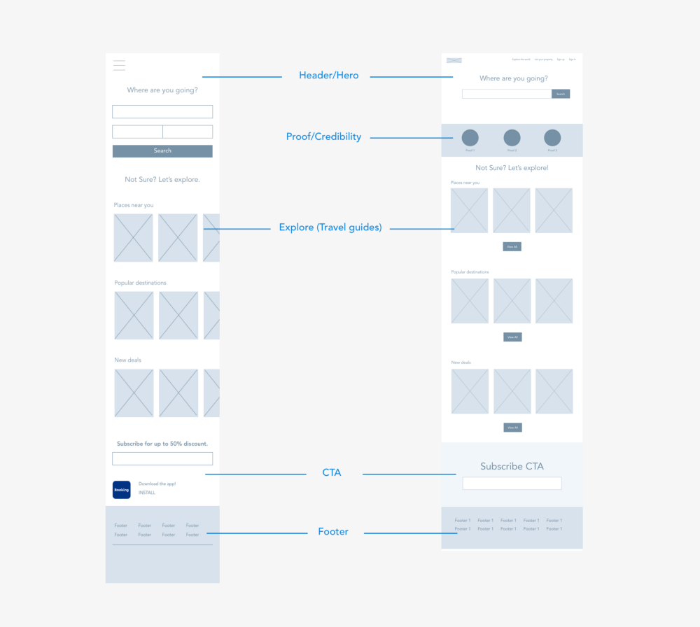
Wireframes for proposed redesign of Booking.com Source: Renee Lin
Wireframes are content-first tools. So, you can’t use dummy Lorem ipsum text at this stage. Instead, use text from your previous website, competitors' content, or proto-text to fill in your wireframes. Proto-text is a rough outline or a bulleted list of points describing what information will go into that page. Since wireframes only exist to display and test your information architecture, they don’t usually use any color, typography, or other distinctive visual elements. They should be minimalistic, easily moldable, and make people think about what is really important for user experience.
Design testing
Until we learn to build machines that can successfully conduct any creative perception tasks, you need potential users to help you evaluate your product. Designers use a range of methods to observe reactions of a target audience, receive feedback, and act on it. These techniques include card sorting, exploration, eye tracking, interviews, guerilla testing, and many more. We discussed this at length in our article on usability evaluation and testing.
You test manually by meeting with users and writing down insights, or remotely via online platforms that connect you with your potential audience. In both cases, you provide people with your wireframes and the more skillfully written content you include, the better. As users will operate only with the help of your instructions and their placement on wireframes, you want to create the most realistic possible scenarios. This way, you will eliminate the number of similar tests during the whole design process and be sure that the brand voice you’ve chosen appeals to your customers.
Phase 4: Introduce the UI and Launch the Redesigned Website
Testing your design will give you the first potential customer feedback that you can improve on. At this stage, your wireframe may transform to become a full-fledged user interface.
UI combines information architecture and visual design. Creating a sitemap and wireframes are the first steps to introducing a user interface. The visual part usually comes last. User interface redesign is often confused with rebranding. While updating UI can certainly be instrumental in creating a new brand identity, these two terms are not the same. Rebranding is a marketing tool aimed to change how the brand is perceived by the outside world. It usually involves logo, name, imagery, and even voice redesign. Since it’s supposed to distance the company from the past identity, rebranding is a radical act that should be taken seriously. Visual redesign, in turn, can happen more often and usually reflects current web design trends.
How do you approach a visual redesign?
Brand before trends. Many companies with modern-looking websites don’t use trending gradients or big letters if they don’t work very well with their brand. Implement some fundamental ideas such as material design or vibrant colors but make them work for your brand, not in spite of it.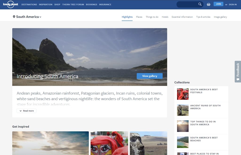
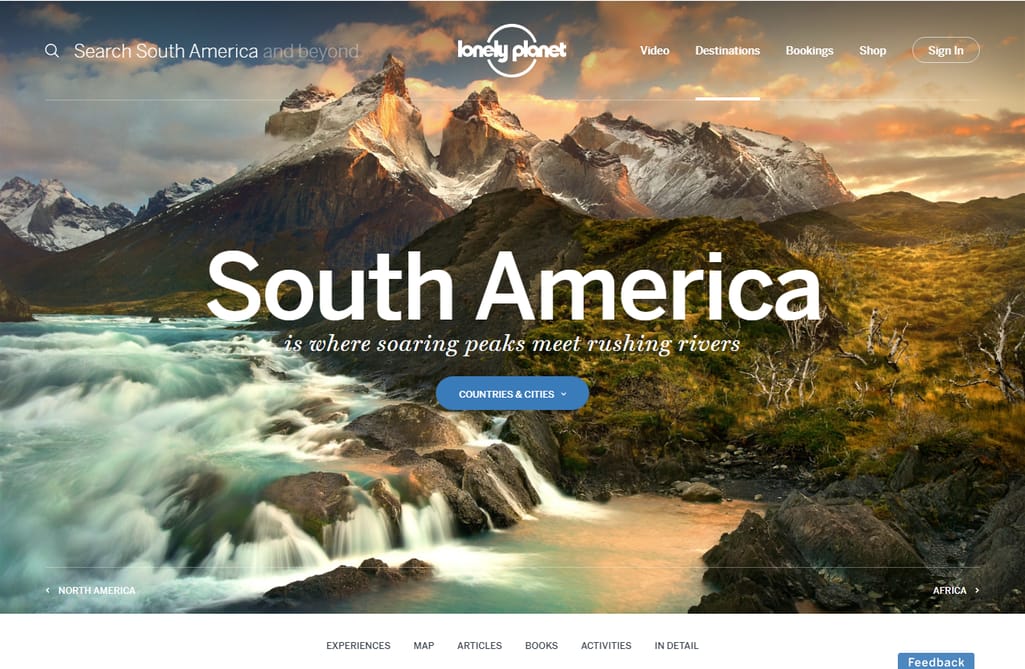
Masterfully used trending visuals and lettering for Lonely Planet created an inspiring experience without sacrificing usability
UX before UI. Helping a user accomplish a task should be more important than startling them with animated buttons or hypnotizing loading screens. Users want to be able to make purchases in one click, receive relevant notifications, and see the most valuable information front and center.
Minimalism before extravagance. Minimalism is the one trend you should follow since maximized simplicity is what users are looking for on the web these days. To step away from the old, ineffective design means stripping away everything that distracts and doesn’t facilitate better results or a deeper emotional response.
Redesign launch
When all the testing is in your rear-view mirror and all bugs that could be found are exterminated, it’s time for a launch. Launching a redesigned website can have even a bigger impact than the original website launch. Your customer opens a familiar link and suddenly sees a completely different interface that they will have to learn all over. How do you make this process painless and introduce updates in a way that will make users believe they were needed and will be beneficial?
Checklists. It’s easy to let something slip your mind when working on a project as complicated as redesign. To make sure that you’ve followed all recommendations and tasks through and addressed all accessibility, usability, and SEO points, use one of many online web design checklists. For examples, this one for the more general principles, or this technical SEO checklist to boost your searchability.
Soft launch. Releasing a new version to a limited number of users will help you make improvements based on more feedback and keep control over each small change. Tell your audience you’re still working on an update, encourage them to provide their opinion, and perhaps allow users to roll back to the previous version if they’re experiencing too much difficulty. A large number of rollbacks will be your signal ofany major problems.
Onboarding. You should communicate that the redesign has been long-awaited and anticipated not only by you but by the customers as well. Guide users through each change and clearly state the benefits. Help them finish their first task with a new user flow but allow them to roam freely and explore the redesign alone.
At this stage you will most likely discover problems that weren’t apparent during previous testing stages and some of them can significantly damage customer experience leaving your audience unsatisfied. Unfortunately, this means you’ll have to roll back to the old design.
You might have heard about Snapchat’s recent app redesign fiasco. With 1.25 million people signing a petition to roll the update back, and its App Store ranking plummeting to 1.8 points, Snapchat lost a lot of enraged and frustrated users in a few days. While most Snapchat users will have to learn to use the new version, you probably don’t have the luxury of expecting the same from your audience.
Update design incrementally and guide users through each change. Carefully gather feedback and each piece of usage data that will let you know what caused the most trouble. And always keep the old content and design brief stored safely and easily accessed in case of need.
Redesign vs design
The volume of your redesign initiatives can vary greatly depending on your goals and expectations. Maybe your content is already shining through the outdated interface and the changes to navigation and UI can help your message be heard. In other instances, you will need to work extensively on what you want to say and how to do it most effectively, ensuring that your stylish branding exterior has some inner substance.
Sometimes, you’ll have to completely revamp how your visitors see and access you, and these changes may drag a long list of improvements behind. Whichever path your website is on, keep in mind these three principles to make your redesign painless and successful:
Continuous development
In today’s world, a leading approach to development is agile, continuous, and incremental. Radical changes are not well-tolerated by users, take more time and effort to introduce, and are only indicated for severely outdated websites. Incremental updates allow you to elevate “look and feel” and conversions at the same time, while avoiding the risks of lags of a revolutionary redesign approach.
Before and after data comparison
To measure the value your redesign has delivered, compare your metrics before and after the redesign. Your organic traffic will be an indicator of your SEO efforts; bounce rate and time spent on the website tell you how well your site performs and its usability; and conversion rates help identify the success of your CTAs, landing pages, and forms.
A/B user testing
In many cases, redesign process resembles design of a new website, and in both cases, you can’t ignore user research and user testing. However, to evaluate whether the new design is better than the old one, you need to ask different questions and prepare different tasks. A better practice would be to invite new users to test both an old and a new website rather than asking old users to compare an unfamiliar interface to the one they’ve gotten used to already.

Maryna is a passionate writer with a talent for simplifying complex topics for readers of all backgrounds. With 7 years of experience writing about travel technology, she is well-versed in the field. Outside of her professional writing, she enjoys reading, video games, and fashion.
Want to write an article for our blog? Read our requirements and guidelines to become a contributor.