

Outlining future trends is a great exercise to kick off a new year. Not only does it set the right mood, it also acts as a time travel machine that allows the future us to look back at what expectations came true and which ones were probably too ambitious. Last year, we took a shot at predicting which trends would shape UX design in 2017. Now, we keep up the tradition and have a look into user experience for 2018. 2017 was a year of breakthrough tech that was set to transform how we interact with the digital world. Borderless designs, wearable devices, AR and VR mushroomed. Can we expect another groundbreaking year for interaction design? With Lenovo unleashing its Echo Show competitor, and Amazon Go finally opening its doors to the public, we can assume that the world and design will keep changing at warp speed and sometimes in unpredictable directions. Here’s our take on what 2018 will deliver for user experience:
- Embracing inclusive and accessible design
- Face recognition as a source of new opportunities
- Getting ready for the screenless world with AR
- Shifting our focus to the users of Generation Z
- The appearance of UX writers and their importance in shaping content-driven design
- Designing interactions with virtual assistants
- Linear user flows as a new standard for layouts
- Borderless and immersive experiences with full screen devices
Inclusivity as a norm
People are becoming more socially aware with each passing year. The attempts to create more inclusive and accessible designs have been made both by giants like Microsoft and Google and smaller brands that boldly declare their stand for equality. How does design reflect this attitude? 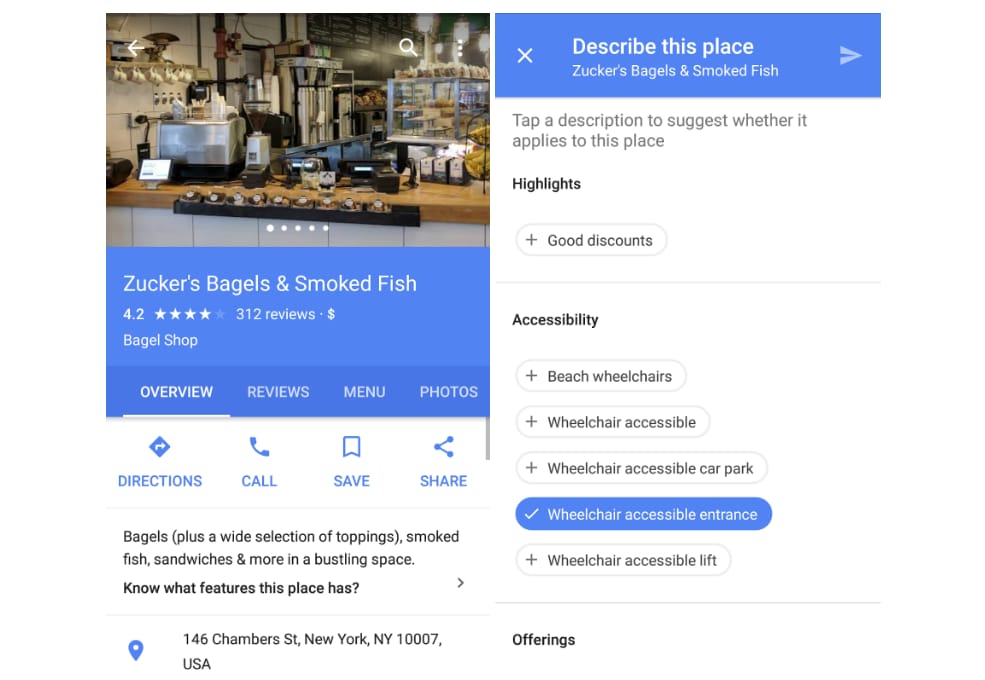
Google Maps now asks users if the location is accessible by a wheelchair
It’s probably true that it’s impossible to design a universal product that will be equally good and comfortable to use for everyone in the world or even for your entire audience. But we still can use all the existing technologies and skills to try to make someone’s life easier to a certain extent. In our article on accessible design, we talk about the need to create interfaces that are comfortable to use for people with different needs and conditions. Beside the points mentioned in our previous piece, here are our basic recommendations for creating great designs for all. Don’t use triggering and inconvenient elements for the sake of design. The trend towards experimental layouts and animations often leads to almost unreadable websites. Eliminate the flashing interfaces and focus on cleaner and sharper design options. If your design violates any accessibility rules, consider whether there’s a substantial reason to break them. Remember that you design for a broad range of people with different abilities and browsing opportunities. Recognize diversity as a norm. Most likely, people who will use your product will differ in skin color, gender, and religious beliefs or no religious beliefs at all. By accepting this, you can avoid Apple’s fiasco with Face ID that recognized a Chinese woman and her colleague as the same person. 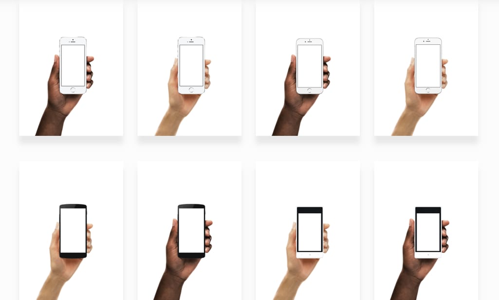
Facebook’s Diverse Hands Kit for design presentations Source: Facebook.Design
Test on users from different backgrounds. The best way to make sure your design is inclusive is to show it to the broadest range of users. We can learn about different perspectives from blog posts and inclusivity guidelines, but we need to understand the joys and frustrations our design evokes in different people. Bring diverse designers into your room. The second-best way to ensure inclusivity is to invite designers that can bring different perspectives and offer valuable insight on the points you may not otherwise notice. Having multiple perspectives has also proven to enhance creativity and innovation.
Uncovering the opportunities of face recognition
2018 will be the year of experimenting and finding new use cases for face recognition technology. In China, people are already being scanned for fast food payment, drug abuser identification, and airport check-in. As the latest Apple and Samsung flagships introduce face recognition for accessing your phone and making purchases, face scanning is gradually becoming a new norm in how we interact with our devices. Along with obvious use cases like payment confirmation, there are still some undiscovered and unconventional ways to use this functionality. iPhone X, for instance, lowers its ringtone and alarm clock sound as soon as you look at your device. How do you embrace face recognition for your own projects? Combine face recognition with other technology. AR company Blippar has rolled out its Halos feature that works as advanced Facebook photo tagging. It links people’s faces with their accounts on different websites and displays social bubbles around a person’s head. This allows friends to see each other’s latest tweets, Instagram stories, and much more. 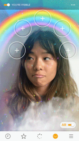
Blippar’s combination of AR and facial recognition Source: Blippar
Use existing solutions. Face recognition APIs from Kairos, Meerkat, and other brands allow you to easily integrate the technology in your product for login, verification, or identifying emotional response. Build enterprise applications. Employee-facing interfaces can also benefit from face scanning. It helps prevent ID fraud and thefts, and even create positive notifications about VIP clients that require special treatment.
Getting ready for the screenless world with AR
Although we’re not yet ready to embrace augmented reality as our central technology for interacting with the world, brands are still finding ways to include AR as an opportunity for development. And these opportunities keep growing. With open source solutions such as ARToolKit and EasyAR along with Apple’s ARKit and Microsoft’s HoloLens, developers can already experiment and put all the widely discussed use cases into practice. 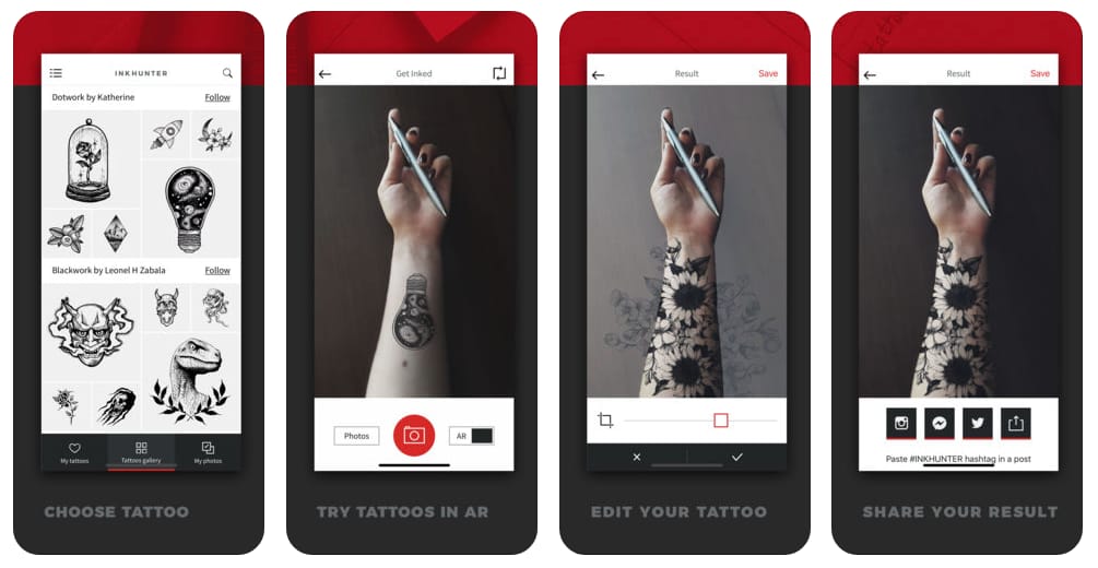
Inkhunter allows users to see how different tattoo designs will look on their skin
But before technical stuff starts building AR solutions, UX designers should step in. They will help a company define what part of the system can, and - most importantly - should be augmented. Who is the end user of this AR experience? Is it employee- or customer-faced? Designing AR systems requires a different mindset and an additional effort in creating useful and fulfilling experiences. What are the exciting and challenging changes for UX designers in the AR world?
- Everything has a potential to be an interface and users are in full control
- Immersive customer experience increases engagement and brand awareness
- User flows are simplified and more intuitive
- Satisfaction level is higher
- Product prototypes are interactive and closer to reality
While there are no established standards for AR development, UX designers should start working on their first AR experiences and develop an understanding of what it means - designing for the screen-less world.
Designing for Generation Z
Step away, Millennials. It’s Gen Z’s time. Born between 1995 and 2014, the oldest of these people are turning 20 this year. They are teenagers, young adults, and college students, less optimistic about the future than millennials but just as passionate about change. They make up the biggest share of the US population - 25.9 percent, which will likely become one third of American's population by 2020. The main characteristics of Generation Z kids are:
- They use smartphones 15 hours a week - more than any other type of device. Moreover, they don’t shy away from their digital addiction seeing it as essential and important
- They are more passionate about being entrepreneurs with 61 percent of high schoolers planning to start their own business right after college
- They want to create and shape culture - they're not just consumers. They also create content with 25 percent posting original videos weekly. They willingly connect with brands online, crave individuality, and enjoy being the part of a community
So, what can you do to make your experience compelling to post-Millennials? No hand holding. Gen Z kids learned to unlock smartphones even before they could walk. They’re capable of learning anything by themselves. They know how to tackle problems and where to look for a solution. So, they may find long tutorials and guidance annoying. You can throw them into deep water and expect them to confidently swim to the shore. Keep your language casual. These people brush off professional wording but also make fun of ungenuine teen slang that companies tend to sprinkle all over their branding. They are drawn to authentic voices that don’t try to be pretentious and seemingly caring. Engage them in creation. Being enthusiastically creative, they like to take part in designing, customizing their experience, and letting their voices be heard. Ask them for suggestions regarding functions, interfaces, and even brand colors. Engage them in surveys and art competitions, and recognize their submissions. 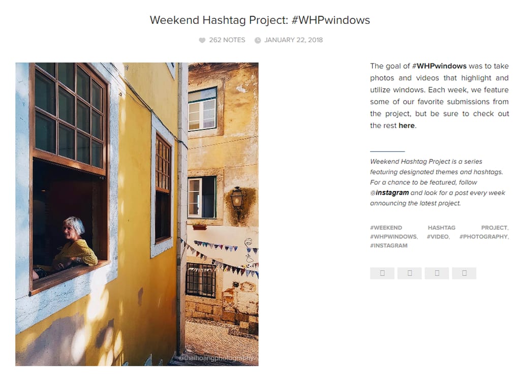
Instagram’s Weekend Hashtag Project invites users to take themed pictures each week and highlights the best entries
Embrace inclusivity. Gen Z is the most diverse and accepting generation yet and they enjoy being seen and celebrated for that. However, they are also quick to pinpoint your mistakes and expose insincerity.
UX writers striving in a content-driven design
The past couple of years saw the appearance of a new job title - UX writer. In a blog post last year, we talked about how content should be the foundation of any design. This trend continues today, but now there are people solely responsible for it. You can’t create wireframes before deciding which messages you’re going to include on a page. Text is another element of user experience, so it’s important to use it to your advantage. Today, machines can create convenient and personalized experiences, and any business can quickly build a basic website with a set of existing tools. Despite that, machines still can’t mimic perfectly genuine human interaction. So, what is a UX writer’s job here? Writing microcopy. Microcopy is a piece of text that enriches an overall user’s experience. Buttons, push notifications, menus, text in the input fields - all of this not only creates a convenient experience, it also increases conversion. Being able to write welcome and error pages with reassuring messages and compose sentences that make customers return is a vital skill for a user experience writer. 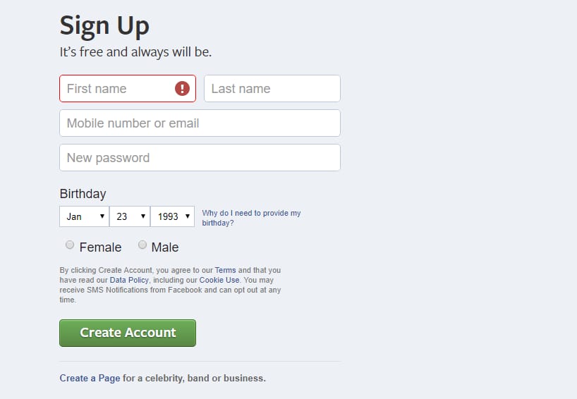
Facebook’s Sign Up page is an example of a great microcopy
Testing different text options. You may have heard the story of how a designer moved the Register button to the checkout and secured for his company a $300 million revenue. It may be pure luck or a writer’s impressive copywriting skills, but in real life, brands have to test several options for important elements before determining the most effective one. A UX writer’s task is to prepare these options, analyze the test results, and choose one successful button that will bring a company those millions. Adding humor and personality. While your brand’s blog content and social media may be bursting with funny and friendly messages, a user will likely be discouraged from dry notes at the sign-up screen. UX writers ensure that you keep your language consistent and personal on all touchpoints. Ensuring adaptability for foreign languages. When creating multilingual products, you can’t simply make one interface and expect it to look and work smoothly for different language speakers. UX writers consult with native speakers to ensure that text placement works well and usability is consistently good. 
Usability issues in different versions of a site Source: Zomato
Designing conversational interfaces. As the trend for voice interfaces and chatbots moves forward, UX writers are expected to create lively and contextual replies to make human-machine communication more natural.
Designing interactions with virtual assistants
Here’s another trend from 2017 that remained on the technology horizon. Forty-two percent of Americans use voice-controlled assistants on their smartphones. It’s convenient, natural, and simply fun. It even allows kids to do a simple YouTube search to watch their favorite cartoons. Moreover, people are getting used to controlling different things with voice commands - turn up the heat, read an audiobook, switch the lights off. While only eight percent of US adults do it on standalone devices such as Amazon Echo or Google Home, talking to the ever present and all-knowing sidekick in our pocket is slowly becoming second nature. Besides voice assistants, we have chatbots - simple, narrow-focused interfaces created with a different mission. They can make daunting tasks like changing your plane seat easier, connecting you with customers without increasing workload for your employees, and automatically delivering location- or time-based news. And if that isn't enough, they can be easily implemented in existing platforms like Facebook Messenger. 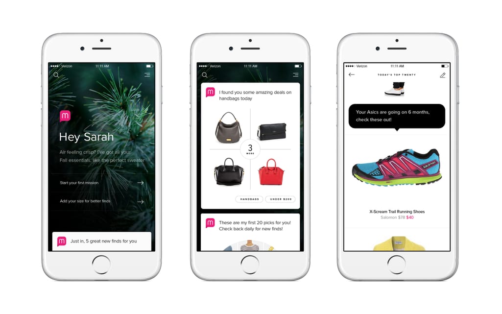
Created by an ex-Amazon team, an eCommerce bot Mona offers personalized shopping experience
What do you need to know when designing virtual assistants? Develop the brand’s voice. You can’t do without a UX writer if you want to create a voice (both written and spoken) that will elicit a hoped-for reaction from a customer. If you already have a written voice, be consistent, developing a voice that is authentic and fits with your existing branding. Stay narrow-focused. You probably don’t want to create another Siri that can tell you the name of the world's tallest building or find the title of a song. While you can season your assistant’s language with jokes and funny remarks, focus on immediacy and successful completion of specific tasks. Visit our previous blog for more recommendations on how to create chatbots.
Linear journeys with clear hierarchy
User flow or linear journey is a natural element of minimalistic design. It guides a user through each task without creating complications and distractions. Think of it as a simple video game with a predefined path - a character will most certainly reach the goal regardless of how many turns and stops they make on their way. A lot of the processes in today’s interfaces are already obeying the flow approach: signing in and purchasing tasks all have a starting point and an end goal that users should achieve in the most efficient way. 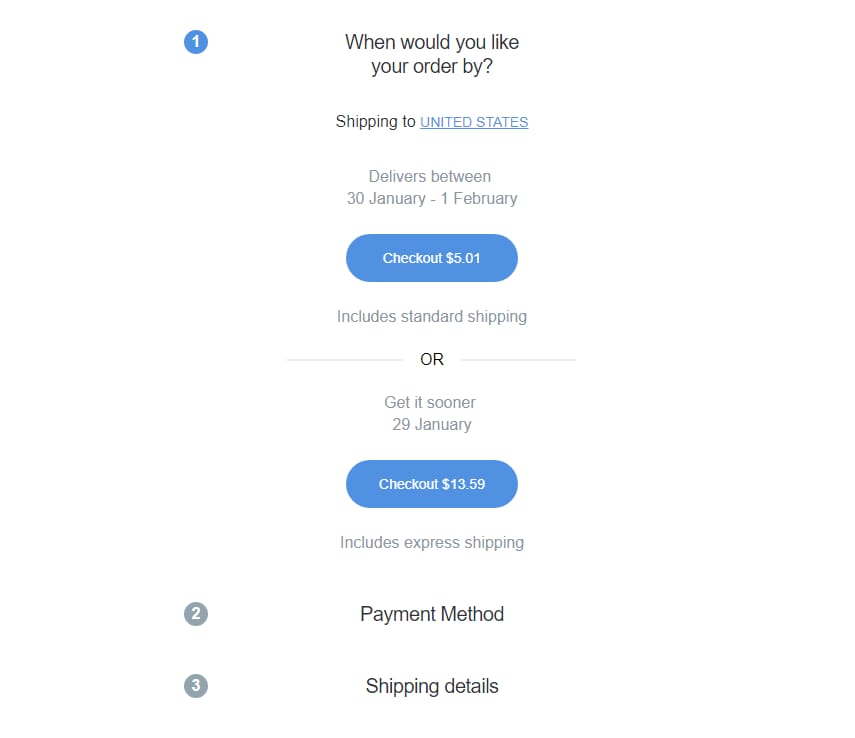
Shopping on RedBubble in three consecutive steps
Creating a simple yet fulfilling user journey is not a simple task - a person will likely get confused at some point and find their own unconventional solution you may have not thought of. That’s why designers should consult with a real audience to sketch out and smooth the paths on which users will be moving. We’ve talked quite a lot about usability testing before, so you may find that blog useful as well. Here’s what else to consider when creating distraction-free, linear journeys in your design: Reverse the task. Go the opposite way by considering the task done and then determining which steps should precede. This way, you’ll stay focused on the objective rather than the process. Follow a clear hierarchy. Most of the Western world perceives content from left to right and top to bottom. Place your elements accordingly, starting with pictures, titles, and prices and descending to the action a user is supposed to see last, like Buy or Continue buttons. Provide fewer choices. The title of Steve Krug’s classic book on web usability says, "Don’t Make Me Think". Less is more: Fewer decisions are proven to bring more satisfaction than an abundance of choices. Complicate gradually. The step-by-step approach works best when you start with the simplest tasks and slowly move to the deeper levels, exposing the core of your functionality for the most advanced users. Just like in a basic puzzle game, you want to eliminate outright confusion and prepare users with something that can be done with ease. Include a Moment of Delight. In design, a Moment of Delight is a confirmation that everything went well, and a person has nothing to worry about. You can achieve this with the text (here’s where a UX writer’s skill comes through), an animation, or a sound. Such satisfactory signals help release dopamine in the human brain and make people crave this experience more. 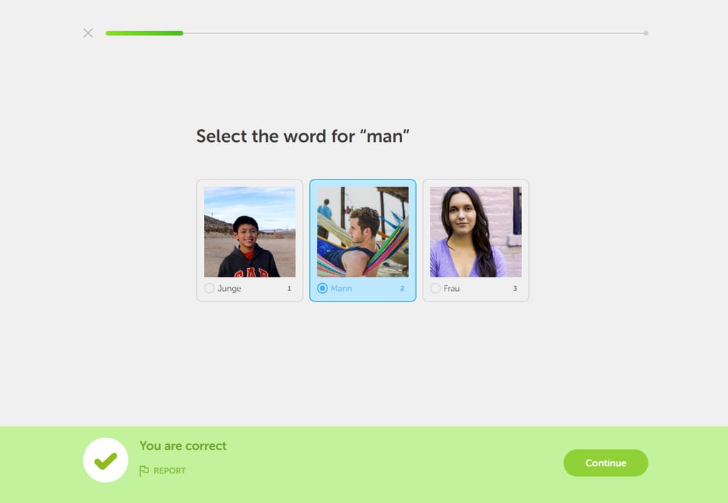
The Duolingo users are all to familiar with the distinctive jingle indicating success
Even fuller full screen experience
The Google search for how to remove the notch on an iPhone X displays more than 2.5 million results. As soon as the device had gone on sale, the App Store was flooded with apps aimed at modifying your wallpaper to mask the annoying feature and pretend that it never existed. However, the discussions around this weird design choice have slowly died out as people started embracing or simply not noticing the black bar preventing their access to the smooth, full-screen experience. Seems like it’s not such a big deal anymore. 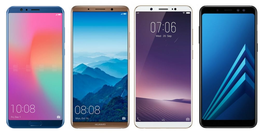 Almost all the smartphones announced at CES 2018 (if you don’t count BlackBerry with its mandatory physical keyboard) have followed the direction of a borderless mobile experience. What does it mean for design?
- People embrace and expect design that allows them to experience the functionality of their phone screens to the fullest
- Pages and clicks are replaced with taps and swipes, websites becoming edgeless and infinite
- Immersive, full-screen videos are taking over, and now they are not intrusive
- Grid design is redefined for more experimental and minimalistic approaches such as easily scrollable one-page websites
A designer’s job is to anticipate the customer's high expectations and develop solutions that deliver a product with the help of full screen capabilities.
What now?
This year we should try to listen to new voices and look at UX design from a different angle. Instead of blindly following newly announced trends and adopting the hottest technologies, we should stay mindful of what these changes will bring us. Will it be a developed brand personality or a completely new approach to presenting and interacting with your product? We're looking forward to seeing these changes spring to life.

Maryna is a passionate writer with a talent for simplifying complex topics for readers of all backgrounds. With 7 years of experience writing about travel technology, she is well-versed in the field. Outside of her professional writing, she enjoys reading, video games, and fashion.
Want to write an article for our blog? Read our requirements and guidelines to become a contributor.