

The case of Snapchat’s bad usability has been a topic of discussion for years. The meteoric rise of the photo-sharing app is amazing since it’s as difficult to use as it is popular. How could the app infamous for its steep learning curve and vague swiping motions surpass Twitter in user base?
Opinions are divided. Some think that the lack of expectations allowed teens, that essential demographic, to decide for themselves how to use the app. Or maybe the element of discovery resulted in better user engagement. Either way, the Snapchat case is more the exception than the rule, a lucky coincidence that probably shouldn’t be depended on to deliver the same result in a different situation.
Regardless of the effort your team puts into the product, the end users are the ones who get to decide how successful it will be.
Usability Engineering in a Nutshell
To understand why Snapchat’s usability has been so vigorously discussed by UX advocates, we first should define the difference between usability and user experience.
Usability means evaluating users’ needs and requirements to create a product that will be easy and comfortable to operate. According to Jakob Nielsen – the man often called “the king of usability” – the main components of usability are: learnability, efficiency, memorability, handling errors, and satisfaction.
User experience spreads beyond simple understanding and complying to a user’s desire. It often goes along with interaction design, engineering, marketing, and user interface.
However, there’s a third term that describes the methods of identifying usability problems and offering valuable recommendations. Usability engineering is a practice aimed at creating highly effective and user-friendly software products using evaluation methods.
So, what is usability engineering exactly? Good usability specialists work with care for customers in mind and advocate for making user experience as smooth and efficient as possible. It usually means:
- Understanding basics of cognitive science and psychology
- Evaluating usability with the help of testing and analysis
- Working by standards already set in the industry
- Conducting studies on possible problems and offering solutions
An important portion of work that goes into usability revolves around accessible and inclusive design, a topic we’ve previously covered in detail in our blog.
But evidently, the usability evaluation is one of the main and most impactful tasks a usability engineer will have to undertake. Let’s explore some of the methods.
Usability Evaluation Methods
Every convenient design is user-centered. Building user-centered design implies a series of design techniques focused on understanding what users need, experience, and value. You should consider how your product will be perceived by a customer in the early stages of product development (don't confuse it with user acceptance testing which is performed at the final stage of development before release). Here’s how you can do it.
Usability testing
This practice is the simplest one yet extremely effective. During a usability test participants are asked to complete typical tasks using the product tested. Moderators observe, listen, and take notes. An effective test, one that will help you get the most insight in the shortest amount of time, requires preparation.
- Develop a plan. Specify which section of a product the test will cover, indicate a specific purpose and a series of questions to be answered, prepare the metrics (both qualitative and quantitative) to measure the satisfaction levels and time spent to complete a task.
- Recruit participants. There are two main conditions your test subjects should meet: They can’t be involved in either the design or development of this product and they should represent your target audience. You can use paid services to find eligible participants or engage people in real life – the popular method called guerilla testing.
- Choose a moderating technique. Deciding how you’re going to moderate a test directly depends on your initial testing goals. There are many techniques you can try, among which are thinking aloud testing and probing questions during or after a test.
- Run a pilot test. To make sure that the equipment and your note-taking method suit the job and that you are sure how well participants will understand your scenarios, conduct a pilot test a couple of days before your first test session.
The method also involves a wide range of possible techniques: You can do it remotely or on site, both with experts and casual participants and with any budget. When conducting usability testing, don’t give users tips or ask leading questions.
Heuristic evaluation
Heuristic evaluation means that usability experts review your product and compare it to the accepted usability principles. The best-known list of principles was offered by Nielsen in 1994. Its universality can be even applied to developing chatbot interfaces.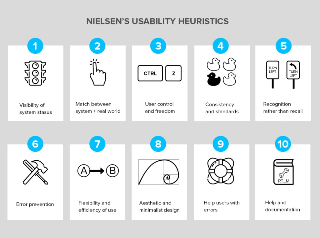
Heuristic evaluation is a simple and low-cost way to assess your current software from a user-centered standpoint
- Visibility of system status - A user should always be notified about the changes and be able to review the current network status. Take note of the downloading animation in Google Chrome or an uplifting confirmation message by Buffer after you’ve scheduled a post.
- Match between system and the real world - All concepts and phrases should be familiar to users, just like the concepts of a “folder” or “wallpaper” have been transitioned into operating systems.
- User control and freedom - Users should be able to skip unwanted steps or cancel the previous decision – the lack of an editing function on Twitter has been enraging users for years.
- Consistency and standards - Your product should be conventional and predictable. There’s a reason why most websites have a login button in the top right corner. Don’t trade familiarity for uniqueness.
- Recognition rather than recall - While recalling information usually involves some cognitive effort and memorization, recognition requires only exposure to a new element. When users sign up for Foursquare, they don’t have to type in their list of personal tastes. They simply choose from the most searched options.
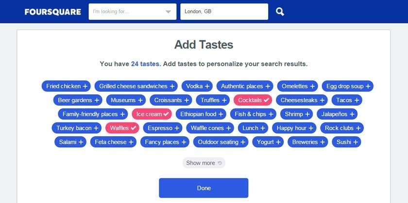
Foursquare not only gives users a wide range of options but also inspires to try something new
- Error prevention - No design is error-free, but minimize the error possibility. Automatic correction in Google Search and the validation screen that pops up before sending an email without a topic both allow customers to feel more confident when using a portal.
- Flexibility and efficiency of use - Both novice and advanced users should have an opportunity to tailor their experience by choosing a more comfortable approach. When using Adobe Photoshop, professionals can operate with hotkeys to work faster while newcomers can choose interface buttons.
- Aesthetic and minimalist design - The well-known Aesthetic Usability Effect proves that aesthetically pleasing design provides a more intuitive and satisfactory experience. Apple’s website is rightfully considered one of the best examples of a simple yet satisfying web experience.
- Help users recognize, diagnose, and recover from errors - Indicate the problem in simple language and provide either reassurance or a solution. Airbnb does a great job by both incorporating humor and providing a link to their home and help pages.
- Help and documentation - Any information should be easily searched and addressed step by step. Get rid of long, boring manuals and address the most relevant questions right away. Evernote, for instance, categorizes questions by type: getting started, tutorials, and troubleshooting.
Card sorting
To evaluate the information architecture of your product, use card sorting. With this method, the target audience is offered an opportunity to categorize content in the most logical and comfortable way using cards. By providing your audience with a series of topics, you will determine how well users understand the connections between the topics and which ones they prioritize.
You can conduct card sorting both face-to-face with a group of users or remotely, via online sorting software. However, the latter won’t allow you to witness the immediate reaction or follow a user’s thought process.
Card sorting can be performed in two different ways:
- In open card sorting, users are provided with website content and asked to categorize it into whichever groups they find most plausible. They also should name those categories. Use this method when you want to determine how users understand your content and how they label it without your prompts.
- Closed card sorting, allows you to learn how users can sort content within predefined categories. It helps identify if customers will be able to find the needed feature.
First click testing
According to a study by web usability experts Cari Wolfson and Bob Bailey, users are twice as likely to make a target action if the first click was correct. It means that the first click users make directly impacts their journey and eventually conversion.
During a first click, test users are asked to complete a task on a functioning site or a prototype without mentioning that their first click will be observed. When applying the first click testing, make sure that you prepare a problem for your users to solve to evoke a natural reaction from them. Instead of simply asking to book a hotel room, describe a real-life situation, such as “You’re looking for a two-bed accommodation for your August trip to Italy with a friend.”
Some usability problems first click testing helps identify:
- Similar looking links that distract customers and increase the number of misclicks
- Important tasks hidden on secondary pages
- How different user groups react to the same wording and navigation
Record the time it takes for a user to make a first click. This number mostly depends on the type of your site (whether it’s an e-commerce or informational portal) and if users reached the needed page right away. According to AltexSoft user experience experts, the goal is to catch their attention during the first 2-3 seconds and if they are still feeling lost after that period, there must be a navigation problem. Many first click testing software tools allow for precise time and cursor recording thus simplifying a usability engineer’s manual effort.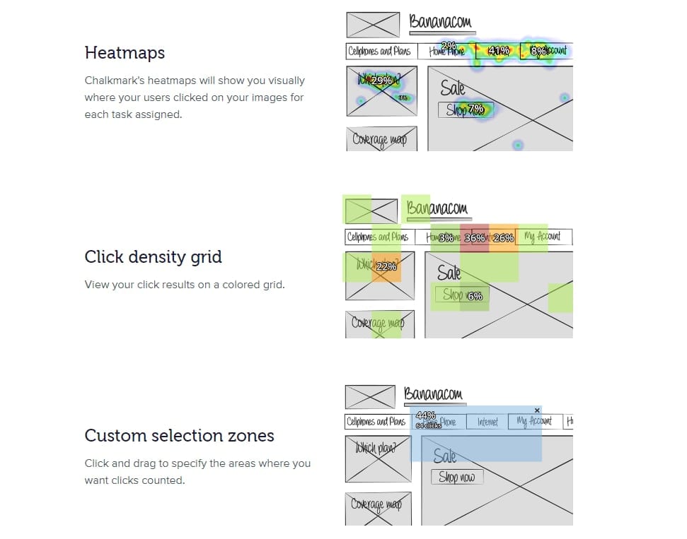
Chalkmark is one of usability testing online tools for testing wireframes and interfaces
Usability Engineering: Practical Tips Based on Gathered Data
The results of usability evaluation directly impact the practical recommendation that usability specialists will offer. After the data (both quantitative and qualitative) is gathered, and you are aware of all weak points, it’s time to apply usability engineering principles to suggest and implement improvements.
Remove redundant features
During an evaluation, you may notice which components of an interface are ignored by the participants, no matter how useful they seemed to you at the planning phase. Just because some elements were included in your initial list of functions, don’t be afraid to get rid of them if they don’t deliver any value.
Maximize readability
The F-scan pattern that we discussed in our article on the recent UX trends is always relevant. It signifies that most users in Western countries are reading content by following two horizontal and one vertical stripe. Display the focal interface elements so that they’re easy to notice at one glance.
To help users grasp more information in an F pattern, divide content into bullets, paragraphs, or dilute it with images
Prioritize actions, not words
Pay attention to how users interact with the interface instead of the preferences they are voicing. Keep in mind that they’re not here to dictate the changes but rather to help you better understand how to build a comfortable experience based on your observations.
Focus on a practical rather than emotional response
When the audience is impressed by your design, it’s easy to overlook (for both you and them) if it’s in fact practical and usable. If it’s important for you to achieve the wow effect, tick the checkmark and continue evaluating to be sure this design still serves its purpose and how easy it is to navigate.
Don’t ignore the help function
In the best-case scenario, users will never want to click a question mark button in the corner of the screen. However, it’s not realistic to expect from customers a complete understanding of your seemingly minimalistic design. At the evaluation stage, test to see if users receive any actional tips from your help section and be sure to include even the most trivial answers.
Connect with your audience on a deeper level
Sometimes, a nice UX can compensate for occasional usability mishaps. Perhaps, your app doesn’t offer shortcuts for the most used features, but you send out frequent and personalized notifications and your layout simply looks pleasant. When you establish an emotional connection with users, they will be more patient with inconveniences and will gladly wait for updates.
There’s no UX without usability
Designers are not users. What will seem of extreme importance to them may never be used by the real customers. And vice versa - a user can still struggle with the design that your team has been working on for months. To learn more about your audience, conserve resources, and be sure that the product you release will work out, embrace usability engineering as a regular practice.
For an organization with a wide range of products and constant major updates, a usability engineering team is a must. However, it doesn’t mean that your single app can succeed without at least one usability expert in a UX department. As luck would have it, you don’t need a full-function lab to run tests – a conference room and a notepad are enough to observe and draw insights from users.

Maryna is a passionate writer with a talent for simplifying complex topics for readers of all backgrounds. With 7 years of experience writing about travel technology, she is well-versed in the field. Outside of her professional writing, she enjoys reading, video games, and fashion.
Want to write an article for our blog? Read our requirements and guidelines to become a contributor.