

Everything that happens before the actual data is presented in a visual form can be considered as the underlying infrastructure, what’s called a data pipeline. The major part of the pipeline is the Extract, Transform, Load (ETL) process and its tooling. You can think of it as the backend of any BI system. Then the frontend of the system is the user interface, where data is finally presented to a user in visual form.
Data visualization, its tools, and techniques create many questions, as the topic is huge enough. So, in this article, we will focus on data visualization through the prism of business intelligence. As the article is big, we suggest you to navigate using this outline, if needed:
What is data visualization: how it works, types of data to visualize, visualization formats
Tools for data visualization: paid, free, and open-source instruments
Libraries for data visualization: the list of libraries to visualize data
Data visualization pitfalls: issues and challenges to consider
What is data visualization?
Data visualization is the practice of converting raw information (text, numbers, or symbols) into a graphic format. The data is visualized with a clear purpose: to show logical correlations between units, and define inclinations, tendencies, and patterns. Depending on the type of logical connection and the data itself, visualization can be done in a suitable format. So, it's dead simple, any analytical report contains examples of data interpretations like pie charts, comparison bars, demographic maps, and much more.
Skyline BI dashboard depicting multiple visualization formats
Source: skylinetechnologies.com
In most cases, visuals are created manually via corresponding software, whether it’s PowerPoint or Photoshop. But, its core usage remains in the field of analytics. For that reason, data visualization or dataviz became a standard way to introduce information for users through the BI interface (data representation tool).How is data visualized in BI?
As we’ve mentioned, a data representation tool is just the user interface of the whole business intelligence system. Before it can be used for creating visuals, the data goes through a long process. This is basically a description of how BI works, so we’ll break it down into the stages shortly:- First things first, you should define data sources and data types that will be used. Then transformation methods and database qualities are determined.
- Following that, the data is sourced from its initial storages, for example, Google Analytics, ERP, CRM, or SCM system.
- Using API channels, the data is moved to a staging area where it is transformed. Transformation assumes data cleaning, mapping, and standardizing to a unified format.
- Further, cleaned data can be moved into a storage: a usual database or data warehouse. To make it possible for the tools to read data, the original base language of datasets can also be rewritten.
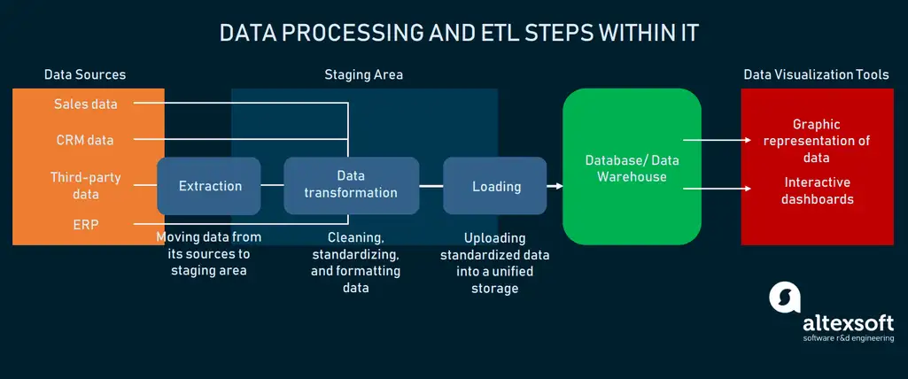
Business intelligence data processing in a nutshell
So, now you can see where data visualization actually takes place in the whole process. Most modern BI interfaces have a wide number of options concerning the choice of how to use data for visuals. In most cases, there is a command dashboard with a drag-and-drop interface that allows you to:- Connect the data source to the system via API (or custom integration)
- Choose the dataset to work with
- Choose the type of visualization
- Place multiple visuals on the dashboard
- Create interactive elements to manipulate the data
- Modify visuals as the data updates
- Type information manually
- Save reports
- Share reports

An example of data visualization in Google Data Studio
Choosing the source, the user is free to operate within the inbuilt sandbox that has templates of visuals. These templates can be filled with the required information and put on the dashboard or used as a single representation.While the process of visualization is not really automatic, there is still no need to create the visuals manually. Generally, all the BI interfaces have templates that you can use. These can be modified and edited by setting up required data properties. In some cases, visuals can respond to changes in data and show these changes by modifying graphs and tables automatically. This is basically done by utilizing data visualization libraries. We devoted a section this topic below.
But now, let’s discuss the types of visuals that are used to generate reports.
Common types of data visualizations
Turning information into an image is not an objective. On a higher level, the data is easier to grasp when it’s represented as a visual: That’s why we explain things like quarters or percent as pieces of the pie.But, on a lower level, a visual is a tool to convey the connections between different units. As Depeche Mode sang in their song "Everything Counts": “The graph on the wall tells the story of it all.” And, that’s correct – visuals are used to tell the story through data interpretation. Thanks, Depeche Mode!
Each type of visual corresponds precisely to the idea of what data it can interpret, and what type of connection (relationship, comparison, composition, or distribution) it shows better. Let’s look at the most common types of visualizations you encounter in business intelligence and data analytics in general.
Bar chart
A bar chart is one of the basic ways to compare data units to each other. Because of its simple graphic form, a bar chart is often used in BI as an interactive page element.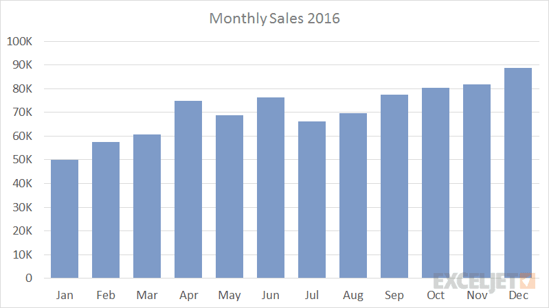
Monthly sales bar chart
Source: exceljet.net
Bar charts are versatile enough to be modified and show more complex data models. The bars can be structured in clusters or be stacked, to depict distribution across market segments, or subcategories of items. The same goes for horizontal bar charts, fitting more for long data labels to be placed on the bars.When to use: comparing objects, numeric information. Use horizontal charts to fit long data labels. Place stacks in bars to break each object into segments for a more detailed comparison.
Pie chart
One more common type of chart we see everywhere, is a pie chart.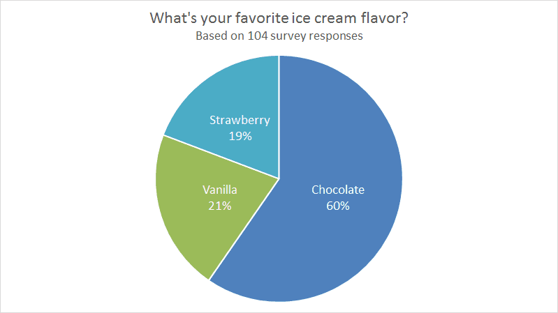
Pie chart showing percentage correlation of ice cream flavor preference
Source: exceljet.net
This type of chart is used in any marketing or sales department, because it makes it easy to demonstrate the composition of objects or unit-to-unit comparison.When to use: composition of an object, comparing parts to the whole object.
Line Graph
This type of visual utilizes a horizontal axis and a vertical axis to depict the value of a unit over time.
Sales analysis by payment methods
Source: datapine.com
Line graphs can also be combined with bar charts to represent data from multiple dimensions.When to use: object value on the timeline, depicting tendencies in behavior over time.
Box plot
At first glance, a box plot looks pretty complicated. But if we look closer at the example, it becomes evident that it depicts quarters in a horizontal fashion.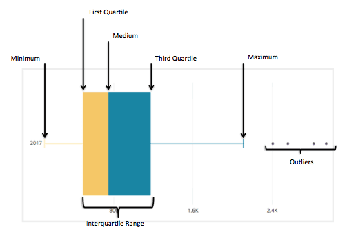
Box plot divided into 5 quartiles, while outliers are shown as object that fall out of distribution area
Source: chartio.com
Our main elements here are minimum, maximum, and the median placed in between the first and third quartile. What a box shows is the distribution of objects, and their deviation from the median.When to use: distribution of the complex object, deviation from the median value.
Scatter plot
This type of visualization is built on X and Y axes. Between them, there are dots placed around, defining objects. The position of a dot on the graph denotes which qualities it has.
A sad scatterplot showing the inability of young people to earn money
Source: www.econometrics-with-r.org
As in the case of line graphs, dots placed between the axes are noticed in a split second. The only limitation of this type of visualization is the number of axes.When to use: showing distribution of objects, defining the quality of each object on the graph.
Radar or spider chart
This type of chart is basically a line chart drawn in radial fashion. It has a spiderweb form that is created by multiple axes and variables.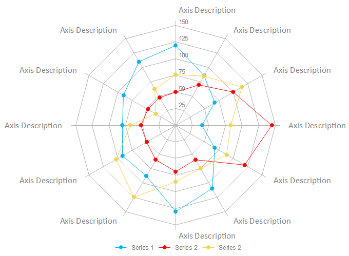
Spider chart structure
Source: edrawsoft.com
Its purpose is the same as for a line chart. But because of the number of axes, you can compare units from various angles and show the inclinations graphically.When to use: describing data qualities, comparing multiple objects to each other through different dimensions.
Dot map or density map
Superimposing a visualization over the map works for data’s geographical domain. Density maps are built with the help of dots placed on the map, marking the location of each unit.
A simple representation of a dot map
Source: datavizcatalogue.com
A dot can define a single unit (e.g. marketplace) or denote a number of objects in a certain area. Such a format makes density easy to notice but may provide zero value if precise numbers are required.When to use: depicting distribution or density of objects.
Funnel charts
These are perfect for showing narrowing correlations between different groups of items. In most cases, funnels will utilize both geometric form and color coding to differentiate items.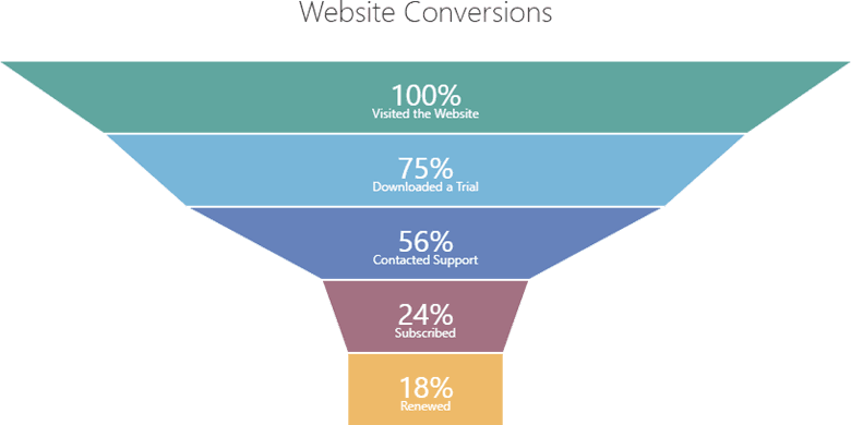
The example shows conversion results starting from total traffic number and the number of subscribers
Source: community.devexpress.com
This type of chart is also handy when there are multiple stages in the process. On the example above, we can see that after the “Contacted Support” stage, the number of subscribers has been reduced.When to use: depicting processual stages with the narrowing percentage of value/objects
If you want to dive into data visualization types, you can check a catalog that provides an explanation for each type of graph, chart, map, or table. In choosing the type of visualization, make sure you clearly understand the following points:
- Specifics of your data set: domain of knowledge or department in your company
- Audience: people you want to present the information to
- Connection logic: comparison of objects, distribution, relationship, process description, etc.
- Output: simply, the reason for showing this information to somebody
Data visualization tools and libraries
There are a lot of products in the data visualization market. In choosing a vendor, look for a scalable BI service that will fit your business size and analytical needs. While the capabilities are pretty similar, the ecosystem each vendor is offering may or may not include important services. In this section, we’ll cover provider options as well as tooling to create your own visualization software.Also, keep in mind: Because of the complex analytical techniques, underlying infrastructure, and explicit functionality, most tools are paid or freemium. Desktop applications themselves are really heavyweights (Tableau 1.6 GB, Sisense about 5 GB). Without up-to-the-minute hardware to operate them, you risk frying your computer.
Popular data visualization tools
In most cases, tooling for data visualization is a desktop application represented by a command dashboard. The integration with data sources is done via API, so datasets will be uploaded automatically. After you point out where your data is stored, the application will provide you with a canvas for the future report where you can place visualizations and fill them with data.Each visualization template has its settings with data properties and correlation types. So, combining different types of visuals, you will be able to construct the report. Depending on the functionality, reports can be further exported as CSV files or shared within the system with other users.
As is the case with any technology market, data visualization providers offer similar functionality, so we will talk more about separate features rather than explaining how it works. For a more detailed overview of tooling, read our article dedicated to BI instruments.
Looker. A data analytics platform offering connection both to web-based and SQL data sources. Looker features:
- Drag & drop user interface
- Customizable dashboards
- Exportable reports
- API integration with third-party sources
- Data querying from database
- Cross-platform access
- Drag & drop user interface
- Web application
- Integration with many data sources (Google products by default)
- SQL data query and API support
- Report embedding
- Shareable access to analytics
- Drag & drop user interface
- Wide list of native integrations with data sources
- Shareable access to analytics
- Report embedding
- Cross-platform access
- Server REST API
- Constantly updated data flow
- Metadata management instrument
- Inbuilt dashboard commenting and highlighting
- Customizable reports
- Role & Permission based access system
- Open API
- Open database access
- Cross-platform access
- Shareable access to analytics
Free data visualization tools
There are not many totally free options on the market. One way or another, there is some paid functionality or product(s) to upgrade to. That said, here are some vendors you can try out to understand how to deal with data visualization:Microsoft Power BI. Not a rare case for Microsoft to offer its software for free, but there are some pitfalls. You can obtain full functionality without paying a dollar, but all the produced reports will be published to the Microsoft Gallery. So basically, all your reports will be publicly visible. Power BI features:
- Drag & drop interface
- Desktop application
- Wide list of native integrations with data sources
- Customizable reports
- Incremental data updates
- Full BI ecosystem as a service in Power BI Pro
Tableau Public. The same goes for Tableau Public – shared, full functionality with all your data published on the public service. We won’t copy the features here, but this has to be on the list of free options.
Google Data Studio. Perhaps, this one is the most accessible option for any user that wants to create visualized reports. Data Studio features:
- Web application
- Drag & drop interface
- Inbuilt integration with Google Analytics and other products from the Google Marketing Platform
- Customizable reports
- Data transformation instruments
- Shareable access to analytics
Libraries, packages, and open-source tools for data visualization
There are also separate tools that can be used to construct a certain type of visuals. Most of them require programming language knowledge (and sometimes frameworks as well).D3.JS is a free JavaScript library for creating visuals by connecting data with the document object model via API, manipulating documents as objects.
Dygraphs is a free, open-source JavaScript library that works for building dataviz in browser. It is suitable for use with huge datasets for building interactive charts and graphs. For starters, check API reference and data format documentation.
Chartist.js is another tool based on JavaScript used to build graphs and charts by styling them with CSS.
Gleam is a Python package for building scatter plot visualization with the help of CSS and HTML.
Leather is a Python library for creating charts in their simplest form and saving them as SVG files to be shared further.
Matplotlib is another open-source Python library aimed at creating 2D visualizations.
All the mentioned libraries and tools can be freely used and integrated with the existing software to create new types of data visuals as templates.
Pitfalls of data visualization
If you decide to introduce visuals to your analytics, you have to learn a bit about their potential snags. Using the tools is not a big deal. Generally, even ecosystem-sized products are pretty intuitive to use.But if you’re a manager or responsible for implementing BI in your organization, be aware of some consequences before the actual data will be available to visualize. Here’s a breakdown of common issues in data analytics by the problem’s domain.
Challenges concerning data preparation
The main pitfall at the dataset preparation stage concerns making the right assumptions. As during any process in software development, defining the required data and feasible sources is based on assumption. The same goes for deciding whether you need a data warehouse and if you want to transform data into multiple formats.A simple solution to it can be found through testing at all stages of data processing. In terms of data visualization, we have to test those assumptions that will directly impact the visualization process. These items are:
- Initial data types
- Chosen sources
- Types of data sourcing (querying, constant updating, ad hoc reporting)
- Architecture of your database/data warehouse
Challenges concerning visualization process
The visualization stage is somewhat less technology driven. While there are semi-AI driven business intelligence tools, the user is still the one who decides what format of visualization will be placed on a canvas, and what will be the data properties. So that suggests:Pitfall 1: Using the wrong visualization format. It’s very easy to get lost in the forest of graphs, charts, and maps, so it will take some time to study the required minimum of dataviz for your business. For example, using a spider chart when the object has only one characteristic to compare will make everyone scratch their heads. And vice versa: A line graph applied to compare multidimensional units, like seasonal sales across 3 countries, each with 10 provinces, is doomed to failure.
Pitfall 2: Using the wrong type of data. A very similar issue, but it takes a couple of times to understand what type of data can be applied to your tried-and-tested dataviz.
Pitfall 3: Dataviz tools don’t generate reports, you do. It might be surprising, but, at the current state, only a few really expensive tools can interpret some part of the information for you.
Pitfall 4: Wrong tooling choice. Well, if you choose to use a free tool or decide to mess with a library, perhaps it can’t be wrong for you. But when we talk about the choice of vendor, things get more serious. Vendors of data visualization offer the whole service to make your life easier as the one who will use the reports. The main point here is to understand whether the service is scalable, so it covers the amount of data you have and frequency of its updates. Visualization capabilities should also be considered, because industry-specific analytics may include exotic forms of dataviz.
Considering all the opportunities and blockers, you are free to implement visual analytics. The most important stage of data processing comes before you enter the user interface. With that in mind, you’re good to go.