

Imagine you’re a business analyst in a fast fashion brand. You’re tasked with understanding why sales of a new clothing line in a given region are dropping. Your job is how to increase sales while achieving the desired profit benchmark. Some variables to consider are customer buyer persona, website reviews, social media mentions, sales figures by day and hour in different store locations, a holiday or other events, expected pay dates in local companies, even heat map data for every store, and current planogram.
That’s a lot of different data stored in different formats. You must to extract it from various systems or sometimes collect missing data manually. Then to move data to single storage, explore and visualize it, defining interconnections between events and data points. Too many dimensions, too much data to process. There must be a data management strategy, and there must be an IT infrastructure to implement this strategy. That’s what business intelligence (BI) is about.
What is business intelligence and what tools are required to support it?
Business intelligence is a process of accessing, collecting, transforming, and analyzing data to reveal knowledge about company performance. And then use this knowledge to support decision-making.
Yes, the process. This means that BI encompasses activities, tools, and an infrastructure that supports data transformation from its raw form into readable graphs. This process can be seen as a chain of consecutive phases:
Phase 1. Extract data – Connecting to the original data sources and retrieving it from them. Data sources may be internal (databases, CRM, ERP, CMS, tools like Google Analytics or Excel) or external (order confirmation from suppliers, reviews from social media sites, public dataset repositories, etc.).
Phase 2. Transform data – Placing data in temporary storage known as a staging area. Formatting data according to specified requirements and standards to make it suitable for analysis.
Phase 3. Load data – Moving standardized data to a final storage destination – database, data lake, or data warehouse. If necessary, creating data marts – subsets of a data warehouse to store information from each of the company units, HR or sales department, for instance.
Phase 4. Visualization – Exploring data and presenting results with visuals (via a user interface).
Steps 1, 2, and 3 are combined into ETL (extract, transform, load) operations. The ETL process specifies how heterogeneous data is retrieved from disparate sources, transformed into a form suitable for analysis, and loaded into a single destination. We won’t spend much time explaining it here since we did that in a dedicated article about an ETL developer.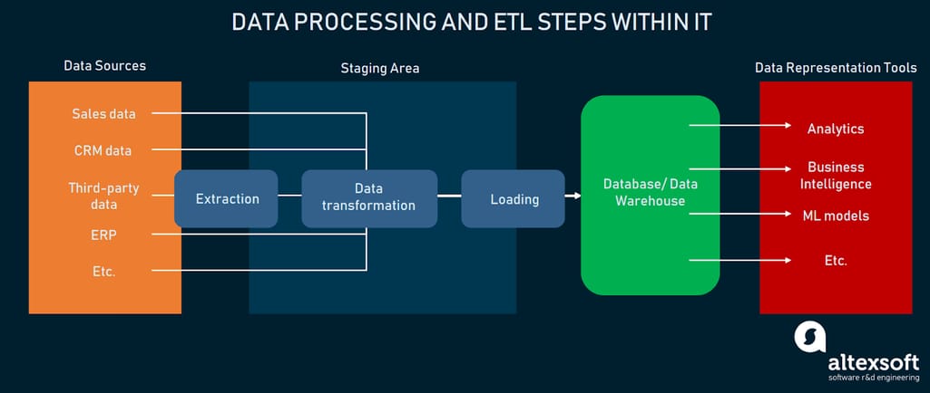
Flow of data and ETL
Previously we wrote about steps to implement a business intelligence strategy, where we touched upon data integration tools and data warehouses. In this article, we’ll go deeper into the tools and services needed to establish and maintain the flow of data from system to system with further analysis and visualization.
We’ll consider two scenarios:
You need the whole BI infrastructure. When you want to set up a BI process from scratch, consider providers whose analytical solutions include modules with ETL, data warehousing services, data analysis, and visualization.
You aim to build custom BI. You have tech people on board that can develop a custom BI platform or some of its parts but are looking for building blocks. In this situation, we suggest looking at libraries, frameworks, and tools with capabilities to perform any of the data processing steps.
End-to-end BI platform providers
First, let’s survey several A to Z solutions by some of the leading providers. These BI platforms include ETL and data storage services, along with analytics and reporting with visuals.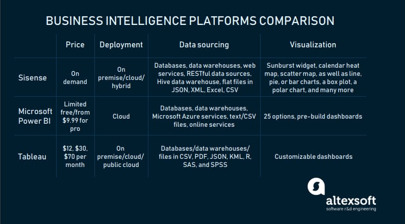
End-to-end BI platforms at a glance
We checked Gartner 2019 Magic Quadrant for Analytics and BI Platforms (as of January 2019) and the list of the best BI software by G2 Crowd.
Magic Quadrant for Analytics and BI Platforms as of January 2019. Picture source: Stellar
Sisense: “no PhD required to discover meaningful business insights”
Sisense is a business analytics platform that supports all BI operations, from data modeling and exploration to dashboard building. It supports on-premise, cloud, and hybrid deployment scenarios.
Data sourcing. There are two ways of obtaining data with Sisense: importing it to ElastiCube, the solution’s proprietary database, or connecting directly to sources. The second option is called the live connection and works well for frequently changing data.
Live Connectors allow for loading data from:
- databases (Google BigQuery, Oracle, MySQL, PostgreSQL, SQL Server, MemSQL)
- data warehouses (Amazon Redshift and Snowflake).
ElastiCube Connectors support all the sources of Live Connectors and:
- web services (Google Analytics/AdWords, Salesforce, MailChimp, Splunk, Stripe, Dropbox, etc.)
- RESTful data sources
- Hive data warehouse
- flat files in JSON, XML, Excel, or CSV.
Connectors to additional not officially supported sources can be obtained from the Sisense community. The full list of supported data sources and types is in the documentation.
Data transformation. The platform provides many features for data transformation. For instance, it analyzes how attributes are spelled in tables, groups them by similarity to help users harmonize attribute names. Interface makes manipulations with data models simple.

Tutorial on how to add a custom SQL table in Sisense
Data visualization. Dashboards are created on the web. Users can add widgets to dashboards. The selection of reporting options is extensive: the sunburst widget, calendar heatmap, scatter map, as well as line, pie, or bar charts, a box plot, a polar chart, and many more.

Multi-dimensional pie chart – the Sunburst widget. Source: Sisense
Sisense has tutorials, videos, and documentation, which are huge help in understanding how to use the platform to its fullest. To get a price quote, fill out a form.
Microsoft Power BI: user-friendly platform that works across all devices
Microsoft Power BI is a cloud self-service business analytics solution for visual data exploration and analysis on-premises and in the cloud. The platform allows for real-time data monitoring on almost any device across all major OSs, with the capability of turning on mobile alerts about any changes.

Overview of Microsoft Power BI
Data sourcing. Microsoft Power BI has a whole lot of data source connectors:
- databases (IBM Netezza, MySQL, Teradata, PostgreSQL, etc.)
- data warehouses (SAP Business Warehouse Server, Snowflake, Google BigQuery, Redshift, etc.)
- Microsoft Azure services
- text/CSV files, as well as JSON, PDF, XML, SharePoint Folder files, and folders
- Online services (Salesforce Objects/Reports, Google Analytics, Facebook, Zendesk, Stripe, GitHub, Twilio, etc.).
Find more data sources are in the documentation.
Data transformation. The solution includes numerous data transformation features. One of them is called the combine files feature: Users can combine all files within a specific folder if they have the same file type and structure, for instance, the same columns. Once users combine files, they may apply additional transformation or extraction steps if needed.
There is also a capability to specify data categories to columns so that Power BI generates accurate visualizations for them. Columns with such ambiguous data can contain geographical abbreviations: CA as California and Canada or Georgia as the US state and a country.
Standard features like filtering rows of fields, changing text records into numeric ones renaming columns or tables, or setting the first row as headers are also available.
Data visualization. Customers have a multitude of visualizations to choose from. The tool will upload custom visuals, pin visuals to a dashboard as a site, or change their styles to see which one works better with given data. You can browse through the list of available visualizations here. The platform also has pre-built dashboards and reports by popular providers like Salesforce or Google Analytics.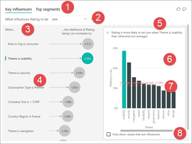
The Key Influencers visual for pointing at factors that affect a given metric. Source: Microsoft Power BI
Users can select between the limited free (1 GB of storage with daily refresh cycles) or the professional version (10 GB of storage from $9.99 per user per month). To start using the tool, simply sign up.
You can read a complete Power BI overview in our separate post.
Tableau: understand your data with just drag and drop
Tableau, which has its spot among leaders of the Gartner Quadrant, offers several products to support an end-to-end analytical workflow.

Tableau capabilities in short
Tableau Server is one of these solutions. It’s an enterprise analytics platform that can be deployed on-premises (Windows or Linux), in the public cloud (AWS, Microsoft Azure, or Google Cloud Platform), or fully hosted by the provider.
Data sourcing. The platform connects to both cloud and on-premise data sources through a web data connector and APIs.
Data sources supported by Tableau Server include:
- databases (Google Cloud SQL, MarkLogic, PostgreSQL, etc.)
- data warehouses (Redshift, Google BigQuery, Cloudera Hadoop, SAP NetWeaver Business Warehouse, etc.)
- files in CSV, PDF, JSON, KML, R, SAS, and SPSS.
Check out the full list of supported data sources to find more of them.
Data transformation. Users can schedule and manage data flows with another tool, Tableau Prep Conductor, that comes within the Data Management Add-on, to embed dashboards into other applications, and combine different datasets. Also, the solution lets users manage dashboard extensions – web applications that allow users to interact with data from other applications directly in Tableau via the Tableau Extensions API. We mentioned a few ways of managing data, but there are certainly more.
Data visualization. Tableau Server is mostly praised for its ease of use, scalability, and customizable interactive dashboards.
For instance, it has the Ask Data feature that allows users to ask questions from any published data source with natural language (via typing) and get answers in the form of a visualization. The feature is based on algorithms “to automatically profile, index, and optimize data sources.”
Tableau Server is included in three software bundles: Tableau Creator ($70), Tableau Explorer ($30), and Tableau Viewer ($12). The price is per user per month if billed annually. The vendor offers a free trial.
Sure, it’s worth considering other vendors that were ranked highest in ratings. For instance, Qlik, Looker, ThoughtSpot, products like SAS Business Analytics, Salesforce Einstein Analytics, or BI solutions by SAP. To find out more about Tableau BI tools, check our linked article.
Next, we will cover the second scenario – building custom BI using specialized tools. Let’s start with data integration.
ETL tools and libraries/packages
To make decisions that will positively influence business in both short and long runs, companies must have a full view of their operational data. ETL, which entails collecting and integrating data from disparate sources into a common destination, helps to get this complete view of business data.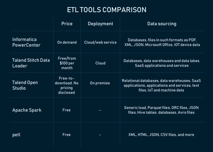
The main characteristics of ETL solutions
Now let’s check out the tools you can use to build an ETL pipeline to put the data puzzle together. Gartner’s Magic Quadrant for Data Integration Tools was one of the sources we relied on when compiling this list.
Informatica PowerCenter: metadata-driven data integration platform
PowerCenter is an enterprise data integration platform by Informatica – provider of data management, quality, security, and integration solutions. Metadata service layer, which ensures better quality and consistency of data, is one of the platform’s peculiarities. For instance, with data lineage verification capability, analysts can “track what data was changed, when and by whom to support business and regulatory demands for data validation and auditing.” Metadata can be exchanged with different applications.
The platform supports batch and real-time data processing. It connects with both on-premises and cloud data sources via REST APIs.
The tool supports a variety of data sources:
- databases (IBM DB2 UDB, Oracle, Microsoft SQL Server, Microsoft Azure SQL Database, Netezza)
- files in such formats as PDF, XML, JSON, Microsoft Office
- IoT devices data.
Reviewers on Capterra and Gartner Peer Insights note the tool’s ease of use, even for people without software engineering experience.
PowerCenter is available in the cloud, as a SaaS, and web service. Pricing is available on demand. According to one of the reviewers, license prices are costly enough, but manageable.
Talend Data Fabric: a suite of solutions for data integration with many supported data sources and formats
Talend – data integration and data integrity solutions provider – is another leader in Gartner’s Magic Quadrant. The company has Talend Data Fabric, a suite of apps for data collection, governance, transformation, sharing across cloud or on-premise systems. One can purchase the whole suite or choose products of interest. Let’s briefly describe capabilities of two of them.
Stitch Data Loader is a cloud-based ETL service that pulls data from various sources via the Import API and replicates it (not in real time) to a final destination.
The sources from which you can extract data include:
- databases (MySQL, MongoDB, Amazon Oracle RDS,etc.)
- data warehouses and data lakes (Amazon Redshift, Snowflake, Amazon S3, PostgreSQL, Azure SQL Data Warehouse, Google BigQuery, Panoply, etc.)
- SaaS applications and services (Zendesk, Salesforce, Stripe, Google Ads, Facebook Ads, etc.).
Registered users can choose between Free and Standard plans.
Talend Open Studio is a data integration service released under the open source Apache license. It combines graphical design environment with a metadata-driven approach. Users can export and execute standalone jobs in runtime environments.
Open Studio connects with:
- relational databases (Oracle, Microsoft SQL server, Teradata, etc.)
- data warehouses (Snowflake, Azure SQL Data Warehouse, SAP Business Warehouse, etc.)
- SaaS applications (NetSuite, Marketo, Salesforce, etc.)
- applications and services (SAP, Microsoft Dynamics, Sugar CRM, Dropbox, etc.)
- text files, IoT and machine data.
All connectors for Talend products are published here.
The solution also supports SMTP, FTP/SFTP, LDAP protocols. Besides REST, it has a support for SOAP API integration.
Apache Spark: building an ETL pipeline in Python, Scala,Java, SQL, and R
Apache Spark, the analytics engine for large-scale data processing, can be used for building the ETL pipeline for applications in Python (with PySpark API), Java, SQL, Scala, and R (with the SparkR package). Spark allows for processing streaming data in parallels (by multiple processors or computers at the same time), that’s what high scalability, speed in processing large amounts of data is all about it. You can work with unstructured, semi-structured, and structured data in plenty of formats, including JSON, CSV, TXT, Parquet, Avro, ORC. It’s worth noting that building ETL pipelines with Spark requires coding skills.
Packages for ETL contain functions, pieces of code that return value – variable or other information coming back from any subroutine. There are many of them to choose from.
petl: Python general-purpose package for ETL
petl is a general-purpose package for extracting, transforming, and loading tables of data in Python. The package provides means of extracting text XML, HTML, JSON, CSV, and many more types of files, build tables, and loading them into a storage system of choice. petl developers note that the package is well suited for working with heterogeneous data and/or data of mixed quality. petl transformation pipelines make minimal use of system memory and can scale to millions of rows if speed is not a priority, according to its developers.
Listing all the tools for building ETL pipelines is outside of this article’s scope. However, let’s keep in mind some more of them: Apache Kafka, Apache Samza, Apache Storm, Pentaho Data Integration, and Amazon Kinesis Firehose.
Now, let’s talk about storage solutions that will keep your transformed data safe and ready for querying. Here are a few popular options.
Data warehousing tools
Data warehouse is a central repository for reporting, data transformation, and analysis in business intelligence. The market has a lot of data warehousing services and tools to offer. Let’s explore some of them.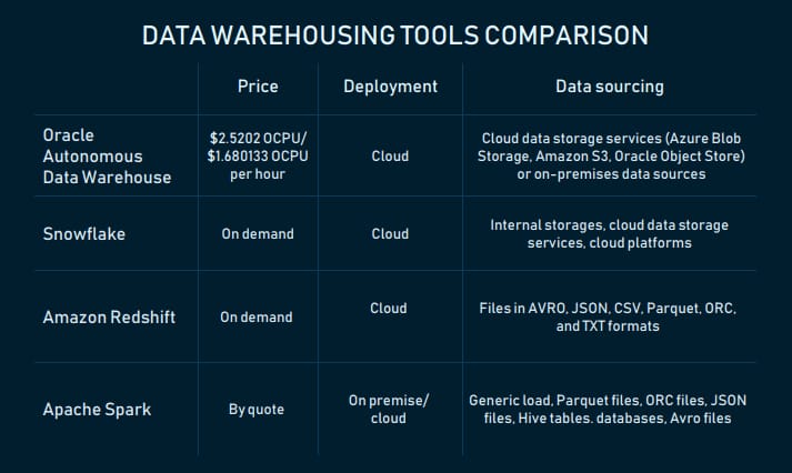
Data warehousing services compared
Oracle Autonomous Data Warehouse: fully autonomous database that scales elastically
Oracle Autonomous Data Warehouse is a cloud fully autonomous storage system built on Oracle Exadata computing platform. According to the official website, it has three main characteristics: self-driving, self-securing, and self-repairing. Self-driving means that the DW doesn’t require manual tuning by database administrators – it uses machine learning for that. Self-securing is achieved through automatic data backup and security updates, as well as access monitoring. The third feature is about automatic recovery from downtime.
The DW can load files from cloud data storage services (Azure Blob Storage, Amazon S3, Oracle Object Store) or on-premises data sources. It scales elastically. The amount of loaded data can be scaled.
The tool is compatible with:
- Oracle BI tools (Data Visualization Desktop, Oracle Analytics Cloud) and cloud services (Oracle Analytics Cloud, Oracle Integration Cloud Service, etc.)
- third-party BI, data integration and visualization tools.
It also supports connectivity via SQL*Net, JDBC, and ODBC.
To start using this data warehousing service, sign up for an Oracle Cloud Account and choose a pay-as-you-go ($2.5202 OCPU per hour) subscription or monthly flex plan ($1.680133 OCPU per hour). You can use a cost estimator.
Snowflake: cloud SQL data warehouse to store and analyze diverse data requiring zero management
Snowflake is a cloud SQL data warehouse provided as a SaaS. Like the warehouse from Oracle, it eliminates manual administration and management. The vendor handles maintenance, management, and tuning of the storage.
Batch data (the provider calls it bulk) and real-time (continuous) data loading are available for customers. The latter is carried out with the Snowpipe continuous data ingestion service. The DW scales up and down automatically and on-the-go.
The warehouse users can work with data from:
- internal (i.e. Snowflake) stages
- cloud data storage services (Google Cloud Storage, Amazon S3, and Microsoft Azure Blob storage)
- cloud platforms (Amazon Web Services, Microsoft Azure).
Snowflake can be used to work with both structured (CSV and table) and semi-structured data (JSON, Avro, Parquet, or XML).
Since Snowflake is compatible with AWS and Microsoft Azure cloud platforms, its architectural layers (storage, compute, and services) are fully deployed and managed on a selected platform.
It’s possible to connect to Snowflake and manage it via web-based user interface, command line clients (i.e., SnowSQL), native connectors (i.e., Python), which can be used to develop applications for connecting to this data warehouse. There are third-party connectors to connect applications such as ETL tools (i.e., Informatica) and BI tools to Snowflake. ODBC and JDBC connectivity are also available, so you can connect other applications like Tableau with Snowflake.
Snowflake offers multiple pricing options. Usage-based pricing is available under the Snowflake on Demand plan. Other ways are to select pre-purchased Snowflake capacity options or get pricing based on a region, a cloud platform used (AWS or Microsoft Azure), and the number of capabilities.
Amazon Redshift: fast, scalable data warehouse in the cloud
Amazon Redshift is a cloud-based, enterprise-level fully managed data warehousing service that can scale up from a few hundred gigabytes to a petabyte or more. The "service" means that it’s used for creating and managing data warehouses.
This data warehouse is a collection of computing resources – nodes – that are grouped into a cluster. In clusters with two or more nodes, an additional leader node coordinates the compute nodes and handles external communication. User data is stored on the nodes. Each cluster runs an Amazon Redshift engine and has one or more databases. Clusters can be managed via Amazon Redshift management API, the AWS SDKs, and the AWS Command Line Interface (AWS CLI).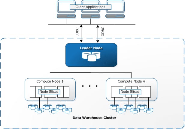
Redshift’s architecture. Source: AWS
The warehousing service is based on PostgreSQL relational database management system (RDBMS), which makes it compatible with other RDBMS applications. Also, it integrates with various data loading and ETL tools, BI reporting, analytics, and data mining tools. Amazon published the full list of partners here.
The service supports data load for files in AVRO, JSON, CSV, Parquet, ORC, and TXT formats.
To query the DW (from client applications), you must either have to use AWS Management Console with the Query Editor or SQL client tools that support JDBC and ODBC.
Redshift automatically and periodically backs up data to Amazon S3.
Having an AWS account is required to start using Amazon Redshift. Users have four pricing options to choose from. On-demand pricing is an hourly rate (from $0.25) based on the type and number of nodes; Amazon Redshift Spectrum pricing depends on the number of bytes scanned. Concurrency Scaling entails earning one to three free credits daily and payment for a per-second on-demand rate for the service. Reserved Instance is discounted pricing for those who use Redshift for one- or three- year term. A free two-month trial is available.
Also, consider SAP BW/4HANA (on-premises and cloud deployment), IBM Db2, BigQuery by Google, Teradata Integrated Data Warehouses, Microsoft Azure.
Data visualization tools and libraries
Well, we have the final component of the BI infrastructure to discuss – visualization. Let’s consider some libraries that front-end engineers can use to apply effective visuals.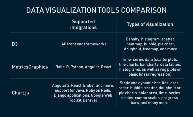
Open source data visualization libraries
D3: JavaScript framework-agnostic library for creating ingenious visualizations
D3 is an open source JavaScript library for visualizing data using web standards – HTML, SVG, and CSS. It supports any front end framework, be it Vue.js, React, Polymer, Angular, or other.
With D3, developers can bind arbitrary data to a Document Object Model (DOM) and manipulate the document based on data. The DOM is a standard for accessing changing content, and update the content, structure, and style of an HTML document. The D3 website says, “For example, you can use D3 to generate an HTML table from an array of numbers. Or, use the same data to create an interactive SVG bar chart with smooth transitions and interaction.”
D3 is a good tool when you want to represent data with dynamic visuals and design them in a unique way to stand out from the crowd. Even interactive visualization on the D3 website’s homepage with examples from various portals hints at it.
Let’s look at the infographic about the state of things in Alaska's indigenous communities by The Guardian as an example of what you can do with D3. The visual changes when a user navigates across regions on a map and clicks on “Population,” “Alaskan Native,” and “Income” buttons at the left part of the screen.
The infographic reacts to clicks and mouse moves. Try it yourself. Source: The Guardian
The fact that D3 is a baseline for many libraries (i.e., Chart.js, eCharts, C3, or Plotly ) proves that this library is very popular and trusted among devs.
Chart.js: a tiny library with a multitude of responsive charts and integration options
Chart.js is an open source (distributed under the MIT license) library with fully responsive charts.
The library provides plenty of samples to explore and illustrate data points in various ways. For instance, static and dynamic bar, line, area, radar, bubble, scatter, doughnut or pie charts (yes, we placed them together on purpose). The collection also includes polar area, time-series scales, combo scales for viewing two or more datasets, progress bars, and many more. The look and behavior of charts can be modified with plugins.
For instance, the interactive bubble chart visually reacts when a user adds, removes datasets, or randomizes data points: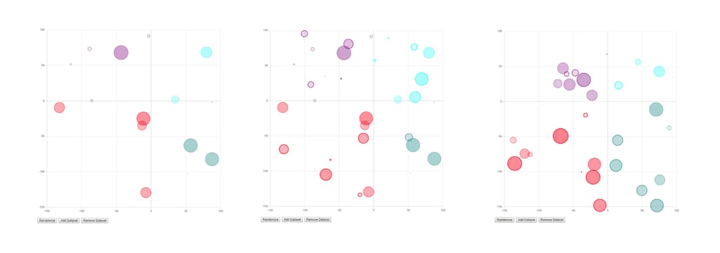
A bubble chart on Chart.js responds to user actions
Chart’s list of integrations include Angular 2, React, Ember, and other JavaScript front end development frameworks. Chart.js visuals can also be integrated into Java, Ruby on Rails, Django applications, used with Google Web Toolkit and Laravel PHP framework.
Lio Fleishman from Sisense says that Chart uses native APIs which make the learning curve as tiny as the size of the library itself: “This library is tiny! It’s only 11kb zipped and these days, in web development, size matters. There’s nothing better than a small size library.”
MetricsGraphics: JavaScript library with standard visuals for time-series data
MetricsGraphics is a D3-based library for visualizing time-series data. Users can choose from interactive graphics like scatterplots, line charts, bar charts, data tables, histograms, as well as rug plots or basic linear regression. While the number of visuals isn’t huge, each of them has many variations.
The library creators note that MetricsGraphics is data-source agnostic: “While it provides a number of convenience functions and options that allow for graphics to better handle things like missing observations, it doesn't care where the data comes from.” Other characteristics its developers point out are simple API and the ability to easily construct narratives by providing a Bootstrap-based layout template.
Other libraries worth checking out are Recharts (React), React-Vis by Uber, VX (React+D3), three.js, Raphael for vector graphics, and more. The choice may depend on the type of data you use most often, front-end developers’ expertise, or personal preferences.
How to choose the right BI tool?
Getting back to the two scenarios... If you’re at the starting point on the path towards a complete BI infrastructure and don’t have a development team, explore end-to-end solutions. The evaluation checklist may include:
Supported deployment scenarios. Based on your requirements for data security, budget, and possible need to scale, define what type of deployment you need and check whether the solution supports it. If you’re not sure about it, look for a consultant.
Scalability. Is it easy to increase storage, computing load, and the number of users? Most providers highlight this capability in a product description. You can always contact a vendor for more details.
Ease of use. From clear and well-structured documentation and published video tutorials to intuitive interface with drag-and-drop feature for data management, a good tool must have that all.
Number and types of supported data sources. Figure whether the tool allows for sourcing data in batches, in real-time, or near-to-real time. What connection options (API or/and web connectors) are included?
Data transformation. Solutions always include basic features for data transformation. Unique features could make a difference for you.
Visualization. You may want to look at the number and types of supported visuals, the capability to customize them, to embed dashboards into other applications. If you deal with streaming data, learn whether a platform supports real-time data visualization.
Pricing options and terms. Evaluate pricing plans and their conditions (fixed, pay-as-you-go, or discounted). Is there a trial to test a tool?
Customer support. Look what channels (email, call, etc.) you can use to reach customer support specialists, their working hours. Review website generally includes questions about the quality of service and support.
If you plan to build a custom BI tool or some of its modules using open-source components, check how big their community is, how many GitHub starts they have, besides looking at the requirements for end-to-end solutions we mentioned above, of course.