

Unfortunately, everyone – even the best of us – experiences bad interactions. Father of user-centered design Don Norman wrote a whole book describing good and bad designs, and most of all - sinfully bad doors. “My problems with doors have become so well known that confusing doors are often called ‘Norman doors.’ Imagine becoming famous for doors that don’t work right,” he laments in The Design of Everyday Things. Norman doors are the doors that you always push when they need to be pulled and pull when they need to be pushed.
Bad interactions – in both physical and virtual worlds - create obstacles between a user and a product, like a push door that they keep mistakenly pulling by the handle. They distract people from getting to their goal and often make them give up altogether. That’s when interaction design comes to the rescue.
Interaction design (abbreviated to IxD) has been around at least since the 1980s but only fairly recently has it come to gain shape and form like any other discipline. And it is a separate discipline. User experience (UX) design shapes the overall encounter with the use of a product, including programming, building information architecture, doing usability engineering, and user research. Interaction design is involved in helping a user reach their goal via smooth, pleasurable, and quick interactions with an object or a machine.
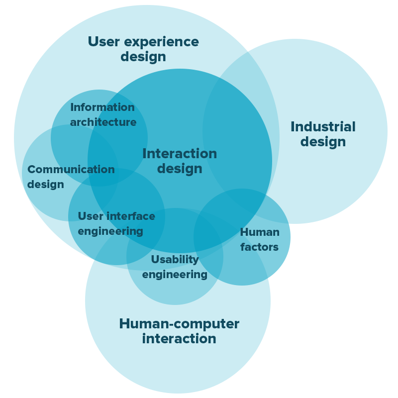
Relationships between different subsets of UX design
If a software product is a house and UX design is everything that makes this house a cozy and convenient place to live in, then interaction design is a light switch near the entrance to each room, a heated bathroom floor, a dinner table big enough to accommodate the whole family. While you only remember your overall experience of living in this house, it’s the small details like nicely colored walls and comfy armchairs that make up this experience.You will often find IxD mentioned together with another term – human-computer interaction (HCI). When the first personal computers invaded people’s homes and offices, the idea that conversations between humans and machines should resemble human-human conversations gained popularity.
Since then, a lot of scientific research, including cognitive science and computer science, has been put to use to explore ways of shaping better communication between machines and humans. As a founder of the field, John M. Carroll notes, “HCI expanded from its initial focus on individual and generic user behavior to include social and organizational computing, accessibility for the elderly, the cognitively and physically impaired, and for all people, and for the widest possible spectrum of human experiences and activities.”
Laws and Principles of Interaction Design
Interaction design lies at the intersection of many different methodologies and therefore designers are still figuring out the discipline’s hard and fast rules. But, there are many principles interaction designers apply in their practice that can be described as a foundation of the whole field. Let’s explore them now.1. Fitts’ Law
Introduced in 1954 and targeted to calculate performance of assembly workers, Fitts’ law describes one of the most basic phenomena of human-computer interactions. It illustrates the relation between the distance to the target, your speed, and the size of the target. It basically says that the bigger the object, the faster you can point to it. Whether you point with a cursor or a finger, you can calculate how big a button should be to decrease the time spent aiming for it and increase the accuracy of pointing.You can check out this demonstration that calculates the time it takes for you to click on circles of different sizes placed different distances from each other.
How to apply it in practice?
- Shorten the distance between action A and action B
- Place common elements in like manner
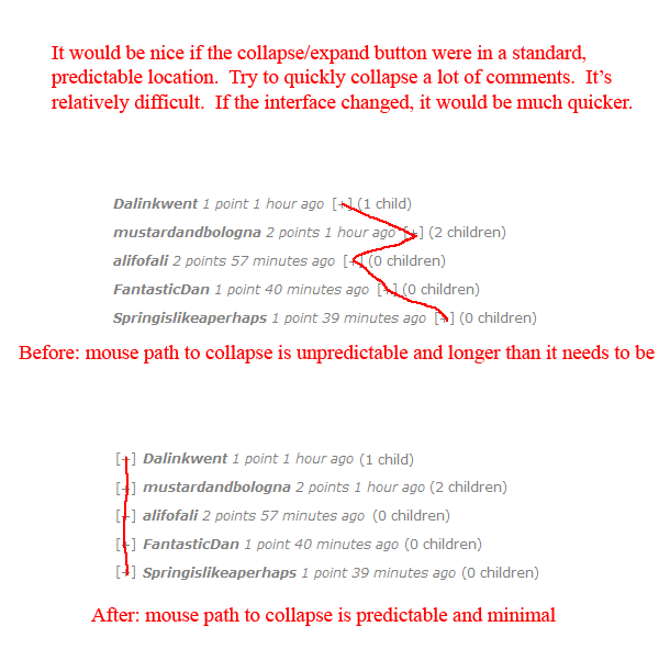
Reddit’s user jbu311 suggested an interface improvement that was later implemented on the website
- Make interactive elements big enough so users can aim easily
- Provide a lot of clickable space around a link (or just make it a button)
2. Hick’s Law
Named after psychologist William Edmund Hick, Hick’s law dictates that the greater the number of choices, the longer it takes to make a decision. This leads to a simple conclusion: Giving a lot of choice is not always a good thing. Despite the fact that users are instinctively drawn to products with more features, simpler solutions bring more satisfaction.Imagine entering a frozen yoghurt shop and seeing endless rows of toppings. You’ll spend hours choosing between them. And while picking desserts may be fun, scrolling through a list of book genres in an online store is not. Amazon, by the way, generously applies Hick’s law to categorize its vast choice of listings. You do have to read through them all to find the needed department, but you do it in measured amounts, by looking through different sections step by step.
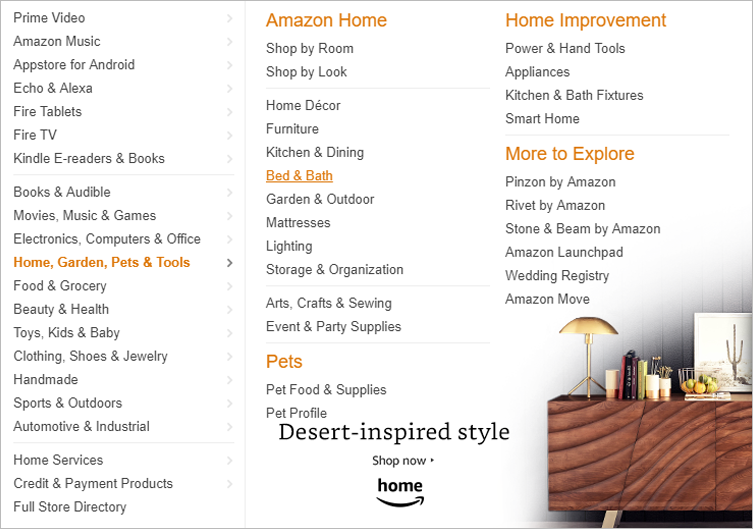
Hick's law on Amazon
How to apply it in practice?- Reduce the number of menu elements and put them in categories
- Highlight Search and Filter features
- Break down the checkout or any long form-filling process into manageable steps
- Leave out excessive customization options
3. Tesler’s Law
In the mid-1980s, Apple computer scientist and then vice president at Apple Larry Tesler came up with a model that states: “Every application must have an inherent amount of irreducible complexity. The only question is who will have to deal with it.” This law is basically the foundation of today’s trend toward minimalist interfaces, in which users don’t have to deal with complexity – because developers do.“The senior designer won't stop simplifying until the design is simple enough,” says Tesler in an interview for Bill Moggridge’s book Designing for Interaction. Even if it takes extra days or weeks, you’ll have to remove clutter from the interface and deal with it on the back-stage level.
How to apply it in practice?
- Embrace radical decisions and start with the final and cleanest state of the design.
- Never skip user testing.
4. Five Languages (Dimensions) of Interaction Design
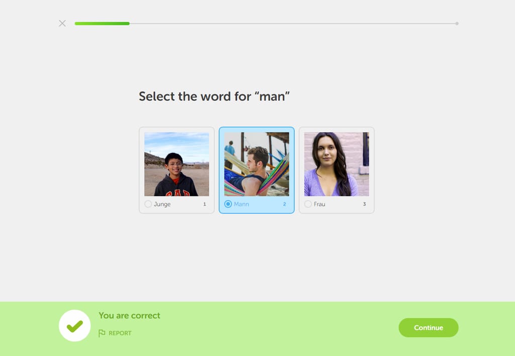
In Designing for Interaction, a usability academic Gillian Crampton Smith offered a concept of four dimensions (or languages) of interactive design. According to Crampton Smith, these languages are the essence of all interactions that help humans and machines communicate effectively. Later, designer Kevin Silver proposed the fifth dimension thus establishing the concept now known as 5 dimensions of interaction design. Designers use them to analyze the current interactions and ask questions within each dimension.1D: Words. This is the language we use to describe interactions and the meaning behind every button, label, or signifier. Words should be clear and familiar to end users, used consistently and appropriately to the setting.

SoundCloud uses effective wording to describe the scope of the service’s functionality
- What words should we use so our end users can understand them?
- Do we use words consistently throughout the interface?
- What meaningful information can we provide to let users know what will happen after they perform an action?
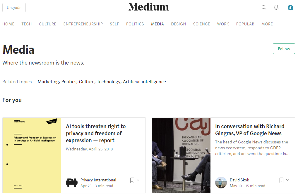
Medium’s clean but distinctive visual style sets the tone for sharing and perceiving textual content
- What feeling are we trying to convey with the chosen visual style?
- What shapes and sizes should we use to evoke an appropriate reaction to our interface elements?
- Are we using familiar formats of menus and forms to boost learnability?
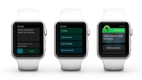
Using Evernote on Apple Watch
- What will users have to do with their keyboards, mice, and touchpads to effectively interact with our product?
- What accessibility issues may people have when interacting with our product?
- Are the interface elements of the right size so mobile users can manipulate them easily?

Animations in Google's material design
- How should the system respond to each user’s action?
- How long is response time?
Duolingo uses simple pre-established paths and reassuring messages
- How do we create error messages that eliminate negative reaction?
- How smooth is our user journey? Are there distractions to shift a user’s focus from the flow?
- What words, colors, sizes, and animations can we use to lead a user to the intended actions?
5. The Poka-Yoke principle
Poka-Yoke is a Japanese term that can be translated as “error proofing.” Originally used in manufacturing, this technique has grown to become a popular model in the lean development approach before transforming into a web design tool. Like many Japanese inventions, poka-yoke is almost an art, creative thinking to avoid false interactions, misclicking, and performing subconscious actions.In real life, you can see the poka-yoke principle applied to sink holes that prevent them from overflowing. Or car alerts that don’t stop until you plug in the seatbelt. In virtual interfaces, the technique is applied when the system asks you to retype a new password.
How to apply it in practice?
- Make high-level administrative actions (like deleting an account) hard to access
- Give a warning before any irreversible action, e.g. that an item will be deleted permanently
- Allow for spell-checking if there’s a chatting element in your product
- Warn a user about the needed number of password characters before the input
6. Norman’s Seven Stages of Action
Design guru Don Norman is famous not only for his hatred of confusing doors. He has also described 7 stages of an action that each person goes through in their everyday life. These stages occur on three levels: goals, execution, and evaluation. Let’s break them down using a simple example.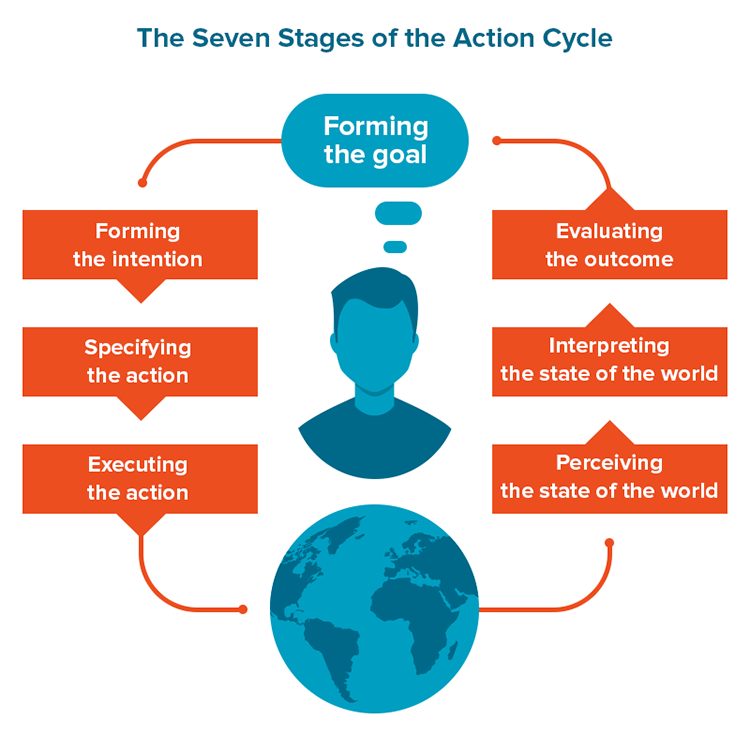
The Seven Stages of the Action Cycle
Stage 1. Forming goals - what do I want to do?Book a hotel room.
Stage 2. Forming the intention - what should I do to meet this goal?
Find a hotel room I like on a booking website.
Stage 3. Specifying the action sequence - how exactly do I achieve this intention?
Open up a browser. Log into Booking.com. Specify my parameters (location, dates, number of guests, other filters). Scroll through the search results. Open the results I like in a new tab to save them for later. Compare the chosen results and find the best option. Click Book, etc.
Stage 4. Performing the action sequence - do the described steps.
Attempt the actions I intended.
Stage 5. Perceiving the stage of the world - use your senses to evaluate how you’re feeling now.
Did I finish the booking process?
Stage 6. Interpreting the perception - figure out if anything changed.
Do I have a confirmation email in my inbox?
Stage 7. Comparing the outcome with the goal - did I achieve my goal?
Yes.
According to Norman, people face two gulfs when using a product: a gulf of execution and a gulf of evaluation. The Gulf of Execution is the moment people try to figure out how to use it. The Gulf of Evaluation is when they’re learning what has changed and whether the action led them to the goal. Norman notes that in many cases, when people are experiencing difficulties, they blame themselves and give up, deciding they’re too stupid. Understanding the psychology of human actions helps us create interactions that bridge both gulfs.
How to apply it in practice?
- Create user journeys according to the assumed action cycles.
- Avoid dead ends and provide additional actions to help users start the cycle over.
- Provide distinctive responses to let users know if they’ve succeeded or not.
7. The Magical Number Seven
Another principle that uses the number seven was devised by psychologist George A. Miller. In 1956, he wrote an article called The Magical Number Seven, Plus or Minus Two: Some Limits on Our Capacity for Processing Information that argues that the average number of items a human can hold in their working memory is 7±2. The working memory is a part of short-term memory responsible for immediate perception and processing. This means that on one exposure, a human can remember 5 to 9 items, namely items of the same attribute.Miller also conceived of the term chunking – breaking up a long string of information into small chunks. Phone or social security numbers are the most common examples of strings that lend themselves to chunking.
Google displays all information is small perceivable chunks
How to apply it in practice?- Place 7±2 items in dropdown menus, navigations, bullet lists, or checkboxes
- Generously use white space instead of punctuation
- Apply the principle only to the information that’s not readily available to read, but rather that which must stay in working memory
The Future of Interaction Design
Back in 1965, co-founder of Intel Gordon Moore predicted that the computing power of devices would be becoming two times faster every two years. It has proven to be true for many decades and only recent re-evaluations concluded that this period now lasts 18 months, not 24, but has reached the performance plateau. It’s curious to notice how much and how little the advancements in electronics have influenced the way we do design.Voice technologies, AR and VR, and Internet of Things devices are changing the way users interact with the virtual world but not changing much of how we design these interactions. Simplicity, mitigating mistakes, making interfaces more accessible and predictable are the ideas that designers both past and present share. This doesn’t mean that there’s nothing else to learn. Computer and cognitive scientists keep working to discover better ways to assist humans and help designers understand them.
What interaction design principles do you apply in your design? And which ones do you think we should cover in an updated article? Leave your comments and suggestions below.

Maryna is a passionate writer with a talent for simplifying complex topics for readers of all backgrounds. With 7 years of experience writing about travel technology, she is well-versed in the field. Outside of her professional writing, she enjoys reading, video games, and fashion.
Want to write an article for our blog? Read our requirements and guidelines to become a contributor.