This is a guest article by Aditya Sharma from Hiration
“Simplicity is the ultimate sophistication.”
– Leonardo da Vinci
A web designer is tasked with creating websites that are engaging and easy to navigate, while fulfilling their objective by helping people, and ultimately increasing the conversion rate. They often end up following trends by using the most common and popular patterns, which can shift the focus from the content to aesthetics.
The functionality of the website suffers when a web designer fixates too much on visual appeal. Users don’t come to a website for the pleasing colors and designs. An easy-to-use UI would be the start of increasing user engagement.
Web designers should strive to strike a balance between making things look pretty and doing things that add value to the website.
Here is a list of 5 common UX mistakes you can’t afford in 2020.
Sticking large headers on top of the webpage
If you don’t know this already, then it might help to know that you’re doing it wrong if you're using large headers on the top of the webpage. It’s a trend that most users hate, and yet it hasn’t died down.
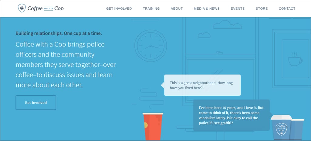
Every day more sites are sticking their brand names at the top of the website and that takes up space that could be put to better use. These make the site hard to navigate by blocking content as you scroll, creating an overall nuisance. There have been instances of websites with headers over 150 pixels in height. These often add no value to a website. Sometimes sticky headers might come with some benefits, but web designers should make an educated decision on what their website needs.
If the client is adamant about using a big header, testing its popularity with the users would be a good idea. Find a balance to ensure that the design does not take over the content. Do not go overboard with the design and ensure that the site can still be browsed comfortably.
You can even opt for a somewhat transparent header to make the user experience better. This can make the content stand out and make the header seem less dominating.
Another factor that is oftentimes overlooked is the sticky header UX concern when browsing on mobile.
Unlike high-resolution computer displays where sticky headers can accelerate user interactions, mobile devices can slug it down. However, responsive design techniques can be deployed to resolve design problems for different platforms.
So, for mobile devices, a hamburger menu could be a better option to optimize the use of space on a page.
The fixed header on this site is less than 80 pixels tall. The smaller size does not hinder navigation.
Using lean, light fonts
Recently, thinner fonts have gained popularity because they look trendy and are easy on the eyes. Today’s advanced screen technology and improved performance might make you think this a perfect scenario. However, light typefaces can mess with the UX and cause poor readability.
Poor readability is one of the biggest failures in UX, and using lean and light fonts to simply keep with the trend will mean that your website user experience will suffer.
It’s just not worth it.
For example, did you know that iPhones and iPads with retina displays do not support thin typefaces well and can make the text hard to read? Other displays may also face challenges while rendering light fonts. The trendy looks will benefit no one if the text is not even intelligible. So rather than trend-chasing, designers should find a combination of size, weight, and color that will work across every display.
To avoid this mistake, it's a good idea to test the site on various devices and screen sizes before rolling out content. You can also provide a thicker font for mobile users while keeping the thin style for your desktop readers.
The answer lies in the balance. Taking a middle ground that satisfies both mobile and desktop UX is something that you should strive to do if you aren’t doing it already.
How to do it right:
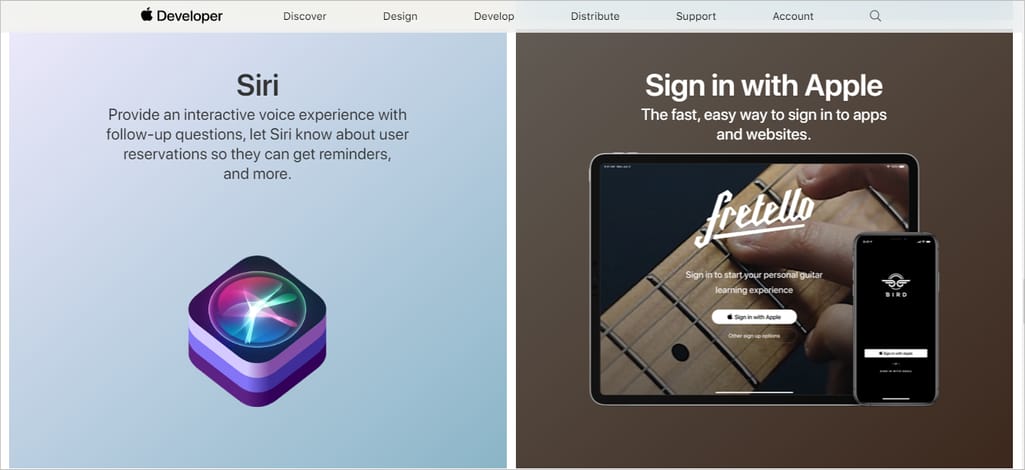
Apple explains it perfectly by saying, “Above all, text must be legible. If users can't read the words in your app, it doesn't matter how beautiful the typography is.”
The example below of the Apple Developer shows how to use legible fonts to get your information across to the user.
Trying to be minimalistic by lowering text contrast
While lowering contrast may appear ‘minimalistic’, in reality, it hampers the UX. Using low contrast elements gives the illusion of minimalism and designers opt for this shortcut because putting in actual work takes time and effort.
When combined with thin typefaces, lowered text contrast makes for appalling readability.
How to do it right:
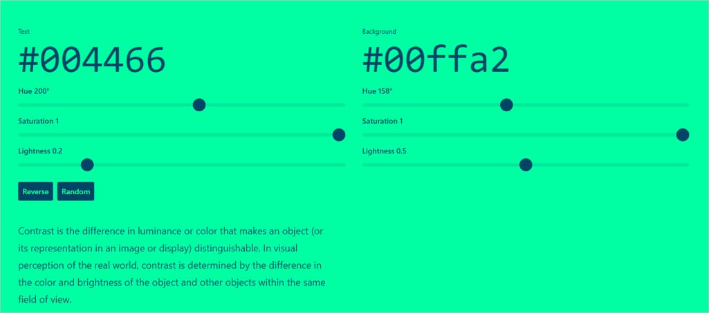
You can find a simple solution in tools like Colorable. Use it to test the text contrast so you know your text contrast is set according to the Web Content Accessibility Guidelines.
Colors can be adjusted once the right contrast has been set to meet the desired look. Running a test on multiple devices would be ideal to ensure that the text is readable across every device.
Seizing control of scrolling
Also known as “scroll hijack,” this trend lets websites seize control of page scrolling (employing JavaScript). Users lose control of page scroll as the website starts displaying unpredictable behavior. This can sow seeds of possible deceit in the minds of users.
Before borrowing this trend for your website, make sure you test it on real-world users, especially the ones that fall in your target audience. Don’t make simple mistakes that could have been easily avoided by simply putting up a prototype of your website to see whether scroll hijacking is right for you or not.
How to do it right:
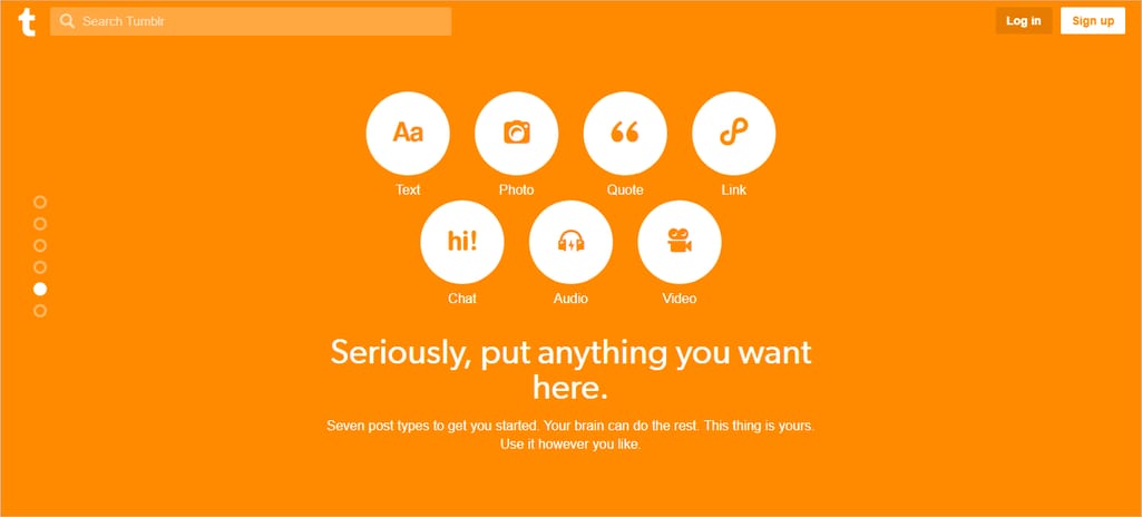
It works for Tumblr as it is largely targeted towards younger crowds. The homepage of Tumblr hijacks scrolling to take users to the next section. It works because the homepage gives control to the user by making the homepage feel like a big vertical menu display that one can look through endlessly.
Displaying carousel-like slideshows on the landing page
Several websites display a slideshow for an assortment of content on their landing pages ranging from simple pictures to informative content. Nielsen Norman Group has even gone on record stating, “People often immediately scroll past these large images and miss all of the content within them.” This means that if the slideshow offers any valuable information, most users are missing out.
The idea, however lucrative, can backfire as the user doesn’t have any control over when the slide changes and not everyone is going to pay attention or read at the same speed. It can be of immense value in engaging users if used correctly.
However, most carousels are purely ornamental and are being put up purely out of FOMO. Website designers can make a pros-and-cons list and only keep the carousel on the website if the pros list is significantly larger than the cons list. And if you are determined to keep it, make sure that the ‘next’ and ‘previous’ arrows have good visibility across every device, no matter how big or small.
There are often dots indicating the next slide which are hard to click on because of their size and low visibility. However, the carousels without any option to change slides are the worst for UX.
How to do it right:
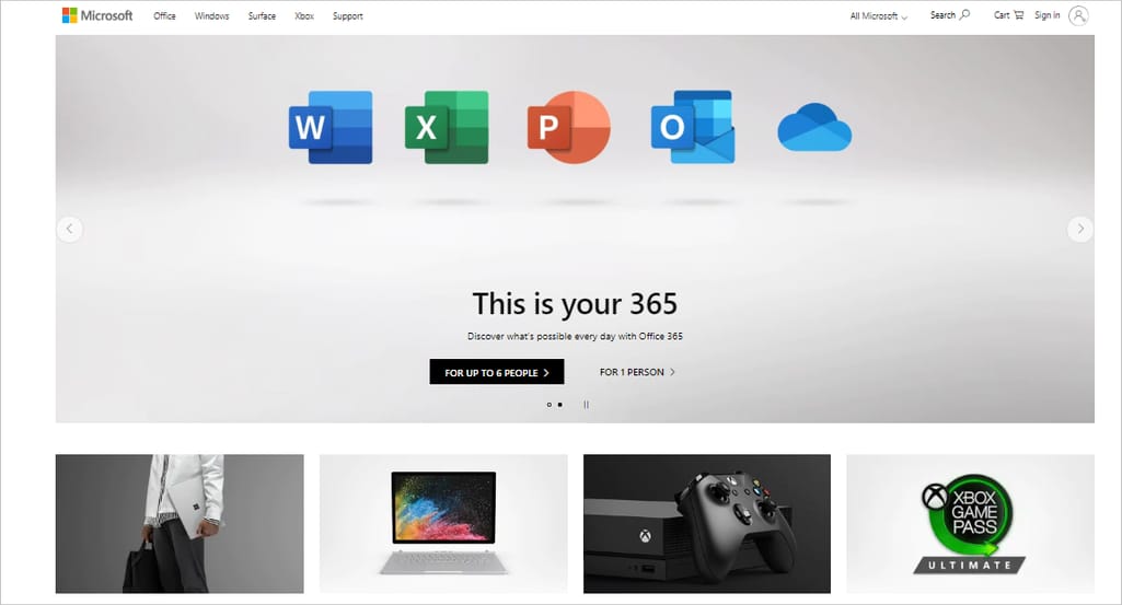
Microsoft has mastered the carousel feature.
It is minimalistic and has the desired impact by featuring only two slides. The pause button gives the user more control and the clearly visible left and right buttons give it excellent accessibility.
Conclusion
With new fads being introduced in the market at breakneck speed and clients demanding the world from their designers, UX can suffer a beating.
Analyze these trends carefully before borrowing them for your website as any lapse in judgment can mess up UX. Innovation is key and simple practices such as testing your designs with real-world users can help avoid drastic UX mistakes.
Trends will keep changing with time but catering to user experience will never go out of style. Balancing aesthetics with efficiency and usability is the key to unlocking matchless UX.
Remember that on the Internet, similar content can easily be found elsewhere. What users are looking for is a quick and efficient way to get things done. So, you could have the raddest color scheme and the hippest scrolling animation, but if the usability of your website is poor, you are bound to lose users.
To ensure that user interaction does not suffer, avoid these 5 UX mistakes when designing a web page:
Using big sticky headers on the top of your landing page or homepage can hinder UX as it blocks content and gives the website an uncomfortable claustrophobic look.
Using thin typefaces can cause poor readability across many devices.
Lowered text contrast can also hinder readability. Try to avoid it as much as possible.
Scroll hijacking if done incorrectly can frustrate users and cause them to quit visiting your website altogether. Give your users the space to breathe and take charge of what they want to read and where they want to go.
Carousels like slideshows displaying pictures or information can also be bad for UX, especially if the ‘next’ and ‘previous’ arrows have poor visibility or if you use dots instead of arrows that are too small to click on.
On a quest to help professionals across the world land their dream jobs, Aditya lives and breathes Hiration — an AI-powered online resume builder and platform to help job-seekers find their way in the treacherous job market — where he’s a Co-Founder and the unofficial CPO (Chief Problem-solving Officer). He likes to code away his days and nights when he’s not busy disrupting the career space.
Want to write an article for our blog? Read our requirements and guidelines to become a contributor.


 On a quest to help professionals across the world land their dream jobs, Aditya lives and breathes Hiration — an AI-powered online resume builder and platform to help job-seekers find their way in the treacherous job market — where he’s a Co-Founder and the unofficial CPO (Chief Problem-solving Officer). He likes to code away his days and nights when he’s not busy disrupting the career space.


