

The requirements for a comfortable mobile experience change every day. Face and fingerprint scanning is transforming the way users access their phones and make online purchases. The size and dimensions of the latest Samsung Galaxy dictates how people manage information on a screen. And the advancements in voice assistant technology may soon eliminate typing altogether. This is a truly transformative age to live in - the age where users’ desires are transforming technology and technology is transforming users’ expectations.
Google, one of the main UX trendsetters along with Apple, describes the main UX principles for mobile apps in these four stages:
- Adopt - principles aimed at directing a user’s initial experience with a product, creating positive onboarding and effortless learning
- Use - focusing on a user’s goals and expectations, providing error-free and effective task completion every time
- Transact - converting seamlessly and securely, implementing one-click payments
- Return - engaging a user and staying relevant in a user’s everyday life
Our user experience experts share their mobile app design principles, which follow Google's logic.
Adopt: One Chance to Make the First Impression
A research by Localytics shows that 24 percent of users never return to an app after the first use. But proper onboarding decreases this number to 9 percent with 61 percent of users returning to an app eleven or more times. So how do we establish a proper onboarding process?
1. Fast and practical splash screens
A splash screen is the first thing a user sees when loading your app. Typically, it’s a simple screen with your logo, the current version of your app, and a loading animation. That’s also where you can put actionable tips to showcase your app’s core functionality and how it can work in a user’s life. But don’t overwhelm customers with all elements of your broad functionality. A long tutorial is boring and it will deprive users of the joys of exploration.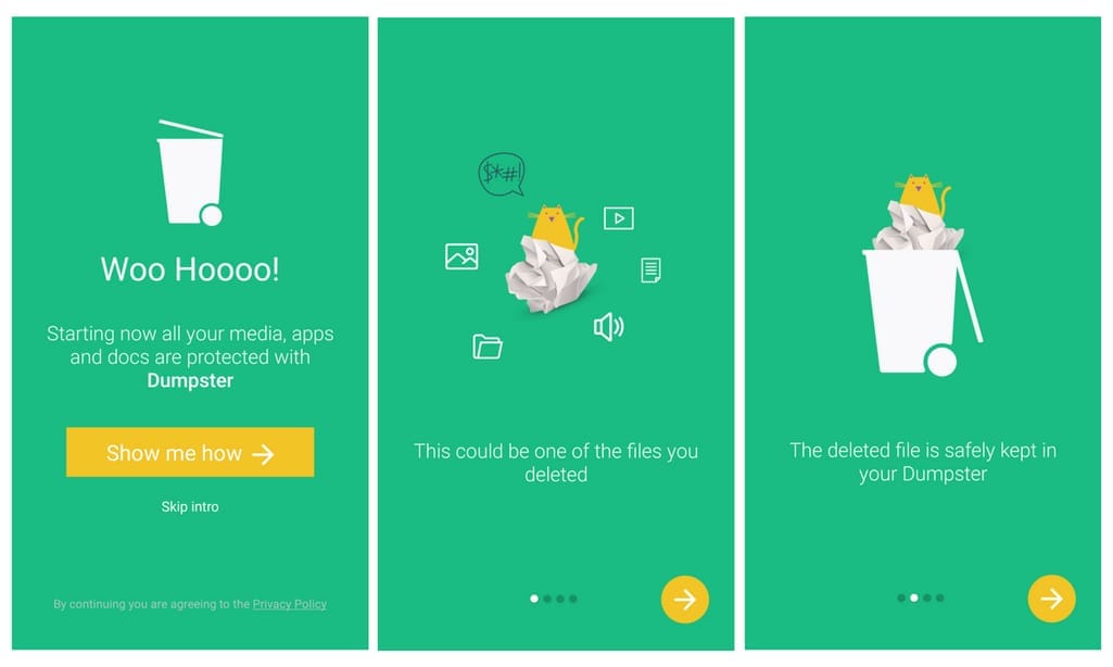
You can watch or skip Dumpster’s simple intro
2. Simple registration
Forcing users to create an account before they explore a product will cost you 85 percent of your potential customers. And those who do sign up won’t necessarily give their valid information since they don’t know how it will be used. It’s a good practice to let users look around as a guest first and then register on their own terms when they’re ready or when functionality requires some minimal data. Show them the value registration will provide such as saving the liked items or an omnichannel experience across platforms. And if you can’t avoid registration, use social login to allow users to enter with their existing Facebook or Google ID.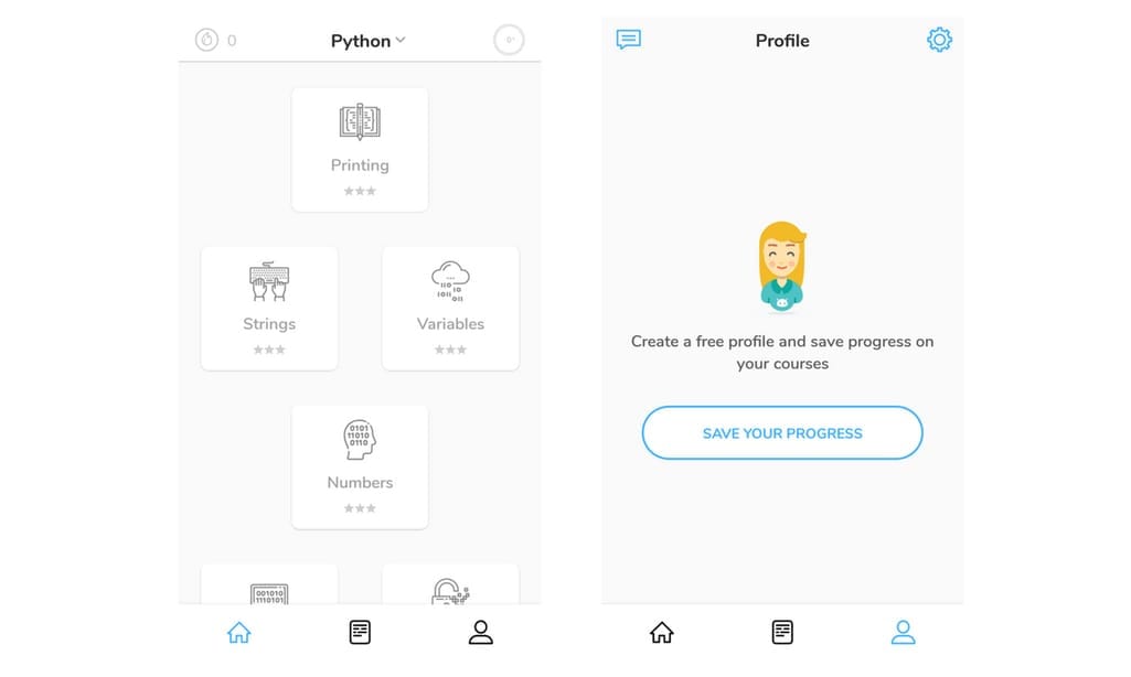
Py allows you to access its free lessons but you must register to save progress
3. Successful training
If a user took the time to download your app and register, you should satisfy their expectations and help perform a task they came for. If your app has complex functionality or unconventional gestures, guide them through their first interaction and offer to create a “test” task. If an app is empty and needs to be filled with user content - such as a notes app - show them how to create, edit, and delete their first note.
4. Unintrusive permissions
For some apps, the access to a phone’s camera, geolocation, or similar feature upfront is critical. But even in this case, it’s bad practice to ask for permission as a user first loads an app. Besides explaining why your app requires this data and how it impacts the experience, ask for a permission only in context.
Photo-editing app VSCO requires camera access only when users choose to use an internal camera. However, they can still upload and edit pictures without additional permissions. When a person is already engaged with an app, she feels more comfortable giving permissions. Remember: If the access was denied and an app can’t properly perform, you should explain why and how a user can enable permissions on a device.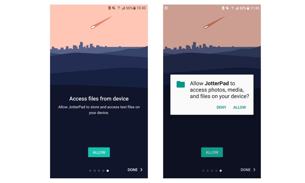
JotterPad gives a heads-up before directly asking for permission but doesn’t explain why it needs it
Use: Completing Tasks and Meeting Expectations
Today a smartphone is our primary tool for accessing information. At this stage, UX design needs to help users perform their tasks quickly and easily, ensuring that they find your app useful and meaningful.
5. Addressing a user’s goals
Minimalism in design doesn’t end at simplified visual elements. It expands to the volume of an app’s functionality. Your users’ desires that you’ve defined through user research must be the key functions of your app. Whether it’s a productivity app, a hotel booking app, or a social one, don’t distract users with functions that will not be used on mobile.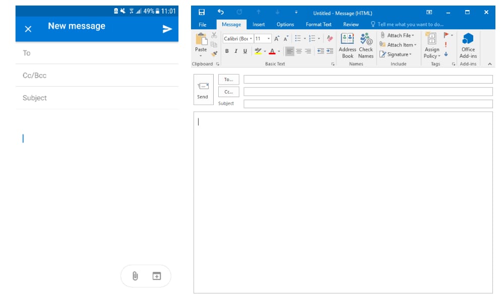
Outlook's mobile version has far fewer bells and whistles than its desktop version
6. Unique mobile possibilities
Mobile apps allow users to do a lot of stuff websites can’t. They can work offline, send notifications, and utilize the features a phone already has like GPS and camera. The creative freedom available for app UX designers allows you to expand the ways users can experience your product. When Apple introduced 3D Touch in iPhone 6s - a new type of gesture control that can sense the amount of pressure - it allowed the creation of more intuitive functions and assignment of different tasks to the same elements. Maybe your business can follow the Ikea path and benefit from the new AR capabilities. While it takes time for a user to learn the full set of your smart gestures, you can use the principles of human-centered design to detect how to make your product easy and intuitive to use.
7. Designing for fingers, not cursors
Despite smartphones becoming larger and laptops being equipped with touchscreens, the desktop and mobile experiences are essentially different. On mobile, use multiple choice instead of typing, enlarge buttons to fit big thumbs, and generously implement swiping and scrolling for comfortable one-hand use. The well-known thumb sweep chart indicating that people can’t reach the top of the screen is no longer applicable to modern phones. People are changing how they hold their phones that depends on the context, so adjust your functions to be in line with how users will interact with your type of content.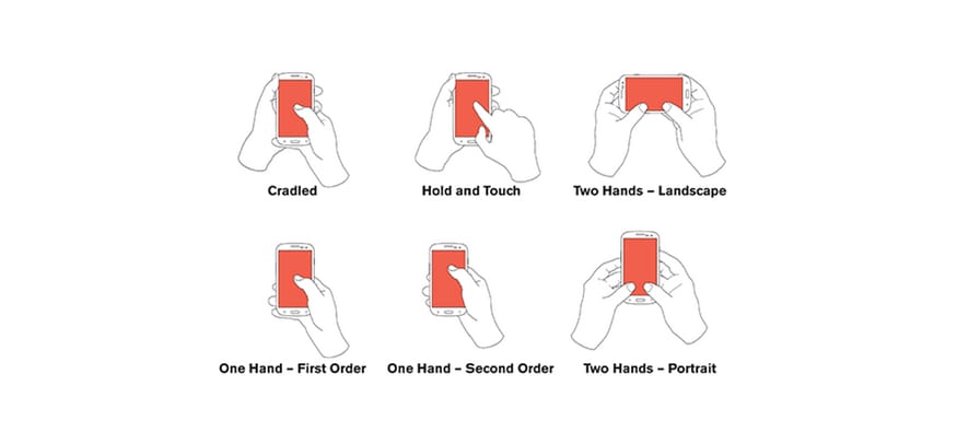
Common ways people hold their phones matters Source: UXmatters
8. Seamless transition between platforms
Not all tasks can be comfortably performed via mobile. People like using smartphones and apps for quick search but they switch to their desktop for product comparison. Despite the growing domination of mobile usage, desktop visits last three times longer. Use mobile apps to highlight the features needed on the go like getting directions to the closest store and sending notifications, and leave rich content to desktops and tablets.
9. Positive offboarding
While most of the advice for app design is focused on making sure a client will stay, ending customer relationships on a positive note is just as important. Give users direct guidelines on how they can delete an account or get a refund. This will establish their trust and make them more willing to share their reasons for leaving. Don’t make this process overly complicated. Instagram, essentially a mobile service, doesn’t allow you to delete an account via the app. Similarly, you can’t unsubscribe from Audible on mobile. When inviting users to register or subscribe to a service, remind them that they can roll back at any time, and keep the promise by providing transparent and easy-to-find deactivate buttons.
Transact: Secure and Convenient Payments
Simple, transparent, and secure are fundamental features of the transaction experience on mobile. It’s not your goal to make users start shopping exclusively via mobile, but rather focus on the aspects of mobile payments that attract customers the most.
10. To-the-point payments
Typically, people who make payments via smartphone prioritize speed. The express payment options such as Apple Pay, Android Pay, and PayPal are essential for mobile commerce. Other ways to speed up check-outs are scanning a card number with the camera and making recurring billings automatic.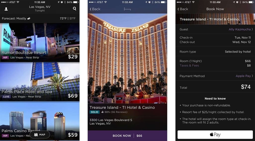
Hotel Tonight employs straightforward, one-click booking Source:iMore
11. Emphasis on security
Many people have concerns about entrusting apps with private data since they can lose their phones or access an unsafe Wi-Fi network. Though the biometric technology is expected to become the safest payment confirmation method, its near adoption in our everyday life is uncertain. Make sure you incorporate time-outs, complex password requests, and two-factor authentications, and let users know they’re protected.
According to Appticles, 37 percent of users do research on mobile but switch to desktop to complete a purchase. To keep this process secure but make it less tiresome on mobile, use step-by-step navigation, affirmations, and eliminate errors with card scanning via camera. Digital content, clothing, and tickets are among the top types of purchases people make on their smartphones compared to the desktop.
12. Immediate feedback
As users go through the payment process, they need reassurance that everything is correct at every step. Display progress bars, use textual confirmations, animations, and other visual clues. End a transaction with a positive affirmation and a follow-up action.
Return: Becoming a Part of a User’s Routine
Mobile apps are a perfect medium for repeated interactions - their constant presence on a user’s device encourages loyalty to a brand and allow for accessing data fast. However, the mere fact that it’s useful and functional doesn’t mean that a customer will keep using it regularly. How do you increase engagement and grow retention rate?
13. Relevant notifications
Almost 50 percent of users are grateful for notifications that remind them of important things and enhance productivity. To make sure you don’t annoy the other half, adopt clever, personalized, and varied notifications. Gather data about the patterns of app usage and which types of notifications attract the most engagement to create a schedule relevant to a user.
14. Narrow-focused widgets
A widget is a simple application that serves as an extension of a bigger app already installed on a device. Creating a widget is a simple and effective way to boost engagement, but you also should apply some UX rules. Provide only narrow functionality via a widget to allow users to access important data or quickly start a new task.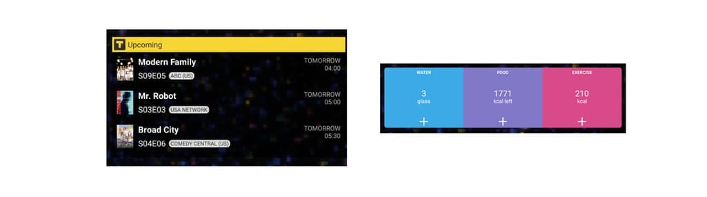
TV Time’s and Lifesum’s widgets display useful information directly on the home screen
15. Personalization
Offer personalized content depending on different user groups, a user’s location, and their past searches and purchases. Allow customers to choose the types of content they want to see and hide the undesired ones. Make it possible for users to create their own categories of content and manage it to their liking. By offering experience tailored to each user’s lifestyle, you foster emotional connection to an app that will result in increasing retention rate. Mobile UX analytics is your number one tool for identifying bottlenecks and areas of interest.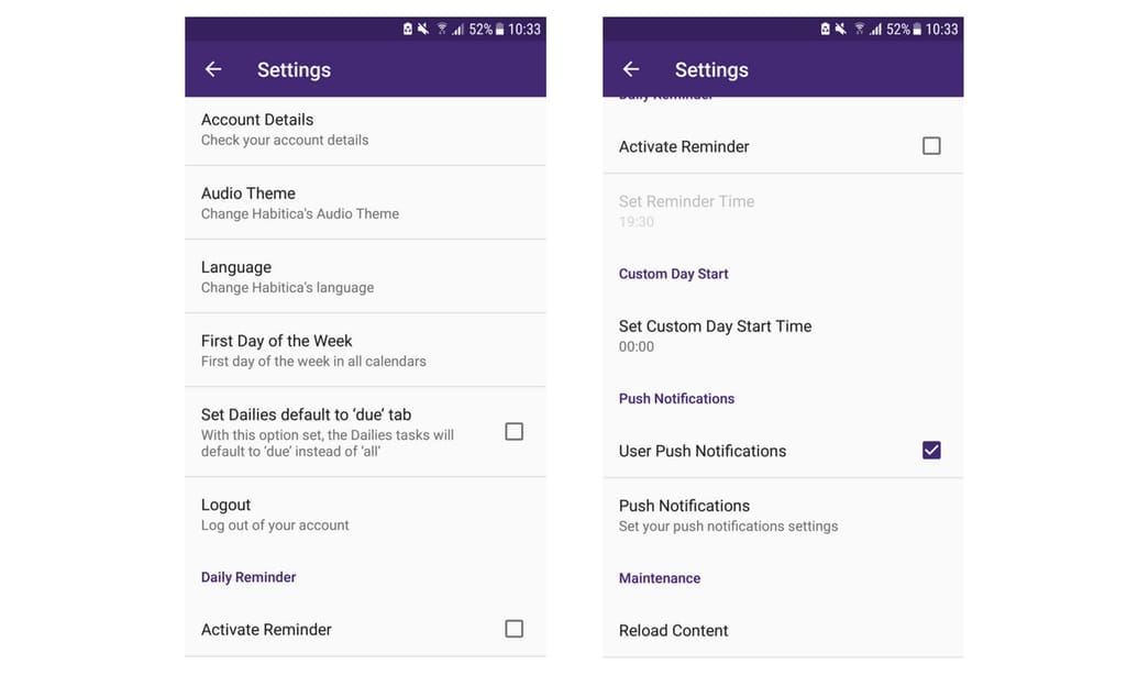
Habitica allows users to customize the calendar and even the audio theme
Final Word
As soon as the first iPhone Xs reach their users on November 3, the face of smartphone-human interactions will change again. Animoji, 3D emojis capable of repeating your facial expressions, may soon become a new normal in social sharing and messaging.
People are getting used to high quality apps with polished design and usability principles in place. In a mobile-first world, to create an app means to go farther than competitors - not only in a number of unique features, but also in an effort to linger on a user’s device longer. To do that, you must know your audience’s expectations and everyday struggles if you expect to deliver a relevant and personalized experience.

Maryna is a passionate writer with a talent for simplifying complex topics for readers of all backgrounds. With 7 years of experience writing about travel technology, she is well-versed in the field. Outside of her professional writing, she enjoys reading, video games, and fashion.
Want to write an article for our blog? Read our requirements and guidelines to become a contributor.