Let's make a bold assumption: Every software product you regularly use is data-driven. Example? Uber, Spotify, Amazon, Facebook, Netflix, the AltexSoft website you’re viewing right now – just to name a few. To deliver the most value and encourage your return and loyalty, executives of companies like to start their weeks by looking at metrics – pieces of quantifiable data that illustrate the changes in revenue and customer behavior.
Of course, knowing these changes exist won't solve anything. Netflix's ex VP/CPO Gibson Biddle, explained that they used data to hypothesize and then A/B test assumptions to find out what worked. That's exactly how Netflix decided to replace their 5-star rating system with simple like and dislike buttons, introduce the "percentage match" of the movies, and majorly simplify the UI.
This article will introduce you to metrics and KPIs to track your product success. While they will give you the knowledge, the real power lies in how you learn from them, interpret them, hypothesize, and spark change.
If you're new to product management, you may spend some time with our YouTube video to learn more about it and then get back to the article.


How product management works
KPIs and metrics for product management
Metrics and KPIs are quantifiable measures that allow businesses to define and track the success of a product or a business activity. Metrics usually assess the performance of specific business aspects, providing granular, operational details. Meanwhile, KPIs – or key performance indicators – help measure performance in connection with strategic business objectives.
Metrics and KPIs help build a product roadmap and plan business strategy. Throughout the product lifecycle, they allow stakeholders to assess how users interact with the product, find areas for improvement, benchmark performance, and make informed decisions about further actions.


In this post, we’ll look at the most popular product management metrics and KPIs that help assess the performance of various digital products.
Below is a list of what we’re going to discuss, and we’ll start with what usually matters most – the money.
- Average revenue per user (ARPU), monthly recurring revenue (MRR), and annual recurring revenue (ARR)
- Customer Lifetime Value (CLTV or LTV)
- Customer Acquisition Cost (CAC)
- Retention rate
- Conversion rate
- Traffic (paid/organic)
- Daily Active User and Monthly Active Users
- Stickiness
- Average session duration
- Bounce rate
- Number of sessions per user
- Number of user actions per session
- Net Promoter Score (NPS)
- Earned growth rate (EGR)
- Customer Satisfaction Score (CSAT) and Overall Satisfaction Score (OSAT)
- Customer Effort Score (CES)
Financial metrics to measure product success
Let’s face it: Stakeholders care most about the bottom-line since, well, money is the main indicator of business success. However, revenue alone isn’t enough to evaluate product performance. Such metrics as customer acquisition cost (CAC) and customer lifetime value (LTV or CLTV) are nonetheless important to understand the factors that impact your profitability.
Average revenue per user (ARPU), monthly recurring revenue (MRR), and annual recurring revenue (ARR)
Average revenue per user (ARPU) is how much revenue you get from one user in a specific period of time (e.g., month, quarter, or year). ARPU is an essential metric for any digital product, from eCommerce websites to online games to travel apps.
To calculate ARPU, divide the total revenue per period by the number of users. The total revenue can include subscription fees, one-time purchases, and additional revenue streams like upsells, cross-sells, or advertising.
APRU = Total revenue / Total number of users
While ARPU is a universal metric, for subscription-based products, monthly recurring revenue (MRR) and annual recurring revenue (ARR) are more revealing. MRR is the total revenue a company expects to earn from subscriptions in a given month, while ARR is the amount for a year.
There are several ways to calculate recurring revenue. The simpler one is multiplying ARPU by the number of subscribers. However, if you want to be more accurate, sum up the subscription fees from all of your current customers, add gained revenue from new subscriptions and upgrades, and subtract downgrades and churned revenue from lost customers.
MRR = APRU x Number of accounts in a month = sum of current monthly subscriptions + revenue from new subscriptions + upgrades - downgrades - revenue from lost customers
Note that MRR and ARR only account for recurring revenue, so don’t include one-time purchases, transaction fees, or paid trials in your calculation.
How to use ARPU, MRR, and ARR. All revenue-related KPIs are crucial to track as they allow you to monitor a company’s current health, measure growth, and make data-based forecasts. For more granular insights, calculate these metrics for different customer segments. This way, you’ll see which user group generates more revenue and make necessary adjustments to your marketing strategy.
Customer Lifetime Value (CLTV or LTV)
These metrics allow you to calculate how much money a user will generate in the long term. LTV displays an average revenue from one user before they cancel a subscription. The point of this KPI is to show you the long-term value of your customer base.
To calculate CLTV, you have to multiply the average duration of a customer’s lifetime (how long people normally use your product) and the average revenue per user (ARPU).
CLTV = Average customer lifetime x Average revenue per user (ARPU)
How to use CLTV. Track this metric to test and select customer acquisition channels, purchasing cycles, and retention strategies. CLTV is also often used in conjunction with customer acquisition cost.
Customer Acquisition Cost (CAC)
This metric covers all the costs spent on attracting customers, i.e., marketing campaigns, sales resources, advertising, commissions, etc. Also, include the salaries of marketing and sales professionals, whether in-house or third-party.
To calculate CAC, divide the total amount of your sales and marketing costs in a period by the number of acquired customers.
CAC = Total sales and marketing spending / Number of new customers
How to use CAC. Use CLTV and CAC to calculate the unit economics of your business. These metrics allow you to identify whether customers bring you less revenue than what you spend on them and whether it’s time to reconsider pricing and product marketing strategy to attract more users. A good CAC to CLTV ratio is 1 to 3 or 1 to 4.
Besides calculating the overall CAC, it’s worth defining the CAC across different sales channels to compare their performance.
Also, benchmark your CAC to your compset to make sure you’re not overspending. The average CAC will vary greatly across industries. For example, in the B2B SaaS sector, the average CAC is $239. Check out the recent First Page Sage report to get more estimates.
Other financial metrics worth paying attention to are operating costs, gross/net margins, and return on investment. As for overall business success, monitor the market share of your company to understand its position among competitors.
Customer loyalty metrics
A bird in hand is worth two in the bush.
Customer acquisition is definitely important, but customer retention is absolutely vital. It’s common business knowledge that existing customers have to be cherished and nurtured as they are much more likely to buy than new ones.
If you know your customer acquisition cost, you know how much it takes to attract a new user. Your current clients are much more likely to try a new feature, switch to a better plan, or take part in an interview for user research, so it makes sense to focus on retaining them. Besides, retained customers often become your brand’s advocates and bring in new ones – at no cost!
So let’s talk about loyalty – or retention – metrics.
Retention rate
Customer retention rate (CRR) is the percentage of customers who stay with the company after a certain time period. You can base your calculations on the number of downloads or first logins to the app.
Retention rate = (Customers at the end of the calculated period - New customers) / Customers at the start of the calculated period
How to use retention rate. It can help you understand whether your product actually delivers ongoing value to your customers. A decrease in retention rate can be a sign of external changes (e.g., new competitors) or internal issues (e.g., poor customer service). In any case, you must find the reasons behind the decline as well as the ways to fix it.
Besides improving the product itself, think of some extra ways to make your users happy. Some ideas worth considering are offering discounts, personalizing your communication and promotions, developing loyalty programs, and enhancing customer service and post-purchase support.
Churn rate
While the retention rate measures the percentage of users who stayed, the churn (or attrition) rate measures those you’ve lost. This metric is especially important for subscription businesses.
There are two ways to approach churn rate. You can track
- customer churn (number of users who canceled paid subscriptions) and
- revenue churn (amount of revenue lost due to customer churn).
To measure customer churn rate, take the number of customers lost during a certain time period and divide it by the number of customers at the beginning of this time period.
Customer churn rate = Customers lost / Total customers
If you want to discover revenue churn, divide the amount of revenue from lost customers by the total revenue at the beginning of the period.
Revenue churn rate = Revenue from lost customers / Total revenue
How to use churn rate. In terms of business success, it’s more effective to pay attention to revenue churn than to customer churn. However, customer churn rate can tell you a lot about customer satisfaction. So treat retention and churn rates as your guides as you change your offerings. For example, if you measure the churn rate after introducing a new subscription plan or applying a new feature, you will understand how users react to the change.
Also, remember that there are rare cases when churn is a good sign. A bright example is Hinge with the slogan “the dating app designed to be deleted.”
Visit our article about customer churn prediction to learn how machine learning technology can help make precise forecasts.
User engagement metrics
Albeit less relevant to stakeholders, customer-oriented metrics will show you how your product development and marketing efforts transform into user interactions. How many users find and use your product? How much time do they spend using all of its features or a particular one? How do customers react to a specific action or feature? Also, these metrics include data on those who stopped using a product abruptly (bounce rates).
Conversion rate
Conversion rate measures the percentage of users who take a desired action, such as signing up for your product, making a purchase, downloading an app, or upgrading to a premium plan.
To calculate it, divide the number of “converted” users (the ones that completed the action, e.g., clicked the ad) by the total number of people exposed to a call to action (e.g., website visitors).
Conversion rate = Number of converted users or visitors / Total number of users or visitors
How to use conversion rate. This metric directly reflects the efficiency and effectiveness of your sales and marketing efforts. A high conversion rate indicates that your strategies are working well, while a low rate suggests that customers don’t find what they need and there’s still room for improvement.
It also allows you to assess cost efficiency. Higher conversion rates mean you can acquire customers at a lower cost.
Conversion rate optimization often involves A/B testing or split testing different variations of landing pages, calls to action, or marketing messages. This allows you to refine your strategies based on data and user feedback.
Traffic (paid/organic)
This KPI mostly applies to websites, while for applications and software, the number of users is more relevant. Traffic shows the general number of people who found and visited the website.
While organic traffic reflects the number of visitors who found a webpage via search, paid traffic counts those who visited it from paid sources, for example, paid search, social media ads, or sponsored content.
You can check the website traffic on a number of SEO platforms like Semrush, Ahrefs, or SerpStat. These tools can give you traffic estimates of your and your competitors’ websites. But to get the most precise traffic figures, we recommend you use Google Analytics and Search Console.
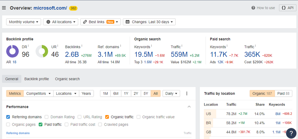
How to use a traffic metric. Analyzing traffic and its dynamics will give you insights into the effectiveness of your marketing strategies. Paid traffic will allow you to find out how your ads and other promotions perform and how accurate your targeting is.
Daily Active Users (DAU) and Monthly Active Users (MAU)
For most digital products, the most valuable metric of product growth is the number of users or subscribers. But what matters even more is the number of active users. Metrics of this category track how many unique visitors or users you have per day (DAU) or per month (MAU). A unique visitor is one who visits a website at least once within a given period of time.
Daily Active User (DAU) – the number of active users per day. An “active user” is one who signed in to an account and performed some activities.
Monthly Active User (MAU) – the number of users who interacted with your product at least once during a month.
This KPI is applied to mobile apps, online games, websites, and social networks. A unique user is defined by ID and login.
How to use DAU and MAU. These metrics gauge how frequently users interact with your product. Higher numbers typically indicate stronger user engagement. They also help you track the growth of your user base over time. By comparing current and historical DAU and MAU figures, you can assess the success of marketing campaigns and product improvements.
Low DAU and MAU numbers can signal issues with the user experience, content, or value proposition.
For products with a revenue model tied to user activity (e.g., advertising, in-app purchases), DAU and MAU metrics are essential for estimating potential revenue and optimizing monetization strategies.
You can segment DAU and MAU data by user type, location, or other factors to gain insights into user behavior and tailor your product's features and content accordingly.
Also, comparing your DAU and MAU figures to industry benchmarks or competitors can help you assess your product's performance in the market. For example, according to Databox’s Google Analytics 4 benchmark report, the MAU for SaaS B2B companies is 2.51K. For the sake of comparison, Netflix boasts an MAU of 23 million as of January 2024 – that’s a daunting number to strive for.
Stickiness
Stickiness is a metric that complements DAU and MAU, showing the percentage of users highly engaged with your product. It reflects the ability of a product to retain its users over time and encourage frequent or repeated usage.
Stickiness is basically the DAU/MAU ratio and is calculated by a simple division.
Stickiness = DAU / MAU
How to use stickiness. Stickiness is highly related to retention and user satisfaction. If a significant percentage of users frequently interact with your product, it means that the product has successfully retained its audience and your customers are happy with it.
Monitor stickiness as you make changes to your product or employ engagement strategies to see users’ reactions.
In general, the higher the DAU/MAU ratio is, the more successful your product can be considered. However, the benchmark varies greatly across industries and product types. For example, while you might use WhatsApp or Facebook daily, you might only take an Uber ride once a week or book through Airbnb twice a year. So make sure to compare apples to apples and benchmark to your nearest compset.
Average session duration
This KPI is another way to track engagement and digital product usage. It shows the average time users spend interacting with your product (usually a website or online platform). Basically, it’s a period of time between the moment a user opens the webpage or app and the moment they exit or close it.
The best way to measure it is to take the total time users spend on your product and divide it by the number of sessions. If you use Google Analytics, it calculates this number for you.
Average session duration = Total sessions duration / Total sessions
How to use the session duration metric. Generally, longer session duration is better as it’s a sign that users spend more time on your product. But again, the “normal value” will vary. For example, people usually spend more time shopping on an eCommerce platform than reading the news or checking the weather.
It’s also important to use the session duration metric together with other indicators. If you calculate the session duration of a group of bounced or churned users, you may find a clue on how to improve user interaction and understand what made them stop using a product. And again, to get a deeper dive, you can analyze the number and duration of sessions by channels to see which ones are more engaging.
Bounce rate
Bounce rate is the percentage of users who visited only one page of a website or app and left without engaging with it.
Please note that if you use the Google Analytics tool, the definition of bounce rate has slightly changed in GA4 compared to UA, the older version. In UA, bounce rate accounted for users that visited the webpage but didn’t interact with it in any way. GA4 now counts bounce rate as the percentage of sessions that were not “engaged.” Engaged sessions are the ones that last 10 seconds or longer and have conversion events (clicking links, opening new pages, etc.).
How to use bounce rate. You don’t want a high or growing bounce rate as it means that your customers aren’t interested in your product or didn’t find what they were looking for on the website. In this case, you’ll have to figure out the reasons behind it. For example, you can use website heatmaps and session recording tools to study how users interact with your product.
Also, conduct surveys and ask for customer feedback. It might turn out that the navigation is unintuitive, or maybe users don’t like the website design or messaging, or the call to action isn’t obvious. Run A/B tests to find the better-performing design. All this feedback will help you optimize your product, reduce your bounce rate, and increase user attention.
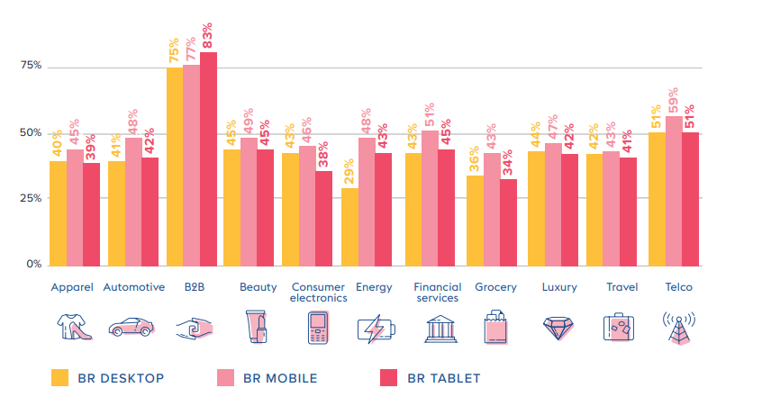
Bounce rate by industry. Source: Digital Experience Benchmark Report by Contentsquare
Besides, remember that Google’s algorithms take the level of user engagement into account when ranking pages, so if you want a good position in a search list, put extra effort into making your website appealing to visitors.
Metrics to measure product/feature popularity
One of the central product manager's responsibilities is to lead the product development workshop, where a product team works on the ideation of new features and UX design. To make relevant decisions, you need convincing data on product and feature usage. Two key metrics here are the number of user actions and sessions per user.
Number of sessions per user
This metric helps understand key user behavior: how often users come back and use the site. It can be tracked with statistics that display the number of logins or site visits. This KPI reveals the popularity of a product – if the audience engages with it again and again. Unlike traffic or session duration, the number of sessions per user shows an average for a particular group of people in some time period.
To calculate the average number of sessions per user, divide the total number of sessions in a period of time (e.g., a month) by the number of users in this period.
Average number of sessions per user = Total number of sessions / Number of users
How to use the number of sessions per user. This metric basically reflects whether users are coming back to your online resource. Research states that the average number of sessions per user is 1.4, so anything above that generally means your website is performing well (though of course, it depends on the industry and product type).
Compare this data across different groups of users or visitors (retained and churned) to understand your customers better. Monitoring this metric can help you predict user behavior changes before churn and prevent it.
Number of user actions per session
This KPI seems similar to the previous one, but it tracks not just how many times a user opened an app or a webpage. It displays which actions a user made and which feature(s) they used while using your product.
How to use the number of user actions. This metric can help you understand how intuitive your product’s design is and which features are the most popular. Track this metric together with retention and churn rates to get an idea of what makes the users interested in your product.
Also, use this data in A/B testing to make decisions about product features and its information architecture.
Metrics to evaluate user satisfaction
Churn and bounce rates, traffic, and retention rate tell about customer perception of your service or product indirectly. The primary way to learn if the customers are happy is direct customer feedback. Here are some of the essential user satisfaction metrics that can be obtained via surveys.
Net Promoter Score® (NPS®)
Net Promoter Score or NPS measures the number of loyal customers who are likely to recommend a product (promoters) vs those customers who hate it (detractors).
To calculate NPS, ask users to rank your product from 0 to 10. Detractors will give it from 0 to 6 points, users with 7-8 points are neutrals, and those who give it 9-10 are promoters.
NPS = Percentage of promoters - Percentage of detractors
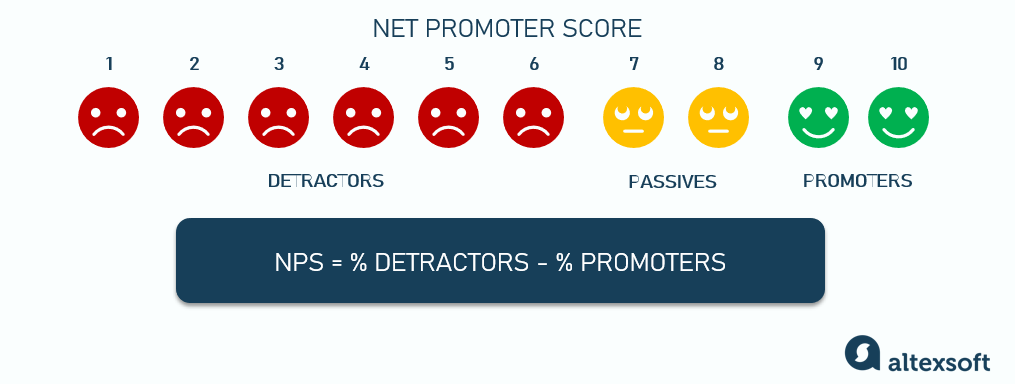
How to use NPS. Obviously, the higher your NPS is, the better. It means that your customers love your company and are willing to refer your brand to others, thus bringing you new business.
NPS awareness throughout the organization motivates employees to deliver more value, react to issues faster, and get to the root of detractors’ problems. Besides, any information learned about detractors should be shared among all departments in a common effort to improve the overall experience of your customers.
Bain and Company who initially introduced the metric identified that high NPS leads to 20-60 percent of organic growth. However, they also indicate that a good NPS doesn’t guarantee success – it might only be evidence of great company-customer relationships. There are other weaknesses of NPS too, so it’s essential to combine it with other metrics as you analyze customer satisfaction – such as EGR.
Earned growth rate (EGR)
Earned growth rate (EGR) shows revenue increase attributable to returning customers and their referrals within a specific period, typically measured monthly, quarterly, or annually. It emphasizes the impact of customer loyalty and advocacy on a company's revenue growth.
In simple words, EGR allows you to estimate how much additional revenue you get from current customers and the ones who came because of word of mouth – segregating revenue from “bought” customers who are acquired through advertising or other marketing/sales efforts.
The calculation of EGR is a bit tricky though, and requires data from so-called “customer-based accounting.” It means you have to track revenues, cost to serve, etc., for each customer, as well as know where they came from (ads, sales efforts, referrals, etc.).
So to calculate EGR, you first have to know the percentages of Net Revenue Retention (NRR) and Earned New Customers (ENC).
Net Revenue Retention (NRR) = ((MRR at the beginning + Expansions + Upsells - Churn - Contractions) / MRR at the beginning) x 100
Earned New Customers (ENC) = (New customer revenue earned through referrals / Total new customer revenue) x 100
EGR (%) = NRR + ENC - 100
How to use EGR. EGR is a solid, financial metric that helps measure your customers’ loyalty in money. A high EGR indicates that a substantial portion of your revenue growth is coming from your existing customer base and the referrals they bring in. This suggests that your business is effectively retaining customers and turning them into advocates who help acquire new customers. A rising EGR over time is a positive sign of customer satisfaction and loyalty.
By tracking EGR alongside marketing campaigns, you can evaluate which efforts are most successful in promoting referrals and customer retention. Also, EGR can help identify which segments of your customer base are most valuable in terms of driving growth through referrals.
Customer Satisfaction Score (CSAT) and Overall Satisfaction Score (OSAT)
Customer Satisfaction Score (CSAT) and Overall Satisfaction Score (OSAT) are both widely used to assess how satisfied customers are with a product, service, or interaction. While they are related, they serve slightly different purposes and are calculated differently.
CSAT measures a customer's satisfaction with a specific interaction or experience, such as a recent talk to customer support, a purchase, or any other touchpoint with a business.
It typically involves asking customers to rate their satisfaction on a numerical scale, often from 1 to 5 or 1 to 10, with 1 being very dissatisfied and the highest number being very satisfied. The responses are then averaged to determine the overall CSAT score for that specific interaction.
CSAT (%) = (Number of satisfied responses / Total number of responses) x 100
OSAT is a broader metric that measures a customer's overall satisfaction with a company, its products, or its services over a more extended period, such as the entire customer relationship or experience. OSAT is typically calculated using a similar scale as CSAT but is not tied to a specific interaction.
To calculate OSAT, you would ask customers a question like, "On a scale of 1 to 5, how satisfied are you with our company overall?" Customers provide their ratings, and the average score represents the OSAT for the entire customer experience.
OSAT (%) = (Number of satisfied responses / Total number of responses) x 100
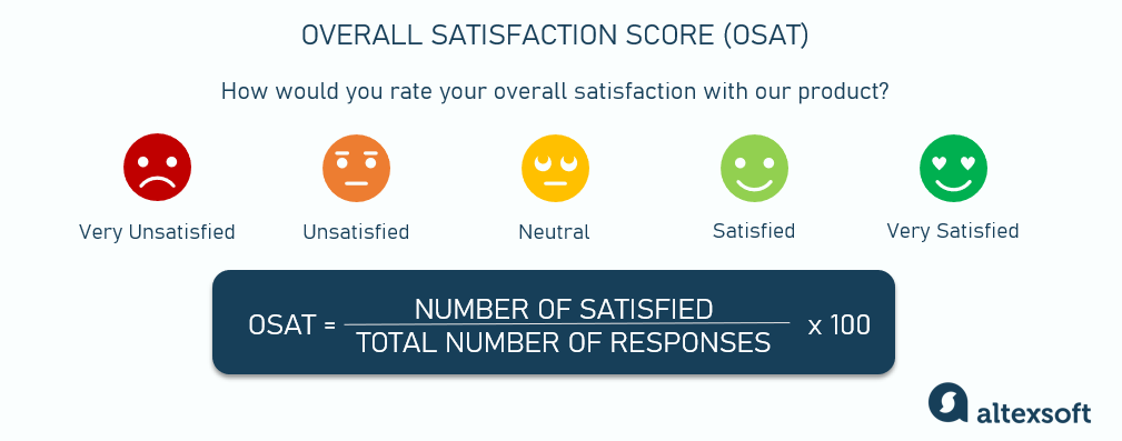
How to use the CSAT and OSAT. The key difference between CSAT and OSAT is that CSAT is focused on measuring satisfaction at specific touchpoints, while OSAT looks at the big picture of overall satisfaction with the entire customer journey.
Both metrics are valuable tools that will help you understand customer sentiment, identify areas for improvement, and monitor the effectiveness of customer experience efforts. They can help you pinpoint which aspects of your products, services, or interactions are performing well – and which may need attention to enhance customer satisfaction and loyalty.
For benchmarking, you can use data from American Customer Satisfaction Index which contains information on the biggest companies and compares stats with past results.
Customer Effort Score (CES)
The Customer Effort Score (CES) evaluates the ease with which customers can complete a specific task or achieve a goal when interacting with your product. CES measures the level of effort required from customers to resolve an issue, make a purchase, or accomplish a task.
CES is typically measured through a survey question that asks customers to rate the ease of accomplishing a specific task or resolving an issue on a scale, often ranging from "Very Easy" to "Very Difficult." The responses are then aggregated to calculate the CES score.
CES = Sum of all scores / Total number of respondents
How to use CES. CES helps identify pain points and areas where customers encounter unnecessary friction or obstacles. The fundamental idea behind CES is that minimizing customer effort leads to higher satisfaction and loyalty.
Use CES feedback to streamline processes, improve user interfaces, and enhance customer experiences.
Of course, there are other ways to evaluate user satisfaction. For example, if you’re just launching a product or feature, it’s crucial to conduct user acceptance testing and get direct feedback from end users. It might help you adjust initial requirements and see how you can improve the product to deliver maximum value to your customers.
On the other hand, if you want to find out what users think about an already established product, you can check reviews about it on social media and platforms such G2, Capterra, or Trustpilot. These websites often become a source of valuable insights and ideas for further development.
Also, such an exercise as customer journey mapping can give you a better understanding of user sentiment and point out potential for improvement.
How to choose software KPIs and metrics to track?
As you can see, there are numerous metrics and KPIs you can track. But to get the most value from data, you have to choose the right ones – and that can be a different set for every business model. For example, for a subscription service like Netflix, customer retention and churn are absolutely vital, while, say, websites primarily focus on traffic and conversion rates.
It’s also important to choose metrics depending on your key business objectives, e.g., attracting a new customer segment, improving popularity with users, increasing revenue, etc.
Another way to choose your KPIs is by going with an existing framework such as AARRR or HEART.
AARRR framework (Pirate Metrics)
The AARRR framework, often referred to as "Pirate Metrics," is a model that can guide you as you analyze and optimize various stages of the customer lifecycle, from acquisition to retention and revenue generation. Each letter in "AARRR" represents a key stage of the customer journey.
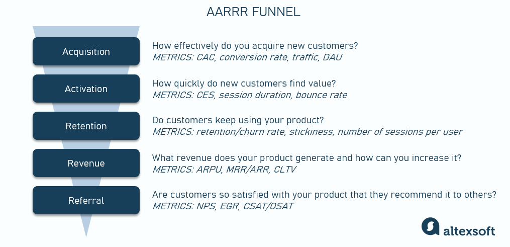
Acquisition focuses on attracting potential customers to your product or service. The key metrics to track how effectively you acquire new customers are CAC, conversion rate, traffic, and DAU.
Activation is about getting users to have their first positive experience with your product. It's not just about signing up but also ensuring that users find value quickly and understand how your product or service can benefit them. The KPIs to pay attention to are CES, session duration, and bounce rate.
Retention is all about keeping users engaged and coming back. Metrics like retention rate, churn rate, stickiness, and number of sessions per user are often utilized at this stage.
Revenue focuses on monetizing your user base. It involves strategies for converting engaged users into paying customers. Use the ARPU, MRR/ARR, and CLTV to control this aspect.
Referral involves turning your existing customers into advocates who refer new customers to your business. Metrics like NPS, EGR, and CSAT/OSAT can help assess customer satisfaction and advocacy.
The AARRR framework provides a structured way to measure and improve different aspects of the customer journey. As you focus on each stage of the funnel, you can identify bottlenecks, optimize your strategies, and ultimately improve overall performance and growth.
HEART framework
The HEART framework is a user experience (UX) evaluation framework developed by Google to assess and improve the quality of products and services, with a primary focus on user satisfaction. It consists of five key metrics, each represented by a letter in the acronym "HEART."
Happiness measures overall user satisfaction and the emotional response of users when interacting with a product or service. Common metrics to assess happiness are NPS and CSAT/OSAT.
Engagement evaluates the level of user involvement and interaction with a product. Metrics in this category can include DAU, MAU, traffic, bounce rate, stickiness, and average session duration.
Adoption assesses how quickly and easily new users start using the product and its core functionalities. Adoption metrics may include conversion rates and CES.
Retention assesses the ability of a product or service to retain users over time. The main metrics here are retention and churn rate.
Task Success focuses on users' ability to accomplish specific tasks or goals within the product. It measures the effectiveness and efficiency of user interactions. Metrics in this category may include task completion rates, time to complete tasks, or error rates during task execution.
While AARRR focuses on the user movement through the funnel and involves a business perspective, the HEART framework emphasizes a user-centric approach. It allows product teams to track user satisfaction and engagement. By regularly monitoring these metrics, you can identify areas for improvement, prioritize feature enhancements, and make decisions to enhance the overall user experience.
Product management KPIs best practices
To wrap up, we have a few more practical tips on how to manage your data and track your product management KPIs most effectively.
Integrate. To collect the most complete and accurate information, create an integrated IT environment. This way, you’ll avoid data leakages and rest assured that you have comprehensive data for the most precise calculations.
Use specialized software. Google Analytics is the most popular tool that product managers use to track and analyze KPIs. However, there are other options to choose from, e.g., Amplitude, Mixpanel, Userpilot, or Heap.
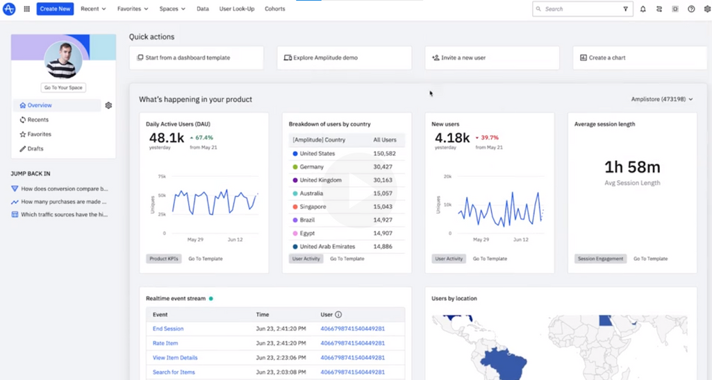
By the way, we have a great overview of product management software tools that you can use to track your KPIs.
Visualize. Create a customized product management KPI dashboard where you can view and analyze your most important product metrics on one screen. It’s so convenient.
Share. Share your findings with your teams and stakeholders. Besides a chance to fresh ideas, it will keep everyone on the same page in regard to the company’s current position and development plans.
According to The State of Product Leadership 2022 survey by Pendo and Product Collective, the main trends in product management are shifting toward customer use of digital products and greater use of data to shape strategic roadmaps. Respondents also mentioned the use of better technology for extracting customer insights.
All this means that to stay competitive and make informed strategic decisions, you have to scrutinize data and track product KPIs. As you understand your customers and their needs better, you can coordinate your product development efforts and achieve the best results.

