

A friend’s suggestion, your very own landmarks bucket list, a destination wedding, all run-of-the-mill travel motivators. But did you know that 1 in 5 travelers admit to visiting a place just because they saw it on a TV show?
Global travel trends are noticeably changing as people tend to make longer and more in-depth journeys, arrange solo trips, and explore places like locals. Obviously, user experience consulting for travel websites and apps is constantly being realigned to these changing demands. Customer-centered and mobile approaches are guiding the rise of smaller but no less significant changes prior to, during, and after the actual trip.
How can you make an adventure enjoyable and seamless from the very first time users enter your travel portal? Here are our practical tips.
Simple and intuitive forms
A user journey on a travel portal usually starts with two basic questions: where and when. There’s so much you can do about your forms within this framework, but it’s still important to avoid mistakes that inconvenience users.
First, let’s note that the same user may have very different needs depending on the context. We can define three different audiences:
- Browsers - open-minded and easily impressed, usually seeking inspiration
- Hunters - analytical and careful, tend to compare prices, use filters
- Buyers - don’t like to be distracted, know what they want, and go for it
While the over-complicated form won’t appeal to all types of customers, neither will the too minimalistic variety. Browsers won’t want to answer questions they have yet to ask, and the Book now button will turn off the hunters.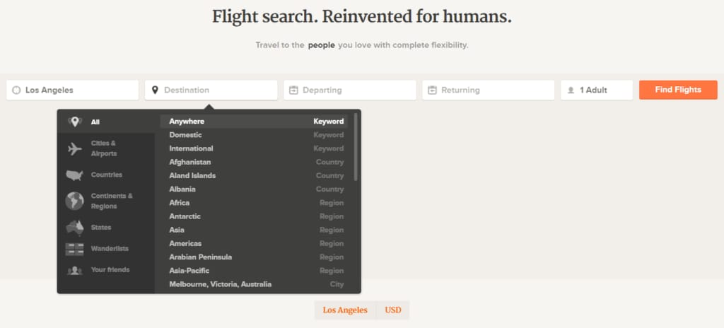
Adioso has a great example of beautifully presented and efficient form
It's also important to remember that, depending on the type of service they provide, no site or app is obliged to cater to all types of customers. But there are still some general rules for creating good and easy-to-use forms.
Some of the basic practices for creating forms:
- Prepare departure and returning date. Include the current date as the departure date and the day after as the returning date as defaults to assist users who book on the go.
- Use geolocation. By automatically identifying the departing point and currency, you’ll save a user’s time.
- Offer an advanced search option. Allow customers with specific preferences to instantly filter search results by budget, type of stay (hotel or apartment), and the general type of vacation.
- Use asterisks. Asterisks are star symbols at the end text that further define it. If you do include extra fields in a simplified form, you may mark the ones that are optional with an asterisk.
Comprehensive search results
Studies show that about 80 percent of e-commerce website visitors leave the booking page without finishing a transaction. It’s understandable, since the number of people who browse and compare is always bigger than those who buy right away. But don't underestimate the extent to which badly executed search results affect a user's experience. Let’s have a look at how some successful travel apps are introducing search results.
Comparing search results by Hipmunk, TripAdvisor, and Trivago
Even though the interfaces look pretty much the same, there are some elements that each service chose to do differently. For instance, Hipmunk shows the availability of free Wi-Fi in hotels as one of the highest-ranking features. And Trivago has included the distance from a hotel to the city center right in the preview. The way brands present their search results is based on a deep analysis of their target audience, testing and validating, and looking at both quantitative and qualitative data. That’s why you will have to go with the approach that fits your type of business and customers best.
Here are some of the important tips to consider when providing comprehensive search results:
- Allow for photo preview without having to leave the search. Customers tend to look through the pics before reading the description. That way they don't have to click on the search results if they don’t like what they've seen.
- Support easy editing. The search bar should stick to the top of the screen and always be available for editing.
- A/B test your page or app. To uncover which features your target audience will find of most value, start with testing. Generally, the most important things for hotel visitors are: location, price, dining options, unique experiences, complimentary breakfast, Wi-Fi, parking, helpful concierges (and what languages they speak), spa services and recreation. Flight conditions that matter to users the most are: price, direct flight availability, Wi-Fi, in-seat charging, duration of flight, attentive crew, free luggage, leg space, free meals.
- Personalize search. You can either show users similar options to the ones they’ve already liked, or use machine learning to adjust relevant recommendations to different customer segments based on analysis of their behavior.
By the way, if your travel focus area is tours and attractions, check our article on the best UX practices and examples of T&A apps.
Transparent booking
Clear communication and transparency are among the focal elements of continuous relationship between brand and client. In travel, where users have strict time and financial limitations, it’s especially important to disclose any information that can affect a user’s choice.
One of the concerns travelers usually have are hidden fees like paid Wi-Fi, parking, or tourist taxes. If you never mention these besides a previously specified price, the disappointment at the final step may convince a user to leave your site immediately and look for a better option.
How Hopper and Booking.com communicate about potentially confusing matters
So how can you take care of a user’s comfort on a travel website?
- Show that you care. Remind customers to check information about the fees on their own and direct them to it.
- No fees are also important. If users are not charged for some services, make sure to include that information as well, so that a user doesn’t have to worry or go check it somewhere else.
- Communicate each point as clearly as possible. If the Wi-Fi access is free only in the restaurant area and users will have to pay for it in their rooms, they should be aware of it.
Post purchase interaction
We already touched on this topic in our story regarding best practices for travel chatbots, but let’s explore it in more detail.
Post-purchase interactions and support entail staying connected to users, seeking feedback, and encouraging them to come back with questions. Support can be expressed differently and not only in handling technical difficulties. TripAdvisor, for instance, will check back on you asking if you ended up traveling to the searched destination and offer to review the popular places in that area. In the age of personalization, such an approach helps a brand appear caring and attentive and gather valuable insights that can be used for future improvements.
Some of the great examples of keeping up with clients are:
- Personalized recommendations depending on a user’s location. It can be a coffee bar or a grocery store near their hotel, a small museum to visit while they’re in a less widely known area.
- Transport suggestions. Offer the ways a traveler can reach their hotel from the airport and don’t forget other options besides a taxi.
- Language tips. Provide a short list of the most relevant phrases and titles a person may struggle with in a foreign country.
Elements of entertainment
Traveling is an exciting endeavor, and for many people trips are the most valuable experience in their lives. That’s why we share Instagram pictures and create Facebook albums dedicated to our journeys; we like to exchange memories and track our milestones. Similar to gaining new skills and receiving praise for improving, travelers enjoy memorializing their experiences and get satisfaction from seeing the progress.
A great medium offered by TripAdvisor allows you to pin the places you’ve already visited or want to travel to on a map and then see the number of traveled miles and the percentage of the world left to see. The brand kills two bird with one stone by prompting users to rate famous places from visited destinations and contribute to the ranking on the website.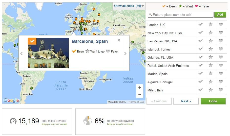
TripAdvisor’s interactive map
Swarm is a similar tool but users there gain coins for each check-in and even access a graph showing their most visited types of places. This competitive element adds to the general gamified experience and allows travelers to share their whereabouts in a unique way.
Social proof
According to a study by The Worms University of Applied Sciences, 70 percent of people look at up to twenty reviews in the planning phase. Even with 41 percent of consumers being positive that some of the reviews are fake, they still affect or alter the choices travelers make. That’s why not allowing your audience to leave reviews will most likely make those in research mode visit other places of evaluations.
What are the best ways to include and display reviews?
- Use third-party reviews. TripAdvisor Content API allows you to display timely data from TripAdvisor on your website and applications. If you only need reviews and rating for your individual hotel or attraction, there are widgets for that.
- Reviews don’t have to be textual. Photos and videos contributed by fellow consumers have the same or often more impactful effect.
- Perks in exchange for reviews. Encourage users to add reviews by offering something of value for them. It could be a certain amount of credits to be exchanged for free services, or simply the status of “Travel Guru” on your platform.
- Allow filtering by reviews. Many users would prefer to see the best rated options before the cheapest ones or those closest to attractions.
- Write review forms for them. For customers who don’t like writing long reviews, use prepared forms to increase engagement. Multiple-choice answers and breaking ratings into categories help obtain the same value and do so without burdening your audience.
Inspiring images
The craving for new experiences is certainly enhanced by visually pleasing imagery. According to MDG, 67 percent of users find images very important in e-commerce, more than product descriptions and ratings. However, while most travel portals make liberal use of attractive pictures, they often ignore the latest trends in impactful representation that make the audience not only click on the pic, but also get immediately inspired to consider the query.
How to make visuals truly impactful?
- Use unexpected analogies. Everyone knows that Paris is associated with the Eiffel Tower, but that doesn’t mean that users won’t recognize France from pictures of local foods or distinctive Parisian balconies.
- Sell atmosphere, not places. Eco-luxury travel brand Bouteco sways their site visitors with images that flaunt lifestyle rather than location. Fascinate customers with the idea of a certain type of travel that would seem unique and apart from anything competitors have to offer.

Bouteco uses pictures and words interchangeably
- Incorporate animations. In case your images are provided by third parties, spice them up with animations. Include explanatory text that apperas after hovering over an image, zoom in automatically for details, or apply filters.
Personalization at the core of UX
You’ve probably noticed by now how much the personalization trend has seized the travel domain. People are now willingly sharing their data about location, Google search, or liked posts on Facebook and expect to receive a custom set of services that’s tailored to their interests and needs.
So, with each UX decision you’re making, you should ask yourself first and foremost: Is there a way to make it more personalized? Perhaps, you will need to apply more advanced technology such as data science or virtual assistance, or try something bold and new, like allowing a search of Cheapflights with destination-specific emoji on World Emoji Day.
Remember, though, that in order to provide your customers with personalized results, you have to use all the relevant data you generate every day instead of simply assuming what will work best.

Maryna is a passionate writer with a talent for simplifying complex topics for readers of all backgrounds. With 7 years of experience writing about travel technology, she is well-versed in the field. Outside of her professional writing, she enjoys reading, video games, and fashion.
Want to write an article for our blog? Read our requirements and guidelines to become a contributor.