

The agile approach to software development has long been a common practice. According to the HP online survey, 16 percent of IT professionals opt for pure agile, 51 percent lean towards it, and 24 percent adopt an agile hybrid approach. Today, waterfall development is mentioned most often as an agile differentiator, what agile is not. We’ve broadly discussed the main differences in our whitepaper on agile project management methodologies.
Despite the adaptability and flexibility of agile management and its rapid response to changes, the workflow can stay centralized and controlled. Agile KPIs (key performance Indicators) provide guidance for strategic planning, evaluation, and improving operational processes.
Traditional value management systems tend to focus on task completion within the categorical schedule and cost framework. However, with agile, customers and team members see immediate results and adjust timeframes and effort to deliver a product that corresponds to schedule requirements. Which tools and techniques does such knowledge demand? Here’s our overview of agile development metrics performance assessment.
Agile software development KPIs
In this article, we aren’t going to explore all possible agile development metrics and KPIs. On top of that, you may invent your own ones that match your project best. However, we will describe the most common KPIs used across multiple software development aspects:
- Velocity
- Sprint burndown
- Release burndown
- Cycle time
- Cumulative flow
- Flow efficiency
- Code coverage by automated tests
- Test automation against manual testing
- McCabe Cyclomatic Complexity (MCC)
- Code churn
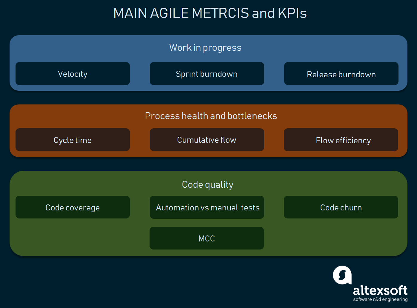
These are the key ones that you must explore first
Measuring work in progress
Velocity
Velocity measures the amount of work (a number of features) completed in a sprint. While it isn’t a prediction or comparison tool, velocity provides teams with an idea about how much work can be done in the next sprint.
Velocity index is unique for each team and should be set to assess how realistic the commitment is. For instance, if the project backlog has 200 story points and on average the team completes 10 story points per sprint, it means that the team will require about 20 sprints to complete the project.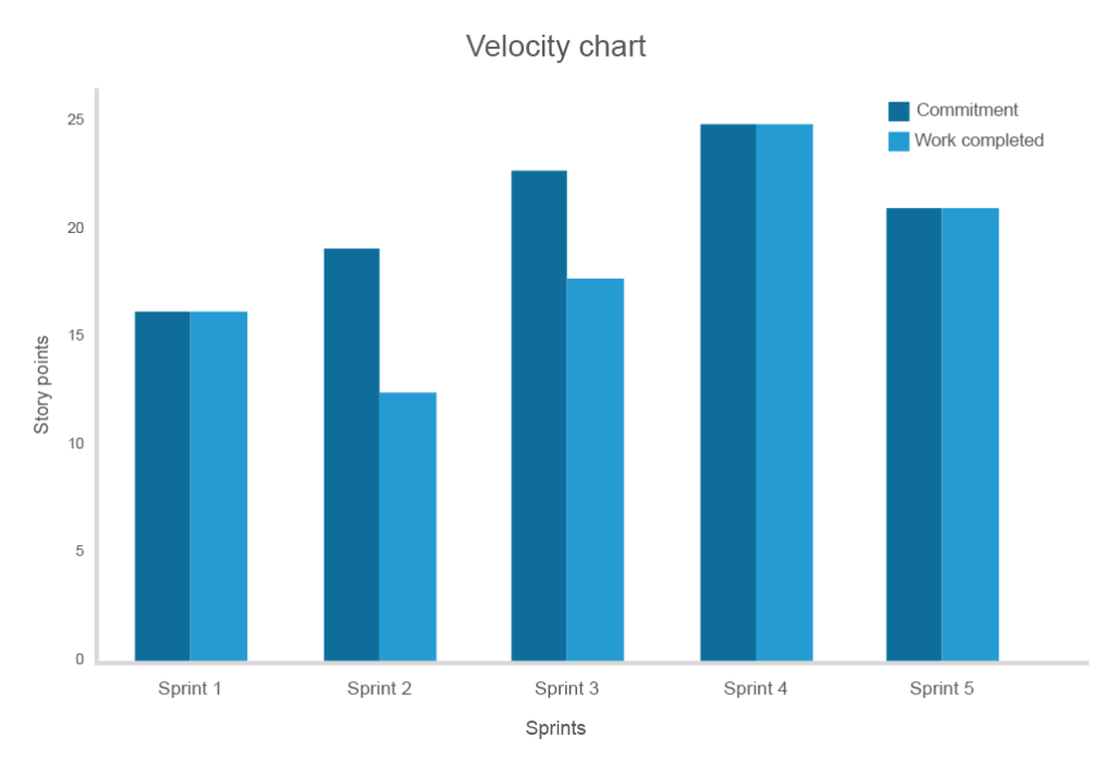
The longer you track the speed, the higher the accuracy of the correspondence between obligations and costs
For a team that’s just adopted the agile methodology or even embarked on a new product, the velocity estimates of the first few sprints will probably be erratic. But as teams gain experience, the velocity will peak and then reach a plateau of predictable flow and performance expectancy. A decrease in consistent flow will indicate problems in the development and reveal the need for change.
Tips for using the velocity metric
Combat inconsistency after 3-5 sprints. If velocity stays inconsistent after a long period of time, consider assessing both external and internal factors preventing clear estimation.
Alter the velocity tracking following team and task changes. When a team member leaves the project or more members/tasks are added, recalculate velocity or restart calculation entirely.
Three sprints are enough for early forecasts. For predicting future performance, use the average of the three previous sprints.
Sprint burndown chart
The sprint burndown chart shows the amount of work remaining to be done before the end of a sprint. The tool is particularly valuable because it displays the progress towards the goal instead of listing completed items. It’s also very useful in uncovering planning mistakes that a team made in the beginning of a sprint.
On the chart below the black line represents the forecasted (ideal trend) line showing at which rate the team needs to burn down story points to complete the sprint on time. The blue line indicates the total amount of work and its progress throughout the sprint. You can see that during days five and six, one team didn’t manage to accomplish the forecasted progress. However, on day seven, the issue was addressed and the work was back on track. Such ongoing updates allow teams to address emerging problems during daily stand-up meetings.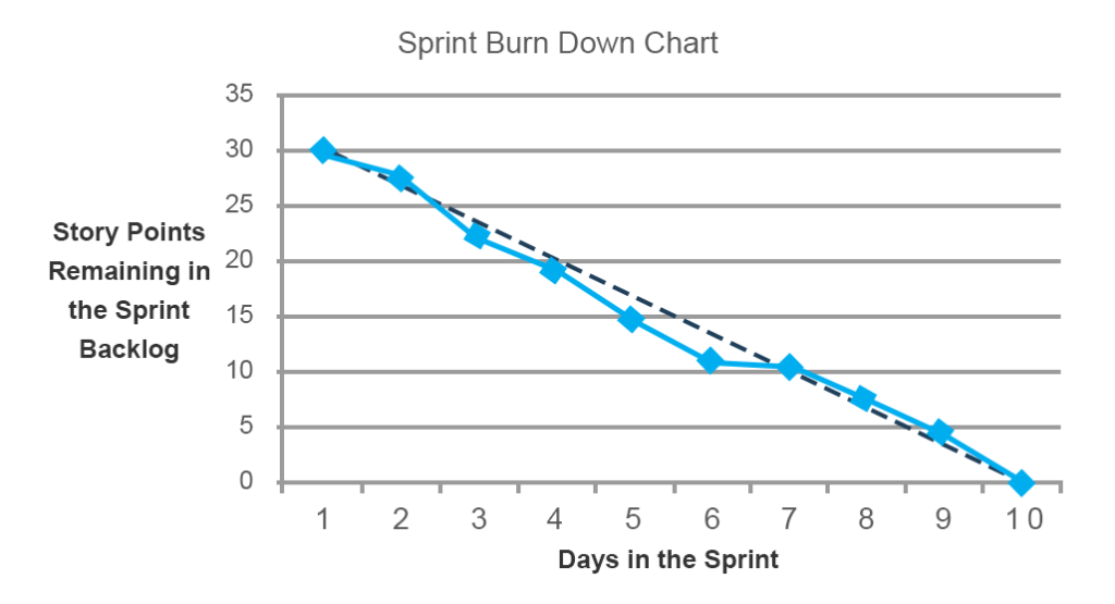
Besides the work performance itself, burndown charts can reveal planning issues
Tips to approach sprint burndown
Story points should be even in scope. If the workflow isn’t consistent, some tasks may have been broken down into uneven chunks. The scope of deviation between an ideal trend and the reality distinctly highlights this problem.
Account for unplanned tasks. The burndown chart is useful for understanding the scope of hidden and untracked tasks. If the amount of work is increasing instead of decreasing, the project has many unestimated or unplanned tasks that should be addressed.
Use a burndown chart to assess team confidence. Considering the current rates, ask your team how confident they are about completing the sprint on time. The longer you apply this metric, the more accurate your sprint estimates are.
Estimating the release with a burndown chart
A release burndown chart indicates the amount of work that must be completed before a release. The chart illustrates the progress overview and allows you to implement changes to assure on-time delivery.
A traditional version of the chart is similar to the sprint burndown chart, but gives an overview of the entire project where the y-axis is sprints and the x-axis is a measure of remaining work (days, hours, or story points). But, what if more work is added to the project or your estimated work doesn’t meet expectations?
On the chart below, a team planned to complete a project in four sprints and initially had 45 story points. While the progress went as planned during the first and second sprints, at the third sprint the estimated work increased, which is reflected on the y-axis in negative values. During the third sprint, 5 new story points appeared. They weren’t completed and the fourth sprint added another 5 story points. Therefore, the progress and the release time had to be adjusted.
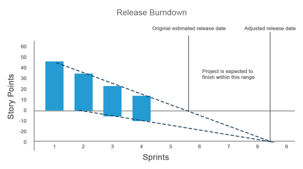
The release burndown chart is super effective for situations with lots of changing requirements and allows a team to stay on track during each sprint
How can the release burndown chart help?
Real-time prediction on release. Once your project undergoes changes, which happens every time with iteratively developing products, you need to see how these changes impact the release date. The release burndown chart allows for predicting the release date in real time according to updates in the work scope.
Deadline predictions. You can estimate whether the team can complete a product release on time or anticipate that the deadline should move further considering added tasks.
Estimating the number of sprints. Assessing how many sprints are required to finish the work is also an important factor to consider with the release burndown chart.
Assessing process health and finding bottlenecks
Cycle time
The cycle time metric describes how much time was spent on a task, including each time the work had to be reopened and completed again. Calculating the cycle time provides information about the overall performance and allows for estimating the completion of future tasks. While the shorter cycle time illustrates better performance, the teams that deliver within a consistent cycle are valued the most.
Using the chart below you can identify the average time it takes to complete a task, draw a median or control limit line that shouldn’t be crossed, and notice which tasks took unusually long to finish.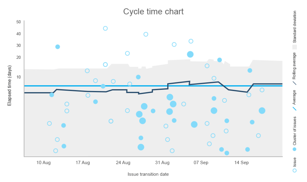
The standard deviation draws a line between the normal and not recommended number of days to complete the task
You can also stack all cycles for a particular period and draw insight from comparing it to other data. By conducting a further investigation, you can make conclusions about the quality of work. 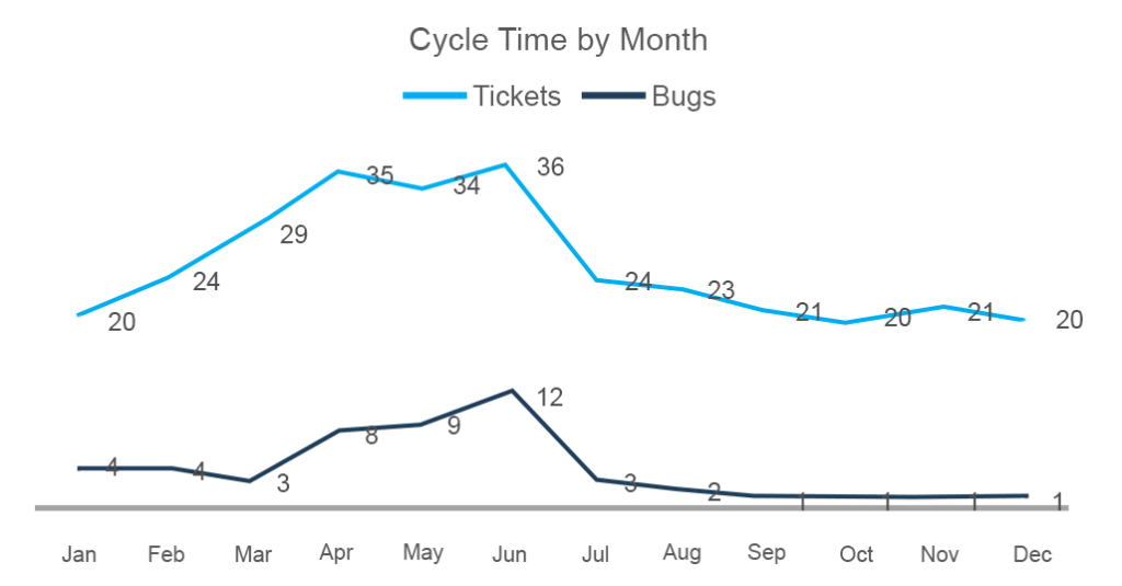
Here you can see that the number of completed tasks from March to June has grown as did the number of bugs
How to use the cycle time
Look for similarities. A good practice is to find similar items that take unpredictable cycle times to complete, revealing recurring problems, either in engineering or management.
Draw predictions. You can make data-driven decisions by predicting the time to complete new tasks based on similar ones from the past.
Track the pace. The chart describes how you keep the same pace of work and define whether there are internal issues that reduce the speed of work.
Cumulative Flow Chart (CFC)
The cumulative flow metric is described by the chart area showing the number of different types of tasks at each stage of the project with the x-axis indicating the dates and the y-axis showing the number of story points. Its main goal is to provide an easy visualization of how tasks are distributed at different stages. The lines on the chart should stay more or less even while the band with the “done” tasks should be growing continuously. 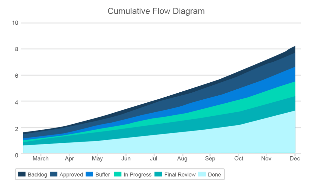
The chart discloses a lot of critical information such as sudden bottlenecks or rises in any of the bands
The CFC will be of a great use for Kanban teams as a simple visualization of the team’s work. The chart also corresponds with Kanban’s three-step workflow. Here you also map three main task categories: to-do, in progress, and completed.
Moreover, the chart helps identify when the work-in-progress (WIP) limits are exceeded. Being one of the most valuable tools in agile development, WIP limits are meant to cultivate the culture of finishing work and eliminate multitasking by setting the maximum amount of work for each project status.
What issues are pointed out by the CFC?
- Backlog growth indicates the unresolved tasks that are either too low priority to tackle at the moment or are obsolete
- Inconsistent flow and sudden bottlenecks indicate which areas should be smoothed out at the later stages
- The width of each band shows the average cycle time
- The significant widening of the “In progress” area can mean that the team won’t be able to finish the whole project on time
Flow Efficiency
Flow efficiency is a very useful metric in Kanban development mostly overlooked by development teams. While flow efficiency complements cumulative flow, it gives insights into the distribution between actual work and waiting periods. It’s a rare case when a developer works on one thing at a time without waiting. The reality is usually more complex. And “work-in-progress” is a name that doesn’t always match status.
For example, the code may have many dependencies and you can’t start working with some feature before another one is finished, or your priorities change, or you’re waiting for a stakeholder’s approval. Measuring how much time you wait against work may be even more useful than streamlining processes related to actual work.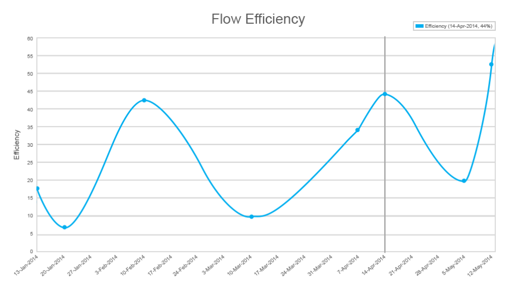
By looking at the lowest efficiency indicators, you can understand the main bottlenecks
How to use flow efficiency
Calculation formula. Unless you apply some project management software that incorporates these metrics, you can calculate flow efficiency by this simple formula: Work/(work+wait) * 100%. Then you can visualize it digitally or even draw the graph on your office whiteboard.
Define your normal flow efficiency. As with all other metrics, it’s impossible to claim normal figures for all projects. Some say that the 15 percent mark is okay for most projects, which basically means that a story point or another item of work waits 85 percent against 15 percent processing time. David J. Anderson, a management expert from the LeanKanban School of Management, suggests that 40 percent and higher should be the target for most teams.
Decompose details of work before fixing flow efficiency. The chart will allow for viewing exact periods of time when your efficiency was the lowest. And this data must be analyzed very carefully, as the real cause and its remedy isn’t revealed that easily. Before you start intensive actions, make a thorough investigation of causes.
Augment flow efficiency with blocker analysis. A good means of realizing the previous point is to augment your flow efficiency with blocker clustering analysis. If some work is blocked, it deserves a colored sticker or another form of visual signal to bring these blockers to the team’s attention so they can react to them.
You can mark how many days some of the work is blocked and prioritize the resolution
Usually, blockers accumulate in clusters as they have many dependencies with each other. Better blocker analysis can be done if you clusterize them starting from high-level similarities like internal and external blockers and then specifying further by design, missing content, or other lacking features. Blocker analysis is a simple way to investigate the valleys in flow efficiency.
Measuring code quality
Code coverage
Code coverage defines how many lines of code or blocks are executed while automated tests are running. Code coverage is a critical metric for the test-driven development (TDD) practice and continuous delivery. Traditionally, the metric is interpreted by a simple approach: The higher code coverage, the better. To measure this, you’ll need one of the available tools like Coveralls. But they all work pretty much the same: As you run tests, the tool will detect which of the code lines are called at least once. The percentage of called lines is your code coverage.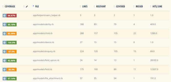
Coveralls, for instance, will break down the code coverage to each file measurement and highlight covered and uncovered lines
How to use code coverage
Focus on uncovered lines and don’t overestimate the covered ones. If the line of code is called once or even more, it doesn’t necessarily mean that the feature it supports works perfectly well and users will stay satisfied. Calling a line of code isn’t always sufficient to close the testing task. On the other hand, the percentage of uncovered lines shows what hasn’t been covered at all and may merit testing.
Prioritize covered code and don’t aim at 100 percent. While this seems counterintuitive, 100 percent coverage doesn’t mean that you have properly tested code. Your project has the code that matters and the rest of a code base. As testing automation is usually an expensive initiative, it should prioritize the features and corresponding chunks of code.
Test automation against manual testing
This measurement defines how many lines of code within a feature are already covered with automated tests against those that are tested manually. This directly follows the previous metric but has a specific use case. Test automation proportion against manual testing is used only when you critically need automation to cover regressions. Regression testing is done to check if something became broken after feature updates. And if your product undergoes constant improvements – which it should – testing for regression should be automated. If it isn’t, your manual QA specialists will have to repeat the same test scenarios repeatedly after each update commit.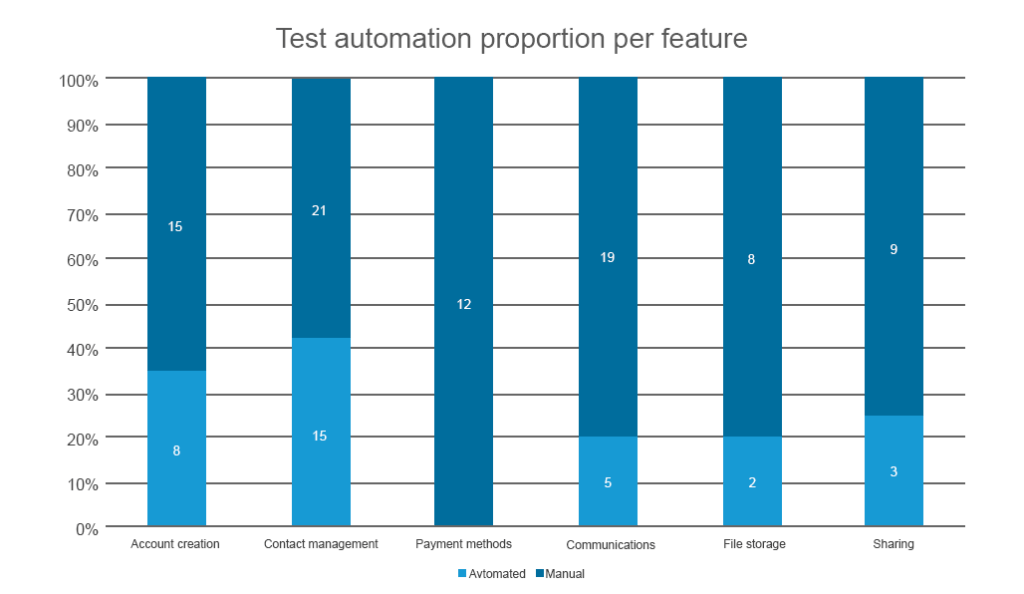
You can use the same instruments used for code coverage to draw this metric
Outlining the automated test coverage per feature will allow you to prioritize the features that 1) may suffer from regression after updates, and 2) for which automated tests are critical. Usually, you don’t have enough time and human resources to cover everything by automated tests at once, unless you work within the test-driven development framework. So, it’s better to prioritize the features that are sure to impact user experience.
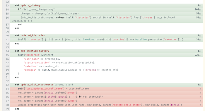
McCabe Cyclomatic Complexity (MCC) of code
Code complexity measurements are used to assess the risks of problems during code testing and maintenance. The higher the code’s complexity, the more difficult it becomes to ensure that it has an acceptable number of bugs and keeps high maintainability. The most common approach to measuring code complexity is the McCabe Cyclomatic Complexity Metric (MCC). One of the formulas to draw complexity results for MCC is the following:
MCC = edges - nodes + return statements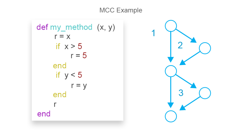
MCC on the image equals 3
With this metric, developers aren’t estimating their code complexity by subjectively looking at it. As engineers’ skillsets differ, their assessments vary which makes code refactoring or fixing bugs more challenging in the longer run. There are many MCC measurement tools on the market that can be combined with other code complexity metrics such as the depth of code hierarchy and the number of code lines.
MCC use specifics and pitfalls
Balance human and machine perception of code complexity. One of the main reasons to use MCC is to make code readable for fellow developers. The readability of code reduces the risks of long-term onboarding of new developers that have to deal with legacy code. It will also simplify refactoring down the road. The problem here is that the MCC model can consider some complex yet readable methods unacceptable. And if you force a developer to refactor complex methods into many sub-methods, you can achieve the opposite results: Many methods with simple logics may become even more difficult to comprehend for a human than a single yet complex method.
Don’t make MCC a restrictive metric. Some organizations practice terminating code commits that don’t pass the MCC test. While this can potentially increase code simplicity, it’s natural to have complex code on the levels of classes, methods, and functions. Blocking them entirely isn’t always beneficial. A good practice is to set general code complexity KPI for developers, which will encourage them to approach coding more consciously and think of simplicity.
Apply MCC for code review. Another valuable practice for MCC tests is to apply it during code reviews to narrow down the scope of work to reviewing specific code chunks where the risks of defects are the highest.
Code churn
Code churn is a very useful visualization of trends and fluctuations that happen to a code base both in terms of the overall process and the time before a release. Churn measures how many lines of code were added, removed, or changed. Sometimes the graphs show all three measurements.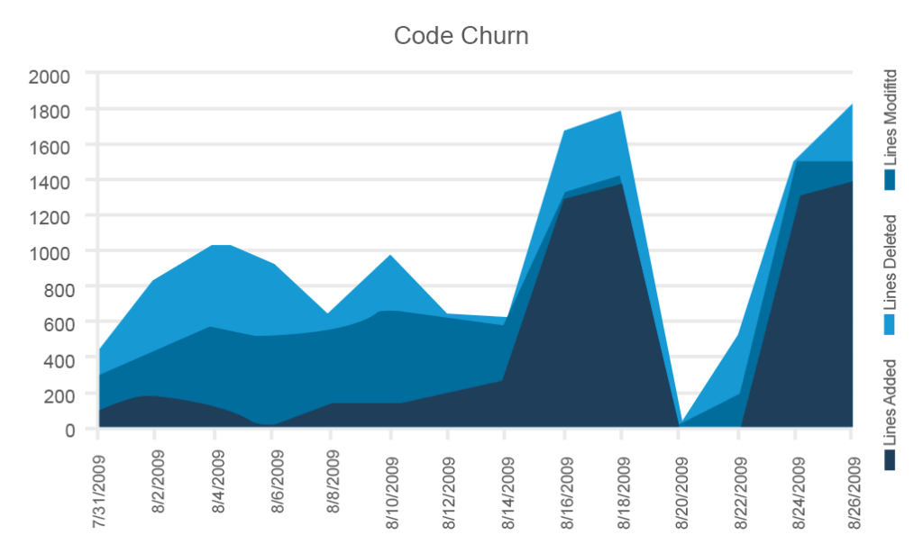
This example from Microsoft includes all three parameters, but you can use them selectively
Although tracking code churn may seem a somewhat primitive metric, it allows for assessing the code stability at different development stages. You should expect the lowest stability during the early sprints and the highest stability – with the concomitant lowest churn – right before a release. If your code is highly unstable and the release date is drawing near, sound the alarm.
Code churn use cases
Look for regularities. Regular spikes in code changes may reveal that the task-generation approach isn’t focused enough and produces many large tasks on a recurring basis.
Irregular but high spikes require investigation. If you have irregular but powerful spikes in code changes, you can investigate which tasks caused such seismic peaks in your code and reconsider the level of dependencies, especially if the number of new code lines increased the number of changed lines as well.
Pay attention to trends. The stability of your product becomes quite critical before a release. As we mentioned, the churn rate should have a declining trend the closer your team gets to a release. A growing trend means possible product instability after a release because it’s likely that the new code won’t be subjected to sufficient testing.
Aim for progress, not control
Just like any other performance indicators, agile metrics don’t always have distinct answers or actionable tips that will seal your success. However, you should use the knowledge they provide to start a discussion, conduct an evaluation, and offer your own plan in dealing with problematic issues.
While metrics provide the numerical insight into a team’s performance and overall satisfaction with the work, don’t fixate on them. Considering that agile metrics are not standardized, there’s no point in comparing successes of different teams. Rather make sure to embrace your team’s feedback, initiate regular discussions, and nourish an atmosphere of common goals and support.