

The lists of travel technology trends for 2018 are filled with buzzwords and unrealistic prospects. Virtual reality, drones, biometrics - these concepts, though not very far in the future, don’t yet belong to our reality, the here and now, where travel and hospitality brands must operate.
While it’s important to keep an eye on disrupting forces transforming the industry, online travel agencies and other service providers ought to stay focused on the existing problems that significantly affect customer experience and make businesses lose ground. We’ve already discussed the steps required to create an online travel agency and today we’re analyzing existing mistakes and how to fix them. Let’s dive right in.
1. Lack of personalization
According to Accenture, 65 percent of users are more willing to buy from a retailer that remembers their past purchases and provides relevant advice. Moreover, about 40 percent of customers leave a website because they’re overwhelmed by the number of options. Today people expect custom solutions just as they expect to get their Amazon packages in record time. There's no going back, and e-commerce brands have only one choice - to adapt.
Personalization allows you to narrow down your focus and learn about each customer so that you can suggest relevant solutions aimed at their needs and interests. What is their budget? What hotel brand do they prefer? Are they flexible with their dates? All these represent an opportunity to match a user’s expectations each time and simplify decision-making.
To implement this, you can use machine learning based solutions. They can analyze each client’s website actions and create a customized experience with handpicked content to ensure the perfect match. Check out our recent article to learn more about establishing your personalization strategy for travel and hospitality.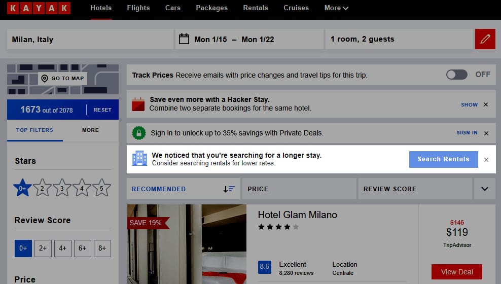
Data-driven Kayak offers personalized experience
The OTA HotelTonight operates exclusively via mobile and, according to a user’s history of preferences, provides only the 15 best hotel options. The more the system knows about customers from their previous uses of the app, the better results it offers. Doing that ensures satisfactory booking in a minimum number of clicks.
2. Not offering complex travel services
Consumers are reasonably adept at finding and booking point-to-point trips and rooms. Currently they need a set of services to take care of all their travel-related needs, from a transfer to their hotel to in-city tours and dining places. By offering limited services, you’re giving a user no other choice but to continue planning their trip on a different website. The good news is that you don’t have to develop these additional components from scratch; you can simply integrate APIs from market leaders.
Here’s how to approach the complex services at your OTA:
Offer different combinations. Some travelers would like a flight, a car, and a hotel to be ready for them. Others may have someone meeting them at the destination and won’t require transport. There are also travelers who are staying at an Airbnb property and don’t have to book a hotel. For instance, Kayak, despite offering services for car rentals, provides packages for flights + stays only. Expedia supports different bundles and gives travelers a discount.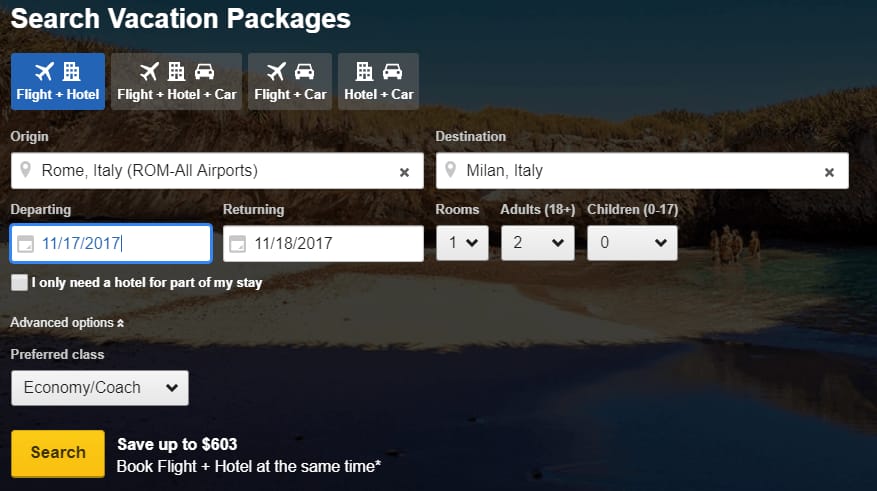
Expedia’s Bundle and Save feature
Show accommodations near one another. Depending on the chosen combination of services, make sure a traveler can easily access them in an unfamiliar city. Show them a map and calculate the time it will take to walk from their hotel to the closest tour gathering point.
Offer a discount for purchasing a package. Some API providers will invite you to be their affiliate partner and allow for direct booking via your website. This can result in noticeable savings and will allow you to offer discounts to travelers.
For more information, be sure to read our comprehensive review of major travel APIs.
3. Not separating business and leisure
While the trend for bleisure (the combination of business and leisure) travel is growing, research shows that only 37 percent of business travelers manage to take some extra time and put some vacation in their business trips. Because of that, business and leisure travel remain two big segments in the travel and hospitality industry, each with its own needs, demands, and patterns. OTAs should understand the difference between these types of travelers and tailor their content accordingly.
So, what are the main differences between business and leisure travelers?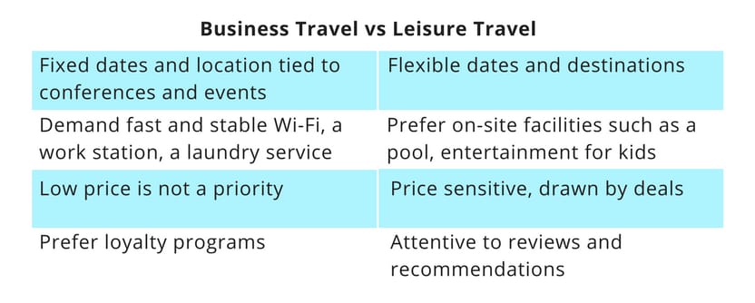
You can use customer behavior tracking to analyze a users’ behavior on your website and identify whether they’re traveling for business or vacation. This will allow you to offer leisure travelers different dates for cheaper prices and suggest pricier options with inflight Wi-Fi for business travelers. You can also allow visitors to filter the options manually by checking the “I’m traveling for business” box, as Booking.com does.
4. Information overload
While the more information about the stays a user has the better, sometimes online booking can be overwhelming with the amount of data you to be consumed. Considering how a traveler will likely switch between tabs to compare results, he or she should be able to easily scan information to identify which features fit best.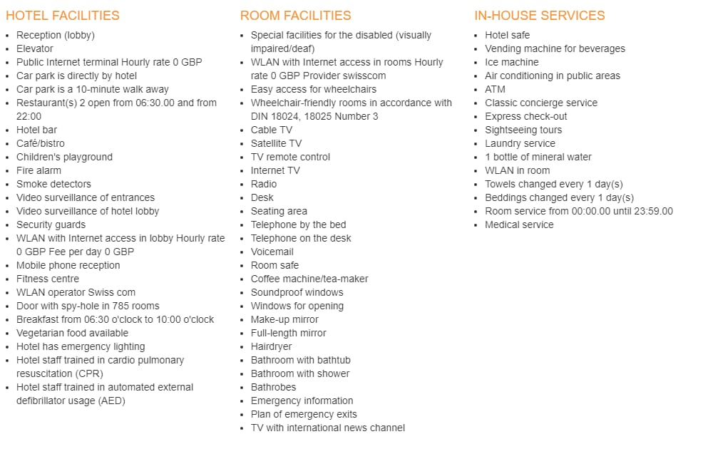
The list of facilities on Hotel.Info is difficult to scan and includes irrelevant information
Here are some of the ways to provide exhaustive info without bombarding a user with paragraphs of text.
Use icons and images. Many of the features can be simplified to recognizable icons such as “no smoking allowed,” “free WiFi,” and “breakfast available.”
Provide only relevant information. It’s expected that a listed hotel has mobile reception and a fire alarm system. Keep it brief and meaningful.
Categorize. For a user seeking a specific set of services such as accessibility or information about pets and children, help them find that info quickly and choose an option that fits their requirements best.
Icons, filters, color-coding, and the lack of information overload allow for simple comparison on Skyscanner
Use complex filters. Allow users to fill in all the desired facilities and display only options that fit them perfectly. You can also use the information acquired through customer behavior tracking to tailor each user’s experience.
Make it easy to compare. Help users easily identify the benefits of each listed option compared to other ones in the search. According to the Where They Go, Why They Stay report, prices, location, and accommodation types (including photos) are the key factors driving travelers’ decision-making process.
5. Unappealing Сalls-to-Action
Designing a call to action is about inviting a user to take your proposal at the most opportune time. Which means that a user should understand the value of each of your CTAs before they click on it.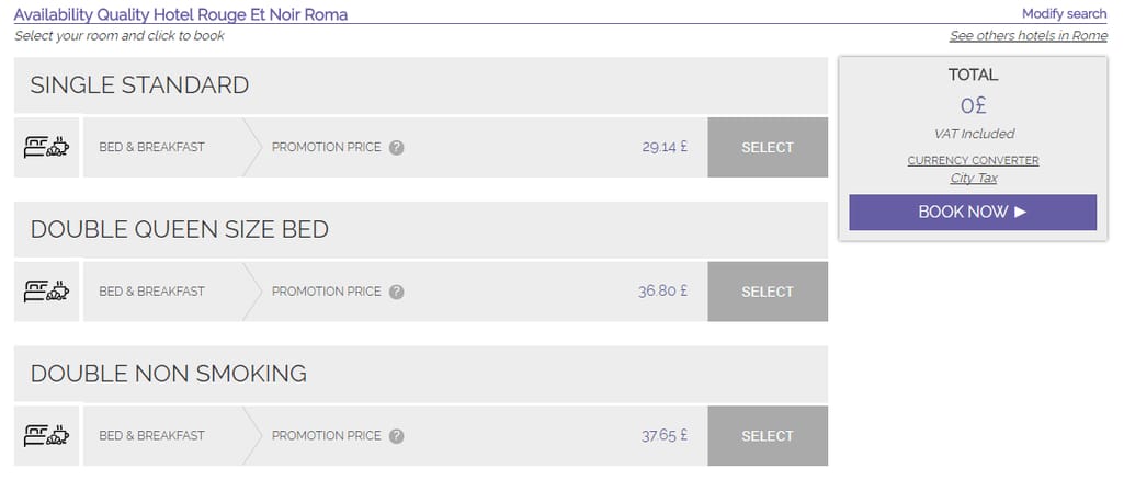
Unintuitive CTAs on Hotelius: Book Now button is highlighted but you should first click Select to start booking
Our recommendations for designing CTAs that drive conversion:
Display them at the right moment. Offer users an app to download when they’re accessing your website via mobile. Offer to send notifications about best deals after they’ve spent some time scanning search results. Don’t ask travelers to book something “now” when they have yet to review all properties.
Streamline the follow-up action. Whether it’s subscription or checkout, make sure the process following a CTA is clear and distraction-free, and that it guides travelers through each step.
Have very distinct CTAs. Make sure there’s a clear difference between CTAs especially if they’re located on the same page. Sometimes “Select” and “Buy” buttons can be confusing and misleading.
6. Ignoring explorers
According to Google, 65 percent of leisure travelers start searching online before they decide where to travel. Which means that a large portion of traffic on your website may be coming from people who haven’t yet decided on their destination and dates. While a majority of OTAs focus on the booking function alone, there’s a market for customers who are seeking inspiration and open to discovery.
Skyscanner, for instance, does a great job with its Recommendations tool. Here you can be as flexible as you want, and the system will provide you with the options for the closest locations for the cheapest months.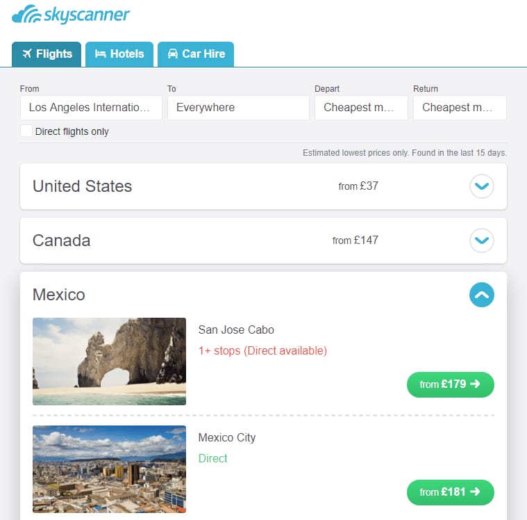
Skyscanner allows travelers to scan the most available options and plan months ahead
But sometimes even big OTAs can’t execute this operation successfully. Booking.com’s exploration feature “Travel guides” that provides valuable information about destinations cannot be accessed via the homepage. Consequently, the only way for users to get inspiration from the content is to choose “Everywhere” in the destination field.
So how do you address the needs of travelers who haven’t decided yet?
Don’t bombard them with deals. If you’re saying that a traveler will enjoy any of your locations, support this claim with a list of reasons to explore this place in real life.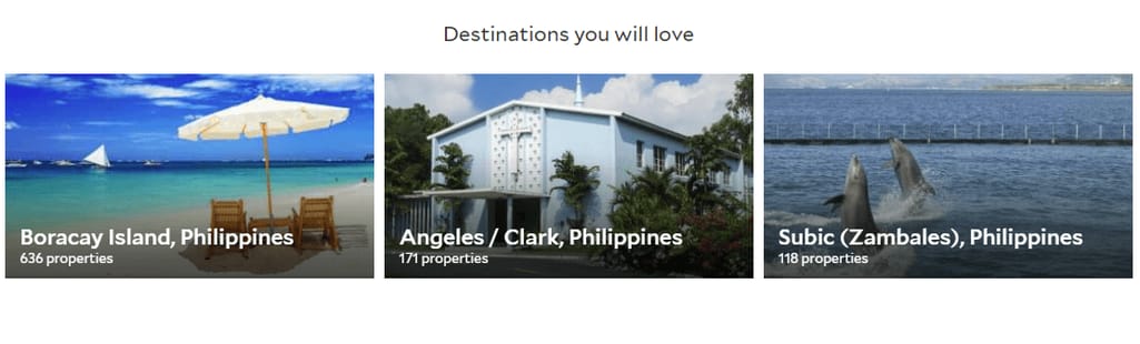
Agoda doesn’t provide any context about the displayed places and links users directly to the search
Segment. Offer options for different categories of travelers - family vacations, romantic honeymoon destinations, adventurous trips for the lovers of the extreme. Customers want to know that you understand their personal dreams and desires.
Integrate filters. Allow users to choose their budget and the desired travel time to eliminate irrelevant results.
7. Not creating original blog content
It’s hard to be different when the tagline of today’s online travel agencies is mostly the same - the cheapest fares. One of the ways to distinguish your website from dozens of others and increase engagement is to create original content. It helps travelers make better travel, accommodation and destination choices.
In 2013, travel was the 6th most popular blogging category followed by such dominant topics as food, technology, and DIY. Blogging provides great SEO benefits, brings new customers in, and helps create a strong brand identity. Content is also easy to share, and it can spark discussions and help you discover your target audiences' interests and challenges.
What type of content could you create?
Listicles. Posts like “10 Things to See in Manila” or “13 Must-Have Souvenirs from New York” always attract a lot of shares. Just make sure you list unique recommendations and employ guest authors experienced in the topic.
Educational. Travelers are always looking for nifty tips and tricks, be it for packing, cultural differences, or hunting for best prices.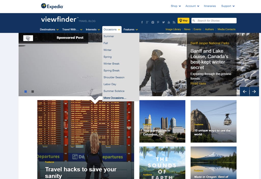
Expedia’s travel blog offers a variety of content about destinations, interests, and more
Video blogs. People interact with videos daily, not only on YouTube, but also on Twitter and Instagram. Visual information is easy and fun to consume, and travel is one of the universally appealing topics. You can start by creating short clips - perhaps up to 30 seconds - for the high performing posts. Test and change styles, engage influencers, and improve video quality as you grow.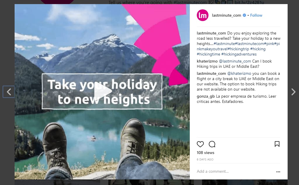
LastMinute’s Instagram videos compiled from images are an example of a great alternative for video blogging
8. Bad customer care
Not all complaints about online travel agencies come from hotels. Customer dissatisfaction is a common pattern even among leading brands such as Expedia or Travelocity. Failure to deliver quick solutions, provide clear instructions, and establish communication channels, along with an unsatisfactory UX bring non-technologically advanced travelers a lot of frustration. According to the latest survey, customer satisfaction with OTAs has remained the same since 2016 while it has increased for airline and hotel websites.
To ensure your customers won’t leave a disappointed review on social media, pay attention to these pain points.
Break down the fees. Customers love transparency, but 40 percent of them are unaware of service fees charged by OTAs. Communicate each fraction of the total price clearly and reassuringly.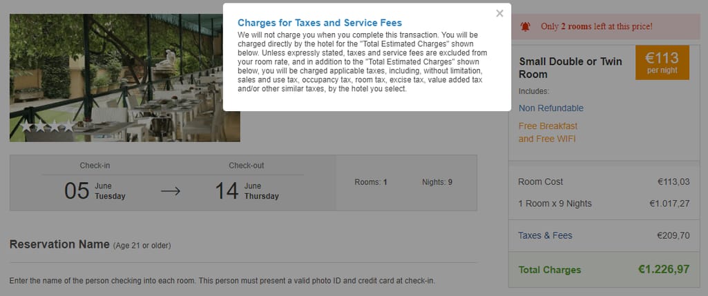
Priceline’s Taxes & Fees pop-up scooped all relevant info into one complicated paragraph
Step up your problem-solving strategy. Booking.com is doing a bad job of providing fast and efficient help. In case of urgency, a user first must click on Customer Service Help at the very bottom of the page, then choose one of the limited topics and find their issue in the list of FAQs. To receive personalized service, a user must sign up and then call or email support. The whole procedure is inefficient, especially in critical situations.
Implement omni-channel support strategy to allow your customers to reach out not only by email, but also via live chat and social media accounts. And consider chatbots to lighten the load of your support agents.
Provide clear instructions. The fact that your website provides some functionality is not enough. If you guarantee to return the difference for a cheaper price, offer step-by-step guidance to send the refund request.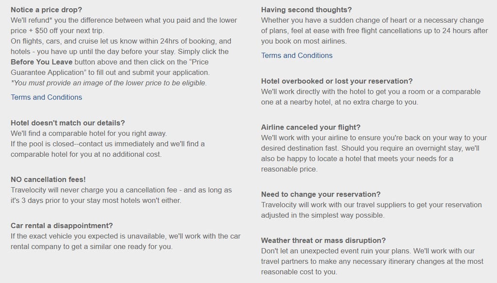
While Travelocity offers free flight cancelations and reservation changes, it gives no instruction on how to do this or links to the page where users can find out more
Following the trend
The biggest booking and reservation websites are constantly testing, optimizing, and keeping their eye on the latest technological innovations and current customer needs. So, sometimes they make mistakes that not only result in bad user experience but may majorly affect whether customers receive what they came for in the first place.
While hotels are trying to bring bookings back to their sites, OTAs are competing for the most personalized, comprehensive, and efficient booking at each step of the travel planning process. You will rise above the competitors if you start with preventing the most common mistakes.

Maryna is a passionate writer with a talent for simplifying complex topics for readers of all backgrounds. With 7 years of experience writing about travel technology, she is well-versed in the field. Outside of her professional writing, she enjoys reading, video games, and fashion.
Want to write an article for our blog? Read our requirements and guidelines to become a contributor.