1. Omnichannel UX Brings Consistency in the Multi-Device World
Despite the fact that one in ten Americans access the web only via smartphone, the trend of catering exclusively to the mobile audience ought to be reevaluated. These days people tend to own more than one device and therefore may switch them mid-task. A study shows that 25 percent of users are more likely to switch to a tablet from their smartphone and 60 percent to a laptop mid-task. A designer’s job here is to create a seamless flow for the customer’s journey providing him or her with a choice. By making this transition smooth for the users with more than one device, we give them control over the time, place, or circumstances where they want to use the product.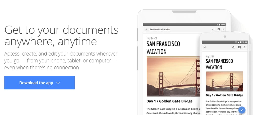
Google’s cross-device services such as Google Docs and Google Keep provide smooth transition mid-task
2. Content Shapes Design. Design Emphasizes Content
“Content is the reason search began in the first place.”
Lee Odden, CEO at TopRank Marketing
According to the survey conducted by the Content Marketing Institute, 62 percent of users are inclined towards the companies that create masterfully written and researched content. It increases trust and authenticity, and distinguishes a company as a reliable source. The accurately assembled content provides value regardless of whether readers reach for their wallets. However, after receiving it, they will most likely make a purchase. Considering this, a designer’s mission is to make sure that nothing impedes a viewer’s experience of the content and that it actually enhances their comfort while they’re watching it.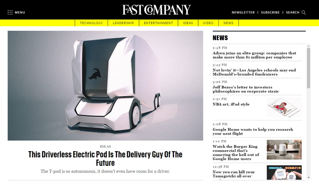
Fast Company’s wise choice of fonts and content layout makes it a great example of thoughtfully created editorial website
So, what elements of design will make your content pop out?
1. Distinct visual hierarchy Hierarchy in design demonstrates to a user how to read the content as it visually differentiates header text from body text. A reader should know where to start and where a new section begins and then ends. This can be communicated via font size, font weight (regular or bold), and sometimes color. Maintain a consistent structural hierarchy to make sure that a reader is not confused about the importance of different elements of content. 2. Scannable text Studies show that most people will read about 20 percent of the page and prefer to scan it before reading. And when they do, most of the scanning follows an F or Z shape – the common patterns of eye movement when looking through information. You can utilize this knowledge by creating a page layout that conforms to this behavior and place the most important content according to eye movement. 3. White space Interestingly, the lack of content will make the existing content stand out more. Don’t overweight your page; let users unconsciously fill the gaps. Minimize the amount of “cognitive load” a user must undertake before he or she reaches the end of the page. 4. Separators There are different ways to separate independent chunks of content to provide an organized and clean layout. Apart from white space, you can use lines between sections, articles, or columns. Text boxes are another popular way to neatly divide completely unrelated content that must be on the page but shouldn’t distract a reader. “Less is more,” says James McCarthy, web developer, UX designer, and entrepreneur. “Giving site content and components room to breathe greatly improves a user’s experience. Strategically placed white space can significantly help content digestion and alleviate distractions. Removing unnecessary elements provides a cleaner, more focused experience. Gone are the days of gratuitous animations and hefty navigation menus. Is it absolutely necessary? If not, remove it.”3. Humanizing Digital Experience with Microinteractions
Microinteractions are secondary features existing to fulfill a single task. If we start paying attention, we’ll see microinteractions everywhere. It’s an animation of a heart popping up when you like an Instagram photo. It’s a pull-to-refresh feature in many popular apps. It’s a green checkmark showing that a username you’ve typed in is vacant. This March, the Facebook Messenger app got a new feature that allows users to react with emojis to individual messages.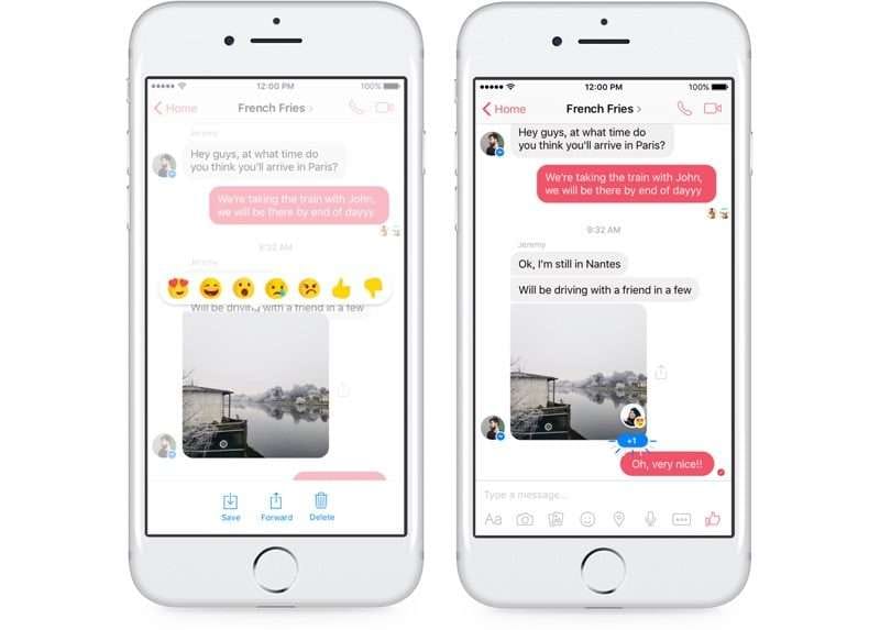
- improves the group-messaging experience by providing a quick response mechanism;
- makes the chatting process more enjoyable and vibrant;
- supports the whole informal, playful feel of the app.

Dropbox’s imaginative way of recommending to choose more secure passwords
Aside from the obvious, microinteractions can make users – well – interact. The New Posts feature recently rolled out on the Tumblr app invites a user to stay longer to see more content without updating the page. Combine it with enjoyable animation or another type of reward, and you’ve formed a habit.
4. Visual Storytelling as a Key to Engagement
“Design creates stories, and stories create memorable experiences, and great experiences have this innate ability to change the way in which we view our world.”
Christian Saylor, UX designer at Universal Mind
With the abundance of content existing on the web, being different is critical. Creating a story around your product, even inviting users to become a part of one, while a challenging model to design, is one of the easiest ways to get them engaged. Design storytelling is widely used by social campaigns to raise awareness about important issues or trigger viewer empathy, while creating a UX that just flows. Users are first affected by the idea, by the goals they’ll be able to achieve with your help, then – and only then – by your expertise. If the story corresponds to their passions, they will believe it.Here are the main techniques to lend a hand to the telling of engaging visual stories:
1. Make the user a protagonist in your story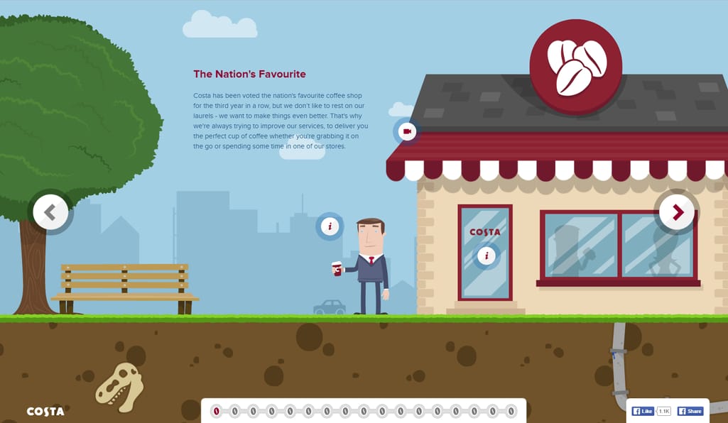
With the help of interactive elements and predefined flow, Costa places a customer in the shoes of a narrator.
2. Stick to the story structure: introduction, culmination, end
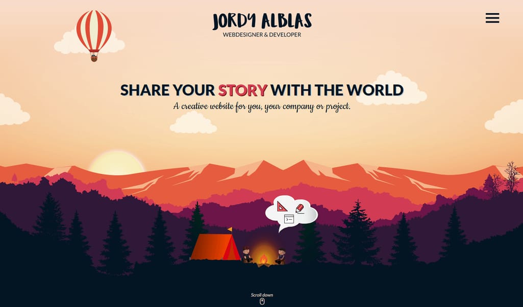
Animations and a consecutive flow on Jordy Alblas’ website persuade a user to proceed until the end.
3. Include responsive visuals
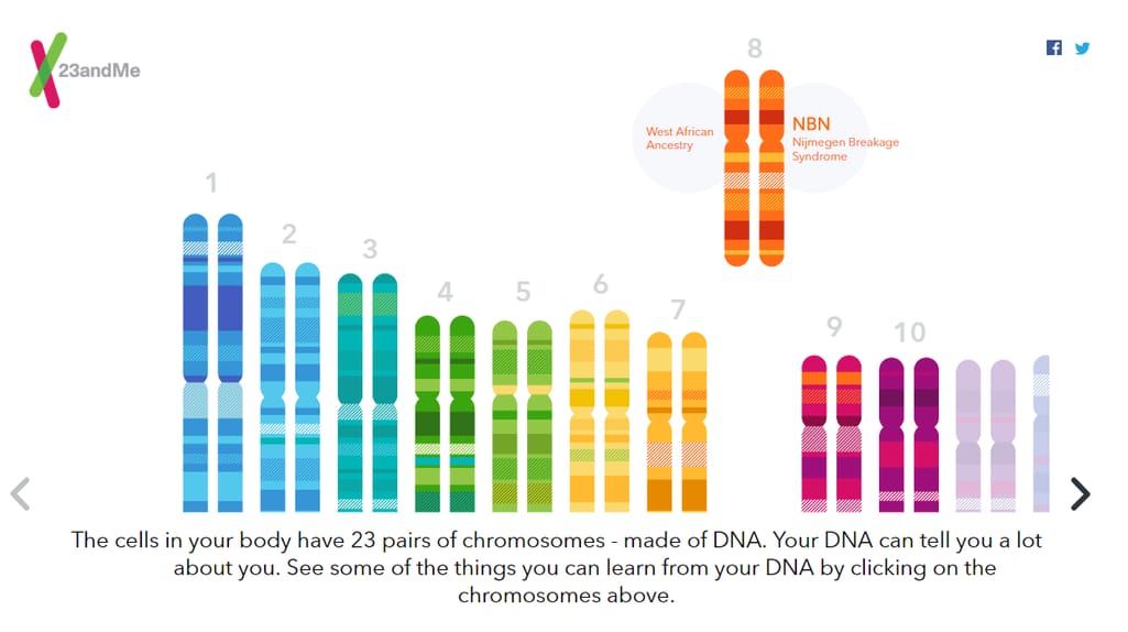
23andMe allows users to learn about chromosomes in an interactive way.
4. Hide some Easter eggs
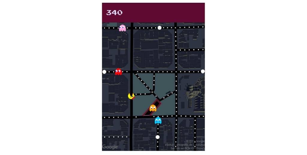
This year on April Fools’ Day, mobile users could play Ms. Pac-Man in Google Maps.
5. Gamify simple features
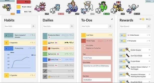
Habitica is a mix between an RPG and an organizing app where users can create avatars, earn XP, and fight bosses.
Remember, however, that the websites intended for instant access to information won’t benefit from interactive stories. See the next trend for design that saves user time.5. Designing in the Interest of Saving Time
In the age of almost limitless sources of information, users are very impatient when finding answers online. Each query on Google gets thousands of carefully selected links, and users know if they can’t find what they’re looking for on the first page, there are hundreds of others to browse.The elements of UX design that save user time:
1. Minimalism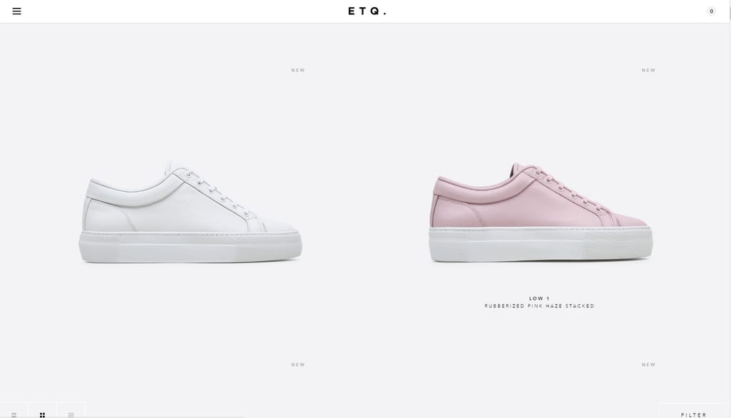
Generous proportion of white space and a pastel color palette help users navigate and easily find what they are looking for (ETQ).
2. Straight-to-the-point design

Airbnb has positioned the main elements of interface in the center top area of the page to simplify customer search.
3. Long scrolling
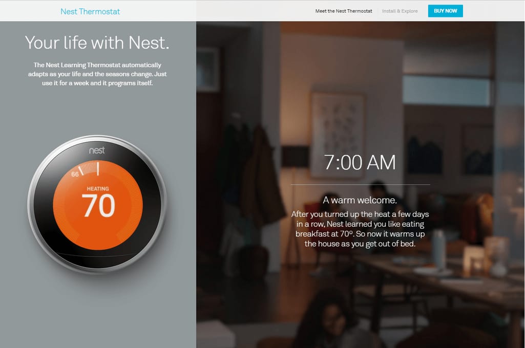
You can scroll through all the information about Nest Thermostat in a single page.
4. Grid boxes
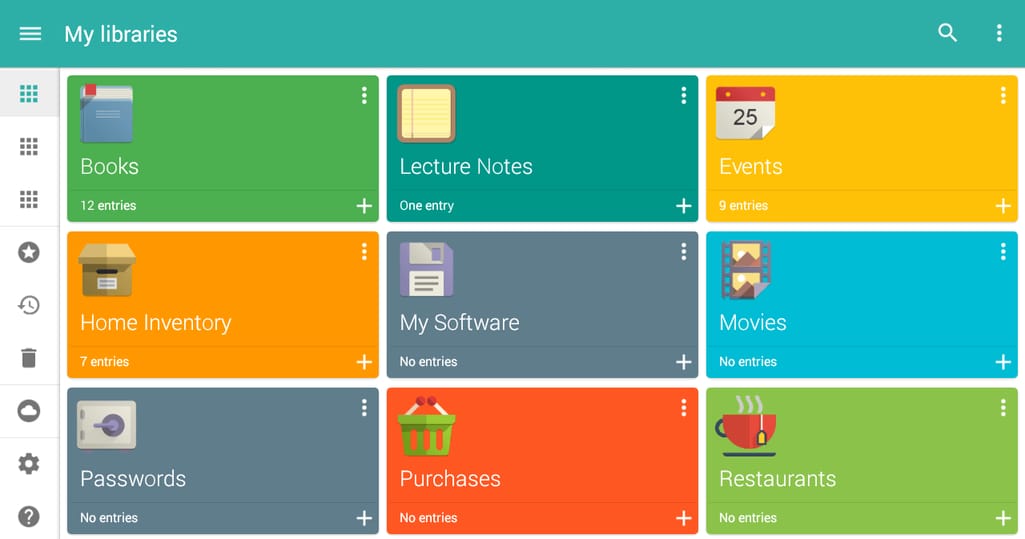
Presenting information in a grid allows mobile users to access all content at a glance when information density is important (Memento).
5. Stacking
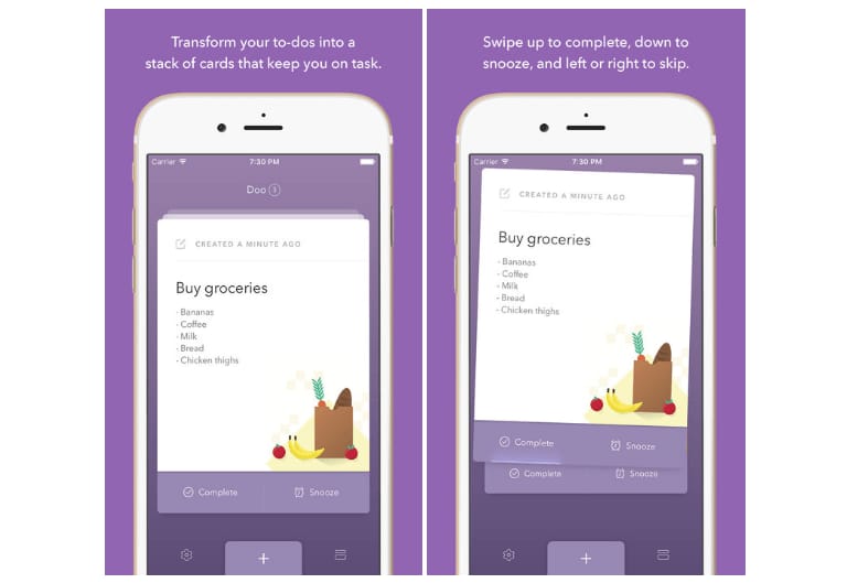
Doo’s design of a simple to-do list uses intuitive gestures for quick access.
We can’t discuss user convenience without addressing the importance of fast loading. Today building a quick interface response mechanism is no longer a choice because research shows that more than half of mobile users will leave a site in 3 seconds if it takes too long to load. Moreover, Google penalizes a website if their speed is too slow. Many factors affect a site’s performance, and a heavily loaded user interface design is one of them. Animations and complex graphics, buttons and links that a user needs to click before reaching the content, the weight and number of font files, and gradients are the elements of UI (especially, mobile UI design) you should use more sparingly. Sometimes it’s worth seeking a professional UX consultant before spending time and money on excessive, disadvantageous design. There are a lot of things to consider when building a website, from unique content to engaging web design, but the layout that saves user time is just as vital as any other part of UX. No fumbling through the menu, no clicking from one page to another, a clear and easy to understand site map invites a user to earmark his or her time to your resource and not any other.6. Conversational Interfaces - the Future of User Interaction
Conversational interface is a general term for chatbots and voice-activated communication platforms powered by AI. Google Home and Amazon Alexa are paving the way for always listening connected home systems, while Siri, Google Now, and Cortana erase the physical border between a human and AI. Interaction design for virtual assistants is fundamentally different from the traditional one. While creating a seamless conversation experience, we need to prepare AI for the use cases that are specific to voice and chat interfaces. Current technological limitations of these interfaces dictate the ways we can improve them in the future. For instance, many of the 7,000 skills for Alexa have been proven narrow or unpolished. Also, the privacy concerns have not been properly addressed yet. Chatbots became one of the most discussed technologies of 2016. The support from Facebook and Microsoft combined with so-called app fatigue has led to the appearance of thousands of chatbots, predominantly for popular messaging apps. Now they can do anything and come in the silliest forms from a sassy weather forecaster cat to an insomniac companion that keeps you entertained at night. Currently there are more than 30 thousand chatbots for Messenger and 20k for Kik. They are free, cheap to develop, and intuitive to use.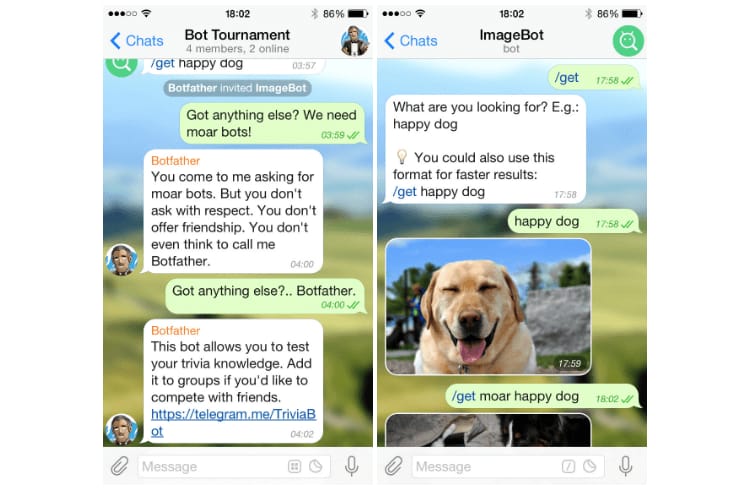
There are thousands of chatbots on Telegram
Chatbots have minimal UI so designers don’t need to worry about the visual aspect. What is more important is crafting the right conversational flow. Considering that human conversations are nonlinear, there’s a lot to consider before constructing a bot. For example, make sure that your bot doesn’t sound repetitive, that it understands different types of questions, and has a number of witty comebacks for when the chat has reached a dead end. To learn more about designing conversational interfaces, check out our guide on building chatbots that your business will benefit from.
In his Principles of Bot Design, Emmet Connolly, Director of Product Design at Intercom, notes that first and foremost, we shouldn’t try to fool a user that it’s another human. Chatbots don’t exist to mimic a real human conversation but rather provide sensitive guidance and improve difficult tasks.7. Virtual and Augmented Reality–get ready for the screenless world
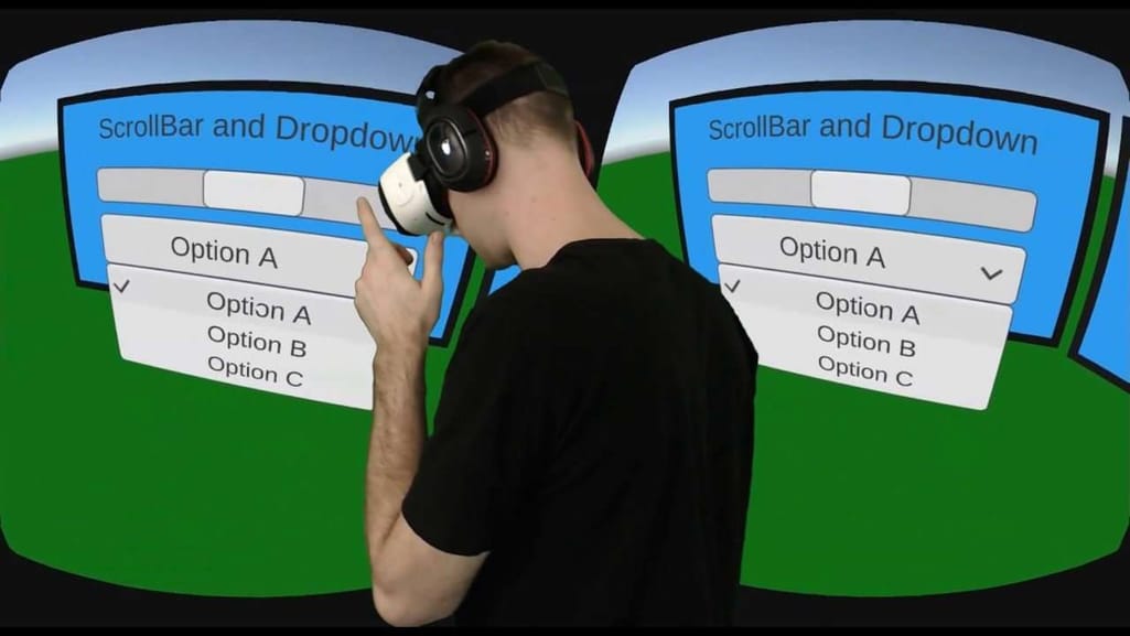
One of the most dramatic changes in the future in the way we use our apps will be the emerging virtual reality technology. Even though the concept has been explored in fiction for decades now, it’s fairly recent that we’ve started thinking about it as a part of our near future. For instance, cruise company Carnival offers a 360-overview of their ships both on deck and in suites to help potential passengers get acquainted with the ship. Automotive giant Ford has also started exploring the potential of VR and AR technologies which will allow the consumers at their convenience to interact with every aspect of a product. To get to this level of technology advancement, we still have a lot to figure out. Leanne McLaughlin, UX/UI designer at Degree 53, says, “VR has become such a buzzword and everyone wants to start using it in their business, whether it’s gaming or real estate. It has its potential in many industries and is great fun, however UX still has lots of room for improvement. For example, using scroll bars and drop down menus in VR menus. These are UI elements from other platforms and can really hinder the experience. The user has to look at them to move them and it can be quite a dull and needless experience.”