
What is a landing page?
A popular misconception about a landing page is that it’s the same thing as a homepage. It is decidedly not. A landing page can be part of a website or stand alone, but it always has another purpose. The hallmarks of a landing page are:- One goal
- A single message
- A lead generation form or a clickable call-to-action (CTA) button.
Let’s imagine, you’re a beekeeper. You sell honey in your website’s online shop. And now you have a special kind of honey that you want to distribute. So you create a landing page precisely for this. This landing page becomes a part of your website and has a call-to-action (CTA) button with an inscription like “Buy Honey Now.”
Direct sales are not the only possible conversion goal. Lead generation is another landing page objective. It aims to gather contact information about people who are interested or might be interested in what you offer to them though they don’t want to buy anything at the moment. The lead generation page can offer a free ebook, webinar registration, or simply a subscription to a newsletter in exchange for contact information.
Regardless of the aim, the whole design and content of a landing page must focus on reaching your conversion goal. You can achieve it in six steps, each of which entails certain elements.
1. Research and segment users
Without understanding your target audience, you can’t make a converting landing page. You don’t try to sell honey to the people who are allergic to it, or those who prefer jam. Analyze your product, then define the target audience and its segments. It’s necessary to tailor the message and make your content relevant to those who will definitely be interested in your product. At this stage, you have to create a buyer persona and consider personalization.A buyer persona. A persona is a portrait of your perfect customer: the person you’re sure is interested in your offer. This portrait includes demographics, professional and educational background, career, interests and challenges, concerns and motivations. You can create your buyer persona on the basis of your current customer profile or via an interview with the target audience. Additionally, personal interviews can help you learn how to make a design more human-centered.
With this knowledge, you can start your work on the landing page itself. Define whether your landing page aims at lead generation or sales. To get more out of it, you can also develop an understanding of how to segment and personalize a landing page for different target audiences.
Personalization. A relevant message increases the chances the user will convert. Consider personalized messages for different segments of your target audience right at the planning stage. You can target a landing page by geolocation, device, industry, past interactions with your website, search queries, or a browser history. That means you need to have different versions of copy and layout for different target groups. One of the ways to personalize a page is to implement smart content.
Smart content, also known as dynamic content, changes depending on the segment a visitor belongs to and shows different versions of text depending on who visits it. Some off-the-shelf landing page builders like Unbounce, Instapage, or Lander have such personalization tools, including dynamic text replacement.
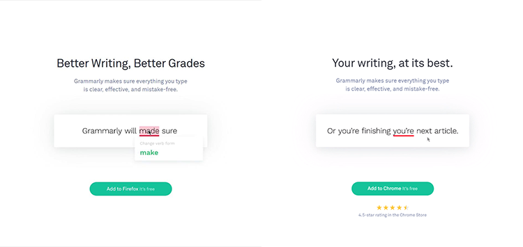
Smart content on Grammarly aimed at different audiences Source: Grammarly
Dynamic text replacement allows for choosing a word, phrase, or a whole paragraph that will vary in different versions. The most common variable items are headings, subheadings, and calls-to-action. Also, you can personalize images and other visual elements. For example, Grammarly’s landing page visualization changes depending on the visitor’s device.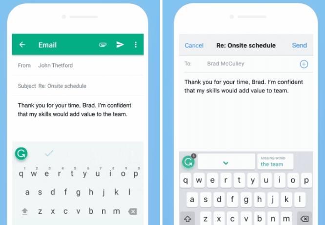
Personalized animations displayed on the Grammarly landing page on Android devices and iPhones Source: Grammarly
So, you have defined the target audience. Now it’s time to convey your message to them.2. Draw attention
Humans have selective attention. The fact that you have a visitor on the landing page doesn’t mean that he or she will make a purchase or subscribe. Headings, typography, and colors affect the way visitors perceive your message. Below we discuss the best ways to put these elements to work.People read web content in different shapes, one of which is an F-shaped pattern, a Nielsen Norman study shows. It has found that people’s reading habits are largely shaped by poor design. If there is lots of text without clearly defined points, headings, and subheadings, a reader strives to save time by reading just the key points.
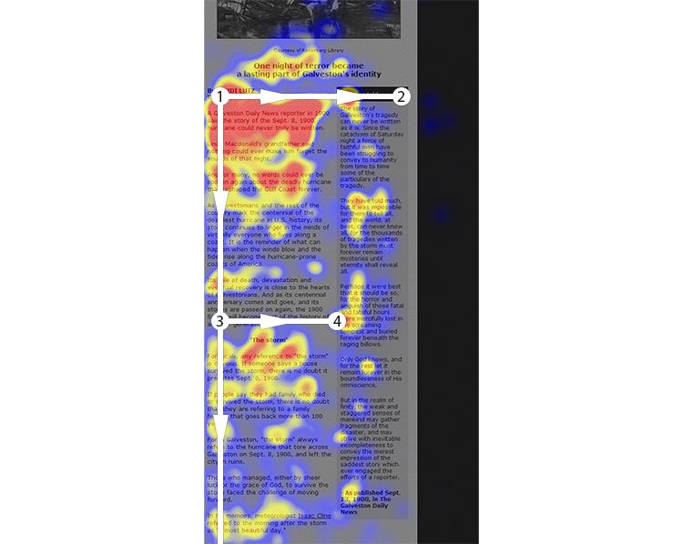
The F-shaped reading pattern heatmap Source: Nielsen Norman Group
Heading, subheading, and the first two paragraphs are crucial for a landing page. They must deliver the essence of your message. The heading of a landing page grabs the reader’s attention. In fact, it’s the most important part of a website’s copywriting. When creating a heading, stick to these rules:- Crystallize the main message for your audience
- Keep it between 10-15 words
- Support it with a subheading
- Use action-oriented language with words like join, shop, save, buy, subscribe, contact, get, explore.
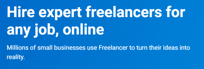
Freelancer’s landing page heading and a subheading Source: Freelancer
Typography. The success of a heading and subheading largely depends on the typography you use. Size and shape help to create the text hierarchy and complement a landing page style. Don’t use more than two typefaces on one landing page, because it will make a page look chaotic.Color scheme. The correct font is not the only way to highlight the important information. The landing page color scheme must work on it, too. Consumer behavior is closely tied to color: It influences the perception of a brand.

Analogous vs. triadic colors Source: Helpscout
The best converting landing pages are those that use one base that consists of analogous colors, and up to three contrast colors from one color triad. Analogous colors look harmonious, while triadic are contrasted. The latter emphasize the main information and draw attention to it, so they should be used for call-to-action buttons or lead generation forms.You can base the color scheme on an image or a photo you use for a landing page title. Such services as Canva, Palette Generator, Coolors, or Colormind create a color palette from the picture automatically.
An image-based color scheme, photo by Ron McClenny Sources: Canva, Unsplash
If you did everything right, your visitor reads the message you’re trying to convey. Now it's time to for the emotions.3. Evoke emotions
As soon as you have a reader’s attention, you can show how a visitor’s life will change after using your product or service. People read visual content much faster than the written variety. Use this knowledge and make them feel their emotions before they start to rationalize them.Images. You can evoke emotions by underlining the positive sides and creating a visual representation of a person engaging with your product. Create an emotional picture with photos, images, and videos. The best pictures for your landing page are images of people using products or services you sell. Use custom photos or stock images. But remember, they must be:
- relevant
- high-quality
- style consistent
- and probably have a person shown (a recent study by CWI Amsterdam proves that images with people’s faces attract more attention)

Scribd landing page Source: Scribd
Where to find stock photos: Shutterstock, Unsplash, Pixabay, Behance, Pexels.Video and animation. People love to see how products work. Embed a video on a landing page via YouTube or Vimeo to give a user a fuller experience of what he/she can get. Also, video can include customer feedback, showing potential customers what the actual customer experience is like. Animation brings statistics to life, making a page livelier with moving numbers or graphs.
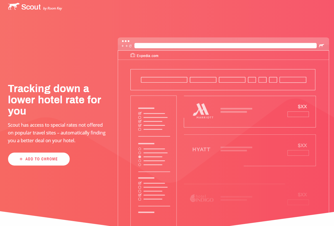
Animated elements on Roomkey landing Source: Roomkey
Well, now your visitor loves the visual part, and is probably inclined to make a decision. Let’s give him/her a push using some words.4. Persuade
The goal of landing page writing is to grab a reader’s attention, send a clear message about what’s going on there, and win a reader’s trust.The less the better is the rule that works for landing page copywriting. Landing pages with fewer words lead to more conversion than the wordy ones, an Unbounce research says. A visitor won’t read every word, so keep it short. Here are two ways to achieve it: write copy or use a testimonial.
Copy. The copy doesn’t have to emphasize your product or service; it must tell a potential user what he/she will get after interacting with it. While pictures create an emotional impression, the copy calls to reason and answers the “why?” question. Keep it simple and clear. Avoid long and awkward sentences, don’t use vocabulary that you won’t use in a normal conversation. And visualize the text with a picture.

Landing page copywriting Source: Shopify
Testimonials. Feedback from real people is always appreciated and leads to better conversions. One testimony is worth ten promotional sentences. Let the users speak for themselves and tell about their experience with your product or service. You can place the quotes at the bottom of a page, but there are smarter ways to use them. For instance, replace a heading with a customer’s testimonial or add a video to the text.
Testimonial with a video Source: Upwork
Well, congratulations, you have convinced a reader! Now it’s time to make the last step.5. Call-to-action
If you don’t have a call-to-action on your landing page, then you don’t have a landing page. A call-to-action (CTA) is a self-explanatory term: It calls on a user to perform a specific action. CTAs exist in the form of buttons or pop-ups that suggest to a visitor a target activity: subscribe, download, buy, etc.A CTA button is the most popular way to ask a user for something. It’s not just a nice, catchy piece of graphics; it must be supported with a solid sentence that calls a user to action. Here are a few tips for creating an effective CTA button. It must:
- be easy to find
- use action-oriented language
- create a sense of urgency
- stand out from the rest of the information
- be placed logically in the text

CTA button on Upwork Source: Upwork
Pop-ups are the most detested technique in advertising, as confirmed by recent Nielsen Norman research. The name of this type of call-to action is self-explanatory as well: When a visitor comes to a page or scrolls, it appears, offering a free trial or subscription. However, pop-ups are still effective if used the right way. They bring more leads if they don’t block access to the content and serve as lead-generation forms.On landing pages, they are not used that often as the page itself already contains the key message and a CTA interface. Usually, pop-ups appear when a visitor lands on a page or is about to leave. They are called entry and exit pop-ups respectively.
Entry pop-ups are used on pricing pages and offer promotions or discounts to encourage a visitor to act. Exit pop-ups use mouse-tracking software to predict when a user is going to leave the page. As a result, when a visitor wants to close a tab, a call-to-action reappears, suggesting some additional service or opportunity. For example, on The New Yorker landing page, an exit pop-up appears when a visitor wants to leave the page. It offers a free 12-week trial before embarking on a full subscription.

Exit pop-up Source: The New Yorker
There are certain recommendations for using them on a landing page. A pop-up shown 5 seconds after entering a site brings more emails than those displayed right when the user lands on a page. It mustn’t be too large and cover the whole landing page. But a small pop-up is an absolutely useful thing. Also, the right context matters: A pop-up that appears in the right spot is more likely to attract visitors than the one that appears out of nowhere.You can use both types of CTAs on your landing page, but if you have several, make sure they have different colors. And keep in mind that landing pages with a single CTA have a higher average conversion rate (13.5 percent) than pages with two or three CTAs (11.9 percent and 10.5 percent, respectively), as an Unbounce case study shows.
Let’s sum up: You have followed the recommendations, you have a page that seems good enough to convert. But how do you make sure it serves the purpose?
6. Test and analyze
The landing page looks great, but you still doubt whether a green button is better than blue, or one heading is more appealing than the other. You don’t need to read the tea leaves, because you can A/B test a landing page after the launch to know this for sure. In case you plan to redesign a website, testing is also a good idea.Testing allows you to understand which items are more effective to influence the target audience. Assess the outcomes of interaction with the page using such metrics as: the source of traffic, page views, bounce rates, number of emails or contacts collected, visitor-to-contact ratio, cart abandonment rate, number of shares, etc. Analysis of the results is the key to understanding the success of a landing page. Learn more about A/B and multivariate testing tools in our article.
Examples of landing pages that work
Now that you’re aware of the main rules for landing page design, take a look at some examples.PayPal

PayPal landing page
PayPal is a digital payment platform that offers services for businesses and individuals, so they have a split webpage with two separate primary calls-to-action for each segment of their target audience. One of PayPal’s functions is to transfer money online, so it's a separate CTA that suggests that a visitor registers to make a transfer. The headings and subheadings use action-oriented language and encourage account creation. An image with people attracts attention. Since the photo is a part of the CTA, more visitors will pay attention to the call-of-action and read about the options for a personal account.Hotel Tonight

Hotel Tonight landing page
Hotel Tonight is an app for last-minute booking. The goal of this landing page is to persuade a user to download the app, which is the only call-to-action that Hotel Tonight uses. CTA buttons reoccur on the landing page, following the reader’s flow and increasing the chance that a visitor will click to download the app. The color scheme of the landing page is based on the brand colors. The title image shows the app screen. The benefits of the app, presented as statements, sound clear, honest, and persuasive, urging visitors to try the app.
Hotel Tonight statements
Spotify for Brands
Spotify for Brands landing page
Well-known music app Spotify offers a service for brands, allowing them to create and launch audio campaigns via the service. This landing page is a click-through and has a single CTA that sends a user to a webpage. Also, there is a CTA button in the About section, where a visitor can learn more about the actual benefits of the service. The heading with a clear message and an image of a person make this landing page effective, drawing more attention to it. The contrast color scheme enhances CTA button visibility.Grammarly

Grammarly landing page
The service provides an online spellcheck application and a browser extension. The landing page paints a picture of how the service works. Main features of the service are shown in the animation, while the main benefits are explained in the text.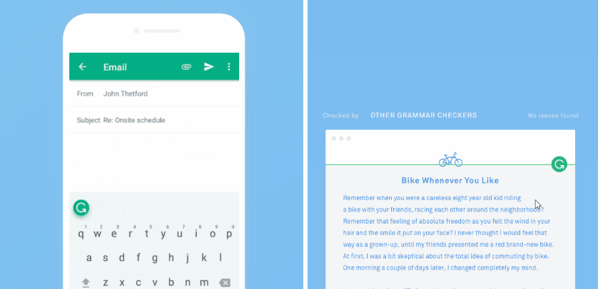
Animation on the landing page: mobile and desktop versions of Grammarly
The landing page with almost no color has a patterned background instead. A CTA uses the core brand color (green). Grammarly’s landing page has a video testimonial section, supported with quotes. Everything here strives to showcase the simplicity and effectiveness of the service, while the color palette emphasizes the text, the only thing that the tool is built for.
Grammarly testimonial
This is an example of a personalized landing page. It targets the message by changing headings and calls-to-action text depending on the device, browser, and user profile. All of this increases the chance that a visitor will install the service. Another good point is the animation that appears right after the first call-to-action, showing visitors the advantages of the service.A few more things to consider
Keep your landing page minimalistic and responsive. Make sure that all visual elements of the landing page will work on every possible device because people will not necessarily visit your landing page from a desktop. Check our article UX design trends for 2018 to learn more about design for mobile devices.The visual part of a good landing page must be consistent with the content. Work on the message and create the right impression. If you have gone through these six steps and have done everything right, your landing page should be effective. If it is not, it means that there is still room for improvement. Change the visual and textual elements, A/B test them, and analyze the feedback.