
By the end of 2017, it is said 70 percent of Americans will make payments via their mobile phone. A recent Federal Reserve Board report notes that in 2015 about 39 percent of U.S. mobile owners used their mobile devices to shop online. Although mobile purchases still trail those of desktop, smartphones and tablets help 82% of users make product decisions.
The drastic shift towards mobile nudges eCommerce stakeholders to reevaluate their platforms and match evolving industry demands. This entails responsive web design, mobile-oriented performance and UX, as well as advanced adjustments to embrace the widest variety of modern users possible.
Things that you lose having mobile-unfriendly design
Google ranks mobile-unfriendly pages lower in mobile search results. In 2015, Google rolled out their 4/21 upgrade. The idea behind it is to penalize mobile-unfriendly pages in search results and enforce responsivity across various devices. While this impacts search rankings on smartphones and tablets for individual pages only, you still lose visitors that come to make decisions and compare prices. Go to the mobile-friendly test to check your pages or get a mobile usability report.You’re neglecting social media campaigns. Nearly 80 percent of the time spent in social media accounts for mobile. Acquiring visitors from Facebook or Twitter thus becomes nearly vain, unless you’re targeting that 20 percent only.
You’re increasing bounce rates. Even intelligently crafted landing pages turn out to be ineffective once your visitors must zoom in to read texts or they merely can’t see target zones without scrolling and adjusting a viewport. This entails extremely high bounce rates compared to desktop results. According to studies, 63 percent of users are prone to leave after a few seconds of experiencing a poorly designed page.
Low speed reduces engagement. Having a responsive page that nicely adapts its sections on mobile doesn’t necessarily mean you provide a mobile-friendly experience. Above-the-fold content (i.e. the content that’s rendered on the top of a viewport and doesn’t require scrolling) should become visible within 3 seconds. A loading threshold that low provides the highest engagement level. To check whether your page is fast enough, try the Google page speed tool.
The bottom line is that a mobile-friendly site isn’t just fancy or trendy. It directly impacts your conversions and eventually revenue. To ensure that you deliver the right experience, you should consider both design and technical aspects that would tailor your eCommerce site to mobile demands. If you’re in the early stages of eCommerce website development, it’s better to start creating the mobile design prior to the one for the desktop.
What are the measures you should take to ensure that your website delivers the right mobile experience? We’ve broken down the points into three categories: design, tech, and various advanced techniques you can employ.
Design optimization measures
- Make sure that your texts are readable across platforms. That’s the obvious one, which can be easily revealed after failing the mobile-friendly test by Google. Don’t make your users zoom or peer into a screen. Also be aware of line spacing and fonts, trying to avoid serifs.
- Avoid horizontal scrolling. Unless you have an image carousel, don’t bother users with horizontal swipes to see a full image or a content section. That’s annoying.
- Think convenient placement for your tap targets. The average pad size of an adult is 10 mm wide; so Android UI guidelines, for instance, recommend making tap targets (buttons, links, etc.) cover at least 48 CSS pixels or 7 mm. If the tap target is smaller, the spacing between it and other elements should take at least 32 CSS pixels or 5 mm.
- Don’t hesitate to hide some sections. A number of sections and elements grow useless on mobile phone screens. These can be landscape-oriented images that just wouldn’t fit or menu links. The latter has been long hidden under a hamburger button on many websites.
- Make use of category search. Generic search is quite limited for smartphones as users can see only a handful of results before they must scroll down a page. A simple and elegant solution is to design an approachable search by department and category to narrow the results and increase specificity. Amazon is an excellent example here. Not only do they sort items by department, they also provide drop-down menus with subcategories to refine results even more.
- Provide a predictive search bar. Even though mobile keyboards are becoming increasingly advanced, it’s still quite challenging to type an entire query. A predictive search bar that has a drop-down menu with matching items will allow users to type 2-4 letters and then see the desired product. It also may show the options that a user hasn’t even thought of.
- Implement a guest checkout option. Filling in all registry forms or trying to reset your password is a painful and cumbersome experience on mobile devices. So, don’t forget to allow your users to check out as guests. In terms of mobile revenue, guest checkouts bring 13 percent higher results.
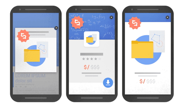
- Create only “reasonable” pop-ups. On January 10th 2017, Google is planning to roll out another ranking change to their search engine, which will combat “intrusive interstitials” on mobile. But how do you differentiate intrusive pop-ups from “reasonable” ones?
- Those that fade the main content making it inaccessible. They can either close after some time or wait until a user finds and carefully taps a tiny X.
- Those that entirely cover a screen.
- The layouts that have above-the-fold content that merely looks like a pop-up. These aren’t really pop-ups but they require users to scroll down to reach the main page contents.
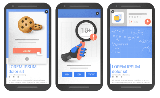
OK pop-ups:
- Those that warn about cookie usage.
- Those that ask for age verification.
- Login dialogs providing access to private content or the content stored behind a paywall.
- Small banners that consume a third or less of screen space.
Performance optimization measures
- Don’t use Flash. Again, starting with the obvious one. All software engineers have switched to the iframe method of embedding videos. It’s an up-to-date and acknowledged standard. However, if your website has been around for quite a while, it may be reasonable to investigate all its dusty, old corners for outdated video software. Apparently, old YouTube videos were embedded with <object> tags, those of Flash Player. The Google guidelines don’t recommend sticking with Flash due to performance and mobile compatibility reasons.
- Optimize images. Images are the bulkiest part of your website contents. On average, 65 percent of the web content is occupied by images, according to the latest HTTP archive report. So with low connection speeds, your website performance is mostly jeopardized by images. To ensure that your trump-card image hits the target on a mobile phone as well, you basically have two options. You either go for various image-optimization approaches or you simply render smaller images on mobile screens. There’s a pitfall to be aware of. If you just swap a bigger image for a smaller one using display: none in CSS, both images will get downloaded. This will increase the loading time even more. Instead, use the background image style via a DIV to load the only image for mobile. Check how your images are loaded by using Chrome DevTools right in your browser.
- If you can get along without jQuery, do it. OK, jQuery is indeed the best-fit library to do JavaScript code; its interface is consistent and unifying. The drawback here: It’s heavy, 30 KB to 200 KB if uncompressed. So, it’s reasonable to reconsider using jQuery for lighter options like Sprint (17 KB) or Zeptojs (5 KB) and boost your mobile performance.
- Employ browser caching for rarely-changing elements. Using browsing caching may work if a user visits a page more than once. Instead of repetitively loading the same images, JS or CSS, a phone or tablet will retrieve these elements from its memory and increase performance. This approach comes in handy only if you have unchanging and large libraries that must be loaded on users’ devices.
- GIFs are great, but it’s time for something faster. GIF animations are dated and there are faster options around. For short, animated videos, you can utilize HTML5 video or convert your GIF to Imgur’s GIFV format. This will reduce size by 10 or more percent.
Advanced measures
If you want to gain greater entry into overall responsivity and user-friendliness, there are some additional things you may consider worth your effort.- Prioritize above-the-fold content. Think of the things your users see first once they access your site before even scrolling a page deeper and optimize that. You can load styling and JavaScript logics later. If you manage to fit into the 3-second loading deadline, you can reduce the bounce rate by about 50 percent! So, make sure that the initial experience is smooth.
- Reconsider the value your server requests deliver. On average, each mobile page makes 214 server requests. And the number will silently grow like mold as you gradually upgrade a website with numerous analytics trackers or ads. Every new request adds to the loading lag. Perhaps it’s time to review those requests and ask yourself whether all of them are that valuable.
- Adopt omnichannel shopping. Not all your customers are ready to complete a purchase immediately via their phones. Some of them use mobile phones to make decisions and compare prices while the final shopping happens at home on a desktop computer. That’s why omnichannel shopping is an emerging trend in eCommerce. It suggests that your customers can start their purchase journey on a phone, probably add some items to a shopping cart, and check out later via another device. However, we haven’t yet seen any detailed and convincing examples of implementing omnichannel shopping. So, you may be an omnichannel trailblazer.
- Embrace accessibility. There are more than a billion people in the world who live with either temporary or permanent disabilities. And these people are your audience too. Unfortunately, a lot of design solutions that we see today are far from being accessible and easy to navigate for this large category of users. To make your mobile design accessible, it’s worth studying W3C standards on mobile accessibility that cover both mobile web and design for apps. A thought-provoking analysis of the topic was also written by Jesse Hausler, an accessibility specialist at Salesforce. We highly recommend a deeper exploration of those recommendations. Here’re some best practices:
- Don’t make color the only means of conveying information; use icons and texts to support your message.
- Texts should be contrasted sufficiently to be readable for people with color blindness and low vision.
- Label all forms to let users understand what kind of information is required.
- Try to limit the number of forms where typing is necessary.
- Avoid vague descriptions to links, making the target of each link clear.
- Create concise and simple texts.
A controversial question on m. subdomains
Although mobile websites seem to be losing their position to those with responsive web design, there’s no definite answer to the question of ditching your m. subdomain if you have one. In terms of performance, mobile websites are generally faster. But frequently, by introducing an m. subdomain you must sacrifice content or features that are available on a desktop version.Google is, however, clear on which way to go and recommends opting for a responsive web design. But it doesn’t necessarily mean that your mobile website will be ranked lower compared to its responsive analog. There’s no evidence supporting that. So, the best advice here is to prioritize your user and never make responsive web design the only mobile strategy. For the advanced solutions that have sophisticated business logics we recommend considering mobile app development.
A simple rule: Put the user before the technology.
There’s a common misconception that should be put to rest. In pursuit of the latest trends and concepts, it’s easy to forget that the end user doesn’t care whether your website complies with all engineering standards. Most of the people can’t distinguish between a site that’s mobile-friendly or one that isn’t.So, the high-priority goal can’t be articulated as We need RWD to cover mobile, because it’s not created to please a designer’s or an engineer’s aesthetics or professional feelings. The final judge is always the user.
Hey, tell us what techniques you employ to make your eCommerce website mobile friendly. What are the most critical ones? If you’re still contemplating whether you should opt for responsive web design or build an app, check out our iOS App Development Checklist. There’s a lot of interesting stuff.